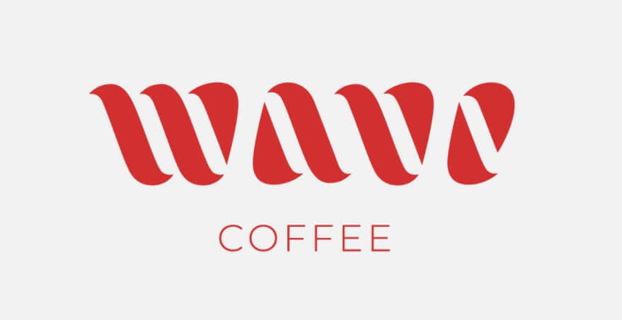
Wave coffee is a brand that sells coffee in the United States, they decided to do a complete redesign to their entire visual brand. They started their work by designing a new logo, they decided to take the company’s brand name as a reference: «Wave», –hello in spanish-.
That is why the letters of the company name in the logo look like an interesting wave effect. The logo designers also took the shape of the coffee beans as references.
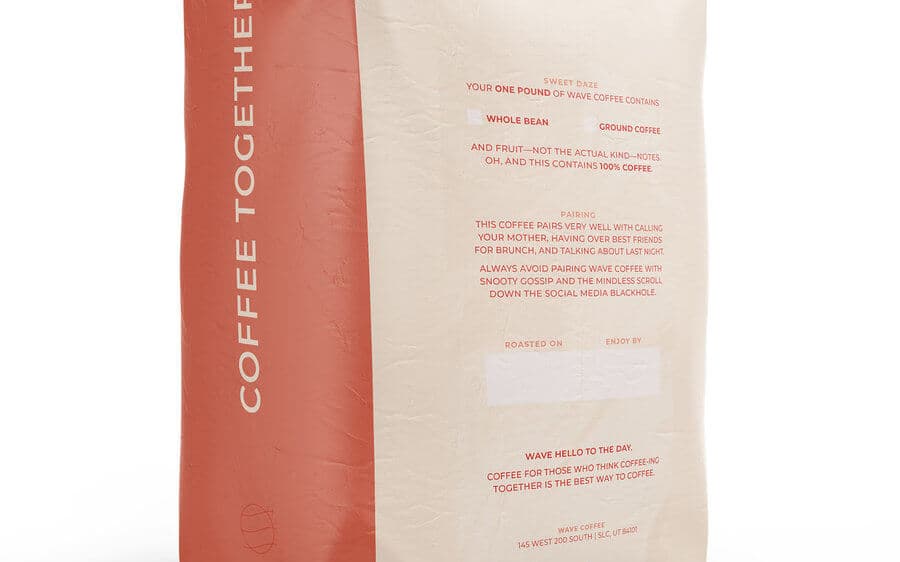
The next element they designed was the coffee packaging, they took green and red colors as a reference. They were inspired by the two flavors that Wave Coffee offers: Sweet Daze and Smooth Talk.
Red is for flavor Sweet daze, which is a mixture of fruits. The green color is for Smooth Talk, which is a mixture of chocolate.
To be honest the design of the packaging is nothing special, in fact the product would go unnoticed on the supermarket shelves. The reason for this article is the logo design.
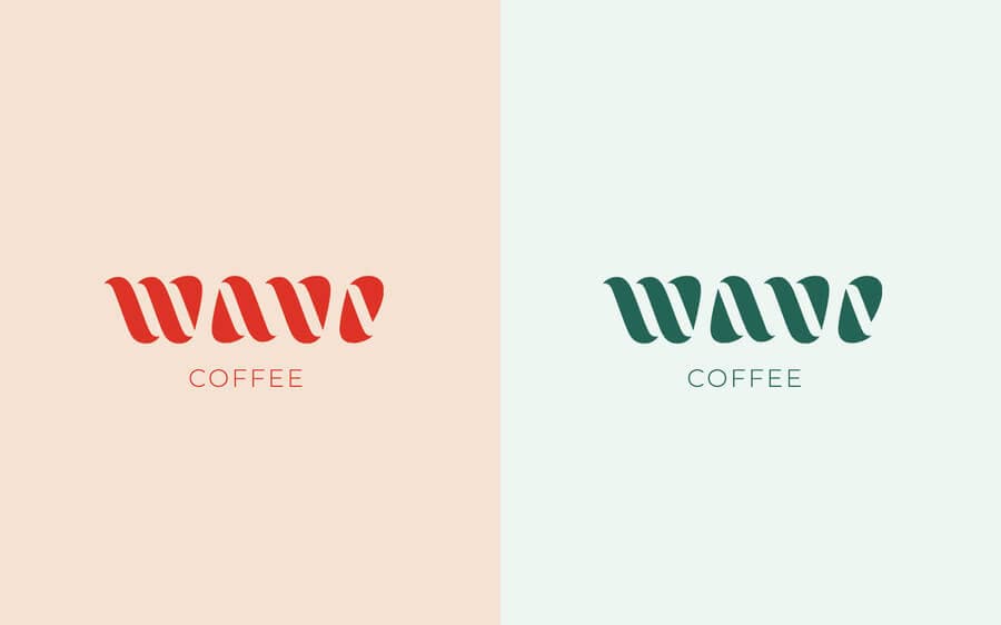
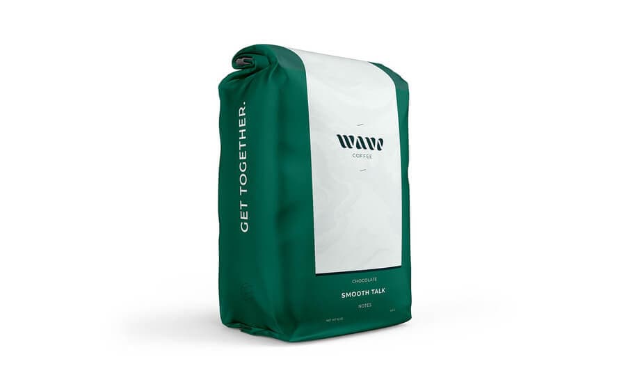
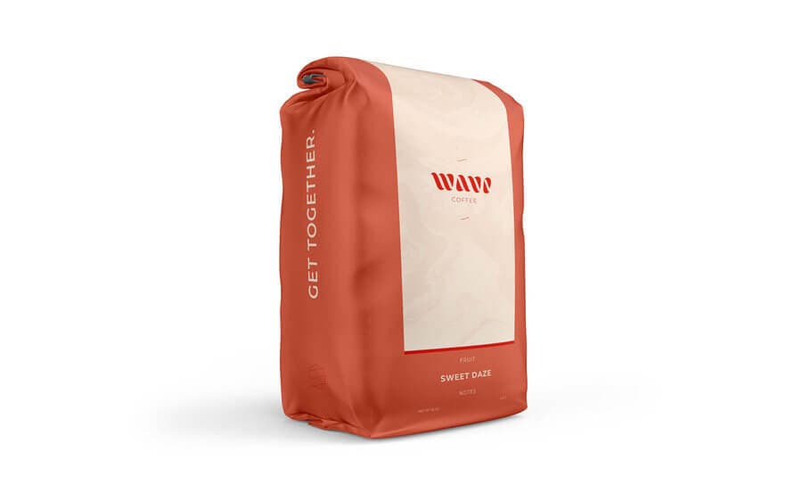
Design of a logo for a coffee brand
This Wave Coffee logo seems to me to be one of the best logos I’ve seen so far this year. They are one of those logos that look good, but if you pay a little attention, you discover that there are letters that form a word.
The first time I saw the Wave Coffee logo, I thought it was something that was rolled up in a tube. The interesting visual effect is something that all designers look for when we design a logo.
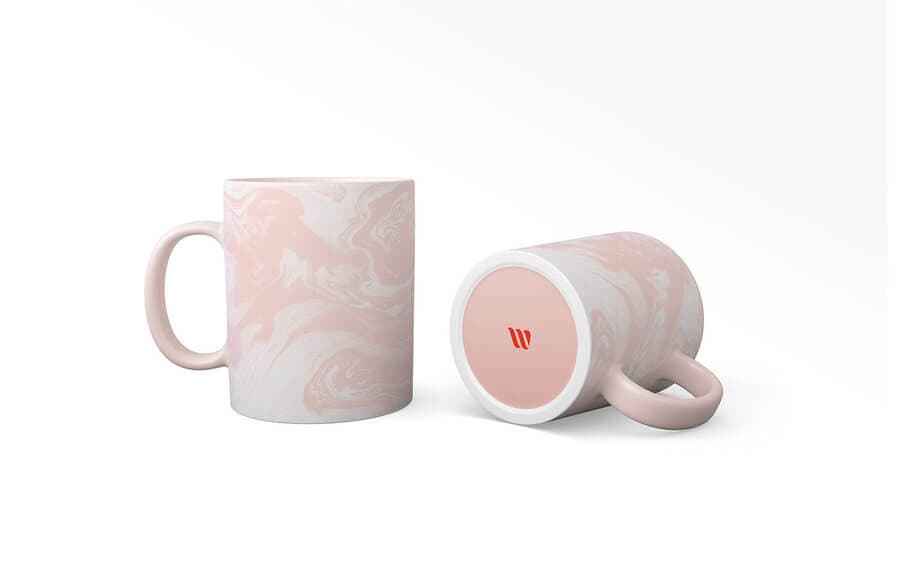
Another great thing is that the logo can be used in different advertising items and it does not look like you are advertising the brand. For example, shirts printed with the Wave Coffee logo would look very stylish.
By the way, the design studio in charge of making the new Wave Coffe logo is modern8. Enter their portfolio because there are very good works, almost as creative as the design they did for the coffee brand.
What do you think of this logo, did you also like it or was I the only one?


