home
>
Blog
>
Design
>
What is the best font for a resume? Bring your resume to life
What is the best kind …
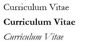
Surely more than once you have asked yourself: “What is the best font for a resume?” And there are so many!
This question has become very important in recent times, in which our resume (more than personal interviews) has become our main employment cover letter.
Join us and we will help you choose a font for your resume that will enhance your resume, and increase your chances of being considered when applying for a job.
Ready? Let us begin!
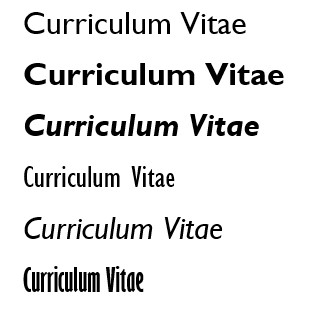
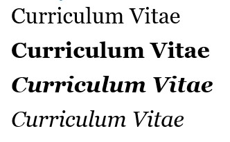
Best resume sources:
- Calibri
- Cambria
- Constantia
- Garamond
- Gill sans
- Georgia
- Helvetica
- Lato
- Arial
- Times New Roman
What type of font should a resume have?
There is a consideration that you must take into account before choosing which font to use in a resume, and that is the type of job you are applying to.

Although resumes, in general, should be formal, there are cases in which this rule becomes more flexible.
For example, a resume for a state administration payroll position will follow an absolutely rigid, which includes the font. To choose what type of font to use in a resume you must take this into account.
Conversely, an outside graphic design job may include the use of fonts. varied of designers as part of the applicant’s portfolio.
Now let’s look at some of the best resume lettering. Choose yours!

We start with one of the most used resume fonts, Calibri.
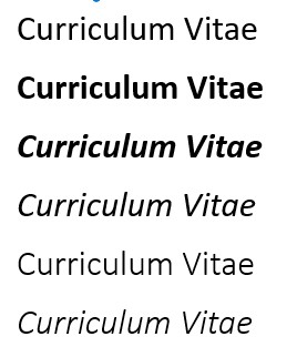
Calibri is the current default font for the word processor Microsoft Word, the most used in the world. If you have ever written any document, it is most likely that you have done it in this type of font.
What you may not know is that Calibri was created to replace Times New Roman as Word’s flagship font, to give it a “more modern” feel. It belongs to the font family ClearType Font Collection, which includes precisely the sources commissioned by Microsoft for its programs and operating systems.
That’s the main advantage of Calibri as a Word resume font: it looks mildly classic, but being non-serif and more rounded, it has a noticeable hint of fluidity and naturalness. If you are looking to give a more dynamic impression to your resume, Calibri may be a good option.
However, because it has been so widely used, your resume written in Calibri may not receive the attention you are looking for. That is why it is convenient vary use of this font for resume within your resume, using various sizes or combining it with other fonts.
Despite its vintage look and serif, Cambria is one of the most recent resume letters, since it was created in 2004 at the request of Microsoft. Its design is very similar to Times New Roman, but adapted to modern times.
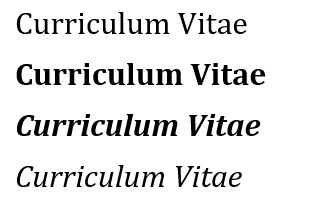
Cambria features a rare combination. Typically, serif fonts are intended for print formats, as they are easier to read on that medium; on the contrary, when they have to be read in digital format they present several difficulties.
Cambria solves this problem with its robust design, in such a way that it can be easily read in both print and digital formats. Its proportions and spacing make it comfortable to read, even if it is a resume with large blocks of text.
If your resume is detailed and requires concentrated reading, Cambria is the best typeface for your resume.
By the way, if you are interested in design and typography, check out this Crehana Typography Design Course.
Constantia is one of the most recent resume fonts on this list, having been created only in 2006 at the request of Microsoft. It belongs to the sources ClearType Font Collection.
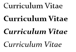
Constantia is classified as a source transitional, that is, it combines the characteristics of both serif and non-serif fonts. It has rounded shapes and is not as heavy to read as other serif fonts.
One of the advantages of Constantia is that, like the rest of the ClearType Fonts, it is designed to be easily read both on printed paper and digital screen.

If what you are looking for is to stand out with one of the best sources for CVs and, in addition, make it easier to read in any medium, Constantia is an excellent option.
Now we will talk about Garamond, one of the best fonts for resume that, at the same time, is one of the oldest.
Garamond’s origins date back to 15th century France, with the designer and engraver Claude garamond. Since then, multitudes of variations of the same font have sprung up, both free and paid.
With Garamond, your resume will transmit safety and refinement. It’s the type of resume font you choose to give your resume a formal air, but at the same time, give it distinction.
Another advantage of Garamond is that it is easy to reduce its size while maintaining its readability.
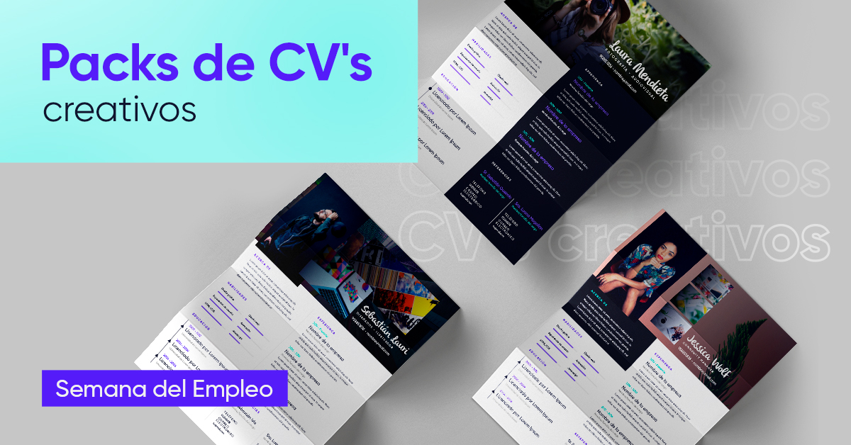
Ready to put together your resume? Download our creative resume pack!
To combine classic and modern on your resume, choose one of the best resume letters, Gill sans.
Gill Sans was created in the United Kingdom in the 1920s, and has been used in that country for various applications until now.
Like other sans-serif fonts, Gill Sans lets you give your resume a look fluid and modern. In addition, since it does not stand out much as a whole, this font for resume will make it possible for you to stand out for your contents in front of your potential employer.

You may also find this font as Gill Sans MT.
If you are looking to distance yourself from the older types of resume fonts, but retain all their formality, Georgia It is a good choice.
Georgia was created in the 1990s, when Microsoft was looking for new types of fonts to use on low-resolution monitors. Its creators then decided to modernize the style of the old Times New Roman in order to make it readable on electronic devices.
That is why, even today, many resumes use Georgia to be read in print or digital.
Georgia is an ideal letter for a resume as it has a large ease of reading. To give your resume formality and distinction, use this type of font and your resume will stand out.
Helvetica It is one of the best letters for a resume. In fact, it is one of the best fonts created in history, no more, no less.
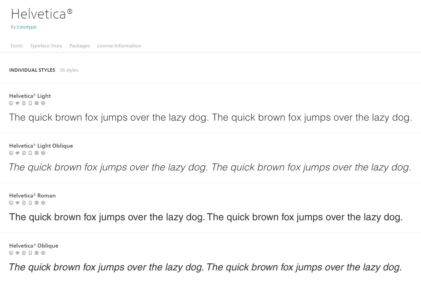
Created in the 1950s by the Swiss Max Miedinger, the Helvetica font has carried its minimalism and its clean lines in many areas, from the logos of companies such as Microsoft, Jeep or Nestlé, to the simplest curriculum vitae.
What Makes Helvetica Great Resume Letter? Its contemporary look with clean, defined lines conveys a sense of experience and formality.
On the other hand, its neutral aspect will help to focus the attention of your potential employer on the content of your resume before in the visual.
If you want to add variety to your resume, there are many Helvetica variants (Light, Rounded, Neue) for you to use in your titles, subtitles, and sections.
A small disadvantage of Helvetica is that it is a source of payment. Apple Mac devices include it, but if you want to use it in Word (for example) you will have to pay an additional cost.
With this cover letter template your next job will be closer. Download it!
Lato is the most recent font on our list, having been released in 2015. It is currently under the cover of Google Fonts.
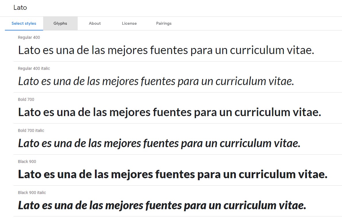
The history of this resume typeface is very interesting, since its designer first created it for a corporate client, but when the project was shelved, he decided to publish it on his own, until he became one of the sources most used in Google word processors.
Due to its corporate origin, Lato is a typeface formal, but not exclusive, which makes it a perfect choice for your resume. However, you should keep in mind that it does not support small sizes so well.

One of the great advantages of this typeface for resume is that, unlike Helvetica, it is totally free.
We leave almost for the end one of the most common CV letters, Arial.
Arial was created in 1982 with the aim of functioning as a generic sans-serif font. It was also intended to become a free version of Helvetica, which at the time was an additional cost typeface.
His character generic It is one of the advantages of Arial: this CV letter can be used in a wide variety of documents without any problem.
Despite being so common, Arial is still used in many resumes. Why? Because it’s a typeface simple, neat and unpretentious, but formal at once.
Furthermore, Arial’s lack of serif has the great advantage of making it ideal for reading in digital formatssuch as a smartphone screen or computer monitor. In this age when resumes are all digital, Arial becomes a classic resume font that you should pay attention to.
By the way, if you are wondering how to make a resume for the first time and what letter to use, let me tell you that Arial is a good option to make yourself known in the world of work.
Finally, we will mention the most well-known and common typeface for curriculum of all, the classic Times New Roman.
Reviewing its history a bit, we will find that Times New Roman was conceived from the beginning as a formal source for the print reading. After becoming well-known in print, Times New Roman spread around the world by being included as the default font for older versions of Microsoft Word.

Times New Roman has the same problem as Arial or Calibri: it has been so used, that it can take away all the attention that your resume deserves. At the same time, this does not erase any of its other advantages: it is a formal serif resume typeface. easy reading.
In addition, some institutions (mainly certain state bodies) they demand the use of Times New Roman to submit resumes.

We hope this little review helps you understand that choosing a good font for a resume is just as important as learning how to write a CV.
Remember that your resume is your cover letter, and choosing the best source for your resume will give you a better chance of being taken into consideration. Go ahead in your job search, and luck!