
For just over 30 years Sean Collins He is the designer who has made each of the patches that NASA has used in all missions.
The objective of designing patches for each mission carried out by NASA is to give meaning and symbols to the objectives and goals of each mission.
It is very likely that you have already seen one of those patches, because it is the first thing that is published when a new mission is announced. In addition to the details of the mission, as well as the names of the astronauts that will be part.
But what Last published is the name of the person who was in charge of the patch design. In fact I thought that work was done by independent designers, through public tenders.
Thanks to the NASA podcast called “Houston, We Have a Podcast,” which was dedicated to patch design, I learned about the work of graphic designer Sean Collins at the National Aeronautics and Space Administration.
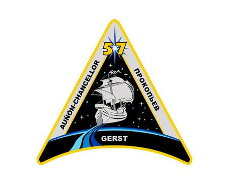
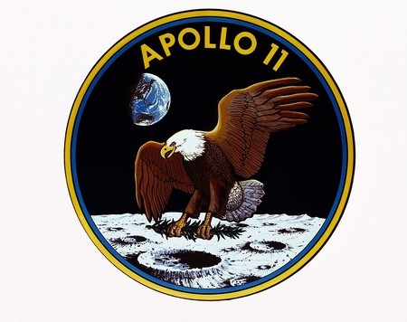
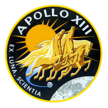

The designer of the NASA mission patches
In the podcast Sean Collins talks about how he came to NASA and began designing patches. It also says what rules you must respect when making a design for a mission. For example do not modify or play with NASA logos and institutional colors.
Sean also talks about sad moments in his career such as when he designed the patch for mission 51-L. Because to get inspired and get ideas, you must talk and get to know each of the astronauts a little. The sad thing about that mission is that all the astronauts died, because the space shuttle exploded a few seconds after takeoff..
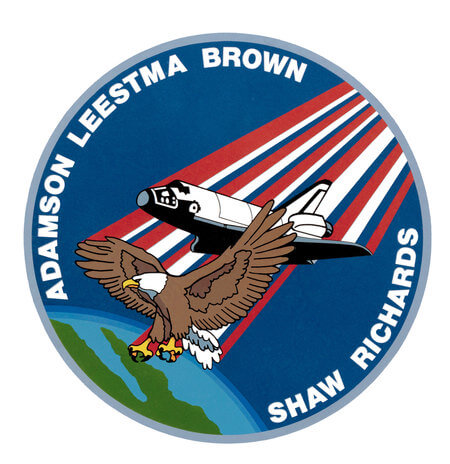
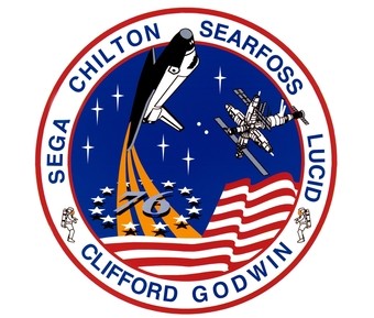
To make the design of a patch from start to finish, before the arrival of computers, it takes Sean Collins to 200 to 300 hours of work. Because I had to make all the elements of the patch by hand.
He used airbrushes to apply the color to his designs. Then I had to introduce them to the mission managers, if they proposed to make changes such as colors or graphics, Sean had to start doing the job from the beginning.
Now Sean builds the patches design in Adobe Illustrator, that makes take less work hours and make changes to the design, in a matter of seconds.
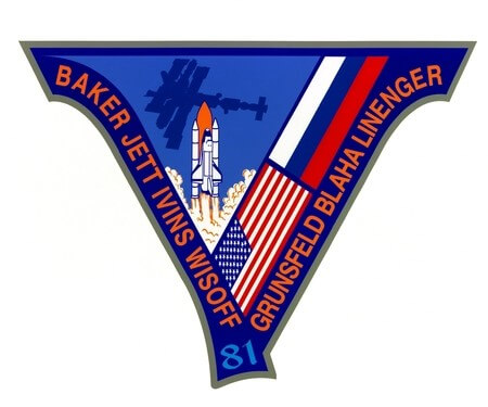

You can listen to the podcast or you can read the transcript of the interview from the NASA website. I recommend the latter, because while you are reading the process of designing a particular patch, you have the opportunity to see an image of the final design, with the patch that was used in the mission.
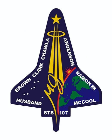
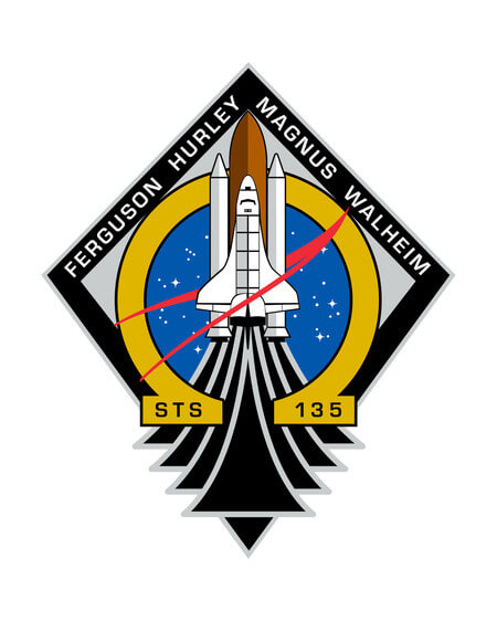
Now the design of the patches are not the best in the world. There are elements and objects of many types in each patch, some are very strange. You do not explain how they can fit into the theme of space.
As for example there are patches that have eagles that are flying in space. There is a patch where a ship that is navigating between constellations appears, other patches have horses, and so on.
In addition to the use of typographies with the names of missions or astronauts. Which are usually placed around the patches, but use all kinds of typographic families.
The interview is interesting, because it forces you to see all the elements you find in the patches. Things you didn’t pay attention to before, or that you didn’t know the meaning of colors or symbols.

