Graphic design has many similarities with the fashion world, the most significant being its evolution based on current trends. Yes, both fashion and graphic design are a reflection of society, of ways of understanding life and consumer habits. This is so, because its function, its ultimate goal, is to reach the public by appealing to their own customs and empathizing with it. This explains the fact that today it is not usual to wear designs similar to those of the eighteenth century or that the design of posters and advertisements not only focus on the message, but also on the form.
However, society is capricious and erratic, and what in the past was fashionable to later fall into oblivion, today can return as a trend. Here is a list of the five trends that they will dominate the field of graphic design for the next twelve months, and we already advance that some of us have already exploited them for years.
Table of Contents
Trends in graphic design
1.- The 80s and the neon colors return
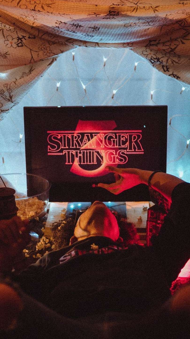
The decade of the 80’s has a very characteristic aesthetic: it was the years of XXL size complements, cardings, lycra and striking colors in the so-called neon effect. Greens, oranges, yellows, violets or bright reds that managed to blind anyone from several meters away.
A couple of years ago there was a revival of these colors, but it seems that it will be in 2020 when they disembark in the world of graphic design to stay. Logos and ads will feature these tones, usually on dark backgrounds for enhance visual impact of the message, taking advantage of a sharp lines typography. The head of the popular Strangers Things series is a good example of how this trend will adapt today.

2.- Letters, letters and more letters
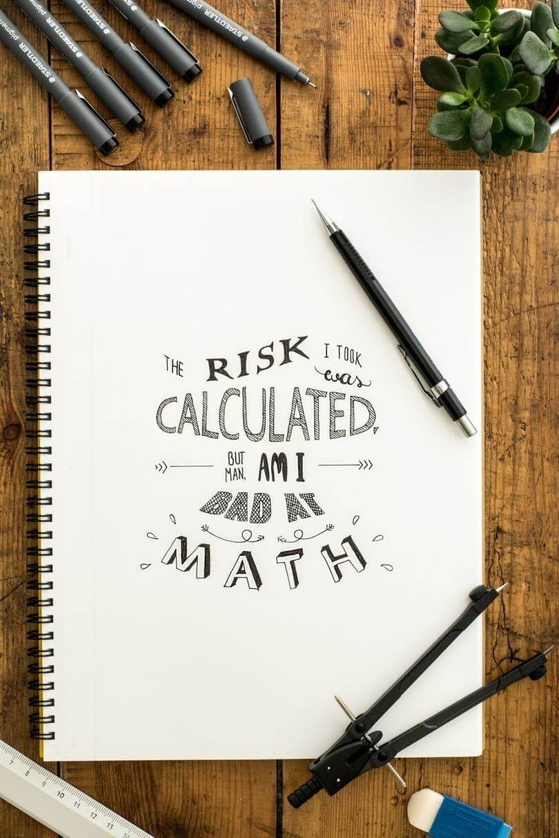
And speaking of typefaces, they are not surprised if most of the ads they see from now on combine different types of writing. The call hand lettering It is increasingly popular among citizens around the world, something that is not entirely strange if we take into account that many people relax this practice and that, in addition, they are achieved much more personal creations.
Graphic design has long realized the opportunity of this new trend, and it is quite common to see commercials, packagings, posters and even logos of new brands created under this concept of handwriting. Its main advantage over traditional fonts is that they allow a greater creativity to the designer, allowing combine elements of many artistic trends. This 2020 lettering will become even more important in the world of graphic design, a trend that already has its own names in the industry such as Álex Trochut or Jessica Hische.

3.- Futuristic aesthetics
Very related to the aforementioned neon colors, it is worth mentioning the return of another trend within the design that seems to have a circular life cycle. Futuristic aesthetics will once again become important during this year, with bright and vibrant color schemes that not only attract the attention of users, but also invite move to a parallel reality. A good example of this type of aesthetic can be found in the advertising of PokerStars VR, the virtual reality game of this well-known poker room that uses bright screens and neon colors to draw attention to a product that promises to move to Player to a unique experience. Other examples can be found in classic formulas such as Coca-Cola, which is not the first time he uses these colors in his commercials to highlight his logo, or in sports brands such as Adidas, which has transferred the striking colors of his shoes to Some of his spots.
4.- Geometric shapes
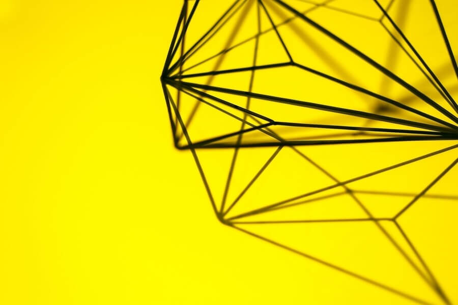
Another trend that returns. During the 1960s, geometric motifs were especially used in the field of graphic design, especially using bright and cheerful colors. Although this 2020 geometry is again present in any design studio, it does so in an updated way. The lines are now thinner, the shapes more polished and the motifs less ornate. It seeks to enhance sobriety through clean and simple strokes, maximizing the expression of less, is more.

5.- 3D objects
We could not finish this article without mentioning one of the tools that is becoming increasingly important in graphic design: three-dimensionality.
Although the creation of 3D objects has always been present when designing and shaping any figure, the truth is that in recent years it has managed to take a step forward and break into the sector with great force. The great reception that this technique is having is due to its versatility since allows the interaction of aspects such as depth, light or textures with basic elements such as shapes or colors. The technological advances that occur in the field of software will be key to the success of this new trend.
Which one do you keep? Do you think you should add any more trends? Leave your ideas in the comments.


