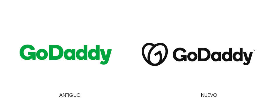
The company GoDaddy presented a great redesign of its logo. It is the first major company that changes its logo, in the few days of the year.
Only a few months ago GoDaddy had changed its logo, they changed the name of the company using a new typeface family. The most important feature was the use of an arrow in the letter «G»From GoDaddy.
Now the change in the logo is in the Isotype. It is a complicated thing to appreciate with the naked eye and without the help of someone who explains it to you. It is assumed that the isotype is composed of a letter «G»And a letter«OR». Together they form the figure of what appears to be a heart.
This is where everything gets complicated, because GoDaddy is a company that specializes in registering domains and hosting web pages. The heart of the isotype does not reflect the turn of the company.


Table of Contents
New Year and GoDaddy releases logo
The GoDaddy brand director, Cameron scott, justify the new logo design as follows:
It represents the entrepreneurial spirit, all our clients have an idea and everyone has an initiative. The company wants to convey that: we are here with you for your first step, and we support you all the way.
Seeing the new logo (I tried to forget the turn of the company), what it reminds me of is a logo of a dating page or something similar.
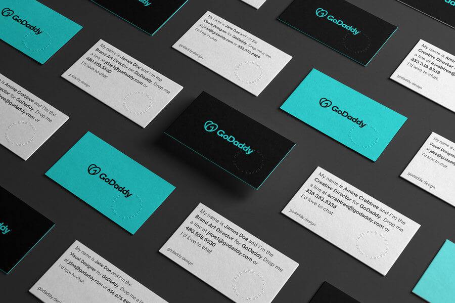
GoDaddy will use the «heart” or the “Go»In their advertising campaigns. For the company, Go means: a symbol of empowerment that encourages them to stand.
The GO was created as a visual representation of the space where three ideas meet:
Entrepreneurial spirit
We create the descending arches of the GO to represent the indomitable spirit of everyday entrepreneurs.
Joy
Joy is a corollary of love that drives entrepreneurs to make their own way. The heart shape of the GO is a nod to this feeling, while its bold lines radiate the same joy that entrepreneurs experience everywhere.
Humanity
Entrepreneurship must be accessible to all, that is why we incorporate humanity in our digital tools for the benefit of all.
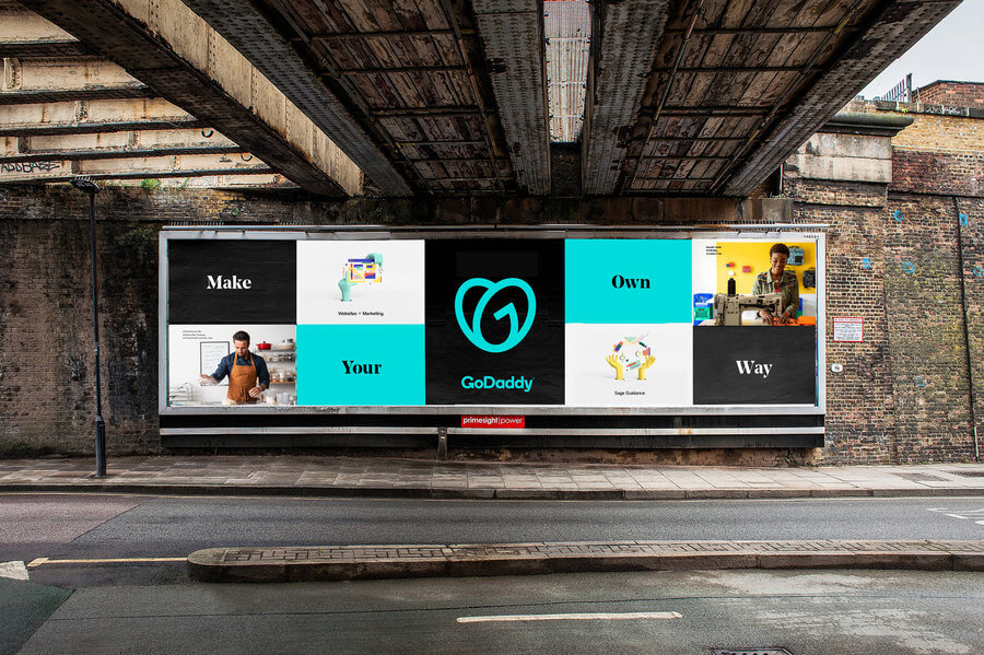

It is certainly a rare design that will not be liked by everyone, but I guess we will get used to seeing that new logo. These large companies have the economic power to advertise everywhere. By seeing the logo a large number of times on the internet or in television commercials, you end up liking or dislike the new logo less.
What do you think of the new logo, did you like it? Do you think it’s an appropriate design for a company with that business turn?
From now on we are aiming to compete for the worst logos of the year?


