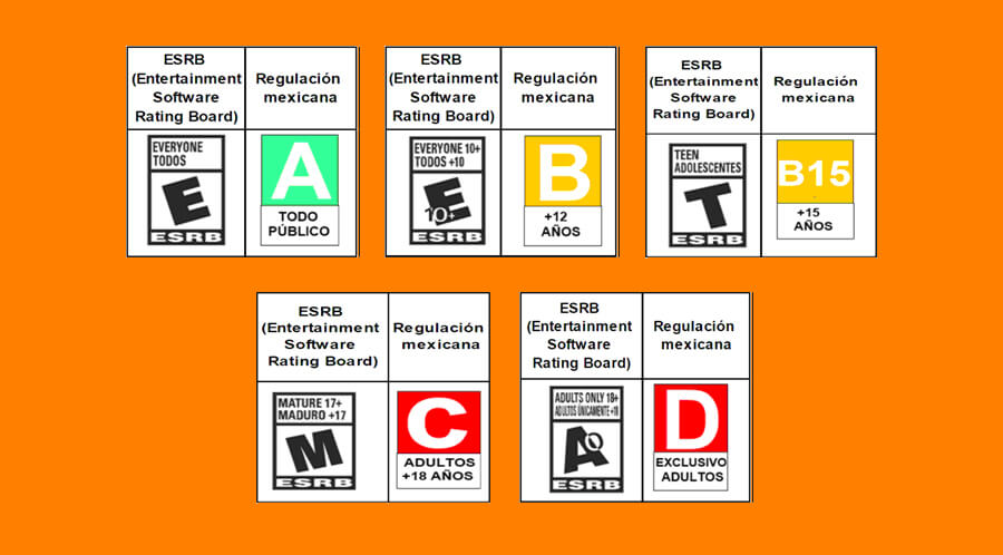
On November 27, the Official Gazette of the Federation published the General guidelines of the Mexican system of video game content classification equivalences.
Among all the points that are listed in said document, the graphic specifications of the design of the different labels stand out. That is to say; the characteristics of the labels that physical boxes of video games must carry by obligation are marketed in Mexico.
These new labels have various design issues, but I’ll talk about that later.
If you want to download the design in vector format, just click on this link. It is a PDF file with all the labels with the size and color variants.
From what I have read on social networks and specialized video game pages, the design of the labels is inspired by the labels of video games sold in Europe.
These new labels do not have a good design, it is a very basic job and with many problems. But comparing the design of the labels in the United States, the new design for the labels in Mexico is clearer and simpler that makes it easier to understand the different classifications of video games.

Table of Contents
Problems in the new design of video game rating labels
When I was preparing the file to make the labels in vectors, I ran into several problems in the design. All these problems They are because of the few technical restrictions, which are in the document published in the Official Gazette of the Nation.
They tell you to use the Arial font, for the texts on the labels, but the proportions do not restrict you. That is, they do not put exact margins, so that the letter is centered. Or so that the texts are justified and therefore the design has some harmony. They give you percentages and freedom for each one to make the label they want with the dimensions that best suit them.
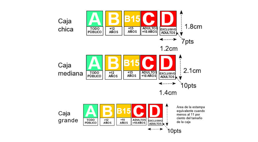
The first problem I noticed was in the label design D. The text “EXCLUSIVE ADULTS” in the document asks you to be a 7pt letter. But when I chose that font size, the word falls out of the rectangle, which is made with the official measurements.
I had to reduce the size of the text, so that it would fit into the white rectangle.
There are other details in the design of the other labels, such as the wrong centering of the words. As for example the labels with the words: “+15 years” and “+12 years” they are not centered on the rectangles that affects, -as I said before-, the harmony in the design.
The same with the letters, if they had posted the exact margins, left, right at the top and at the bottom, all the texts would be perfectly centered.
Another important point is color contrast, which does not exist on light-colored labels. The letter “A” should be black or dark, so that it stands out from the pale background color.
All those details in the design of these new labels could be fixed immediately with the help of a graphic designer. Any designer would have done the work of creating the exact measurements for each of the graphic elements on the different labels.
This is the most relevant information of the mandatory design for the new labels:

The video game content Classification is categorized as follows:
Classification “A”. Content for all audiences.
Classification “B”. Content for teens from 12 years old.
Classification “B15”. Content for ages 15 and over.
Classification “C”. Content not suitable for persons under 18 years of age.
Classification “D”. Extreme and adult content.
The stamp with the Classification will be printed or with a label attached to the front cover of the product, in three sizes: small, medium and large.
The application will contain on the left side, the Classification icon within a circle or rectangle. Below is the warning to alert the consumer about the Rating of the video game.
The typeface to be used on the labels is Arial and the font size for the Classification and warning must be proportional to the Classification stamp, and cannot be less than 7 points for the petty box and 10 points for the medium box.

Stamp measurements on the reverse cover
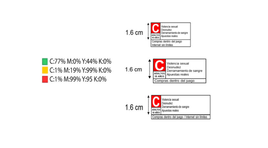
Sorting stamp size Petty Cash: up to 76.2 cm2. Not less than 1.6 cm high and the width necessary to include each content descriptor on a separate line with Arial font of at least 7 points.
Medium Box: more than 76.2 cm2 and up to 106.68 cm2. Not less than 1.6 cm high and the width necessary to include each content descriptor on a separate line with Arial font of at least 7 points
Big box: greater than 106.68 cm2. Not less than 8 percent of the height of the box
The typeface to be used for the Classification letter is Arial and the size of the letter may not be less than 10 points, but the size of this letter and the icon may be larger to be proportional to the size of the box.
Tags can have different descriptors in their design, these are all the existing ones:
· Blood animation.
· Real bets.
· Simulated bets.
· Sexual content.
· Strong sexual content.
· Bloodshed.
· Nudity.
· Partial nudity.
· Humor for adults.
· Vulgar humor.
· Language.
· Strong language.
· Song lyrics.
· Strong song lyrics.
· Reference to drugs.
· Reference to alcohol.
· Reference to tobacco.
· Blood.
· Violent references.
· Comical antics.
· Suggestive themes.
· Sexual themes.
· Use of alcohol.
· Drug’s use.
· Use of tobacco.
· Violence.
· Cartoon violence.
· Fantasy violence.
· Intense violence.
· Sexual violence.
If you want to find out in detail all the guidelines of the new labels that you will find in video games, I recommend that you go in and review the file that was published in the Official Gazette of the Nation.
In that document there are many terms that you will not understand unless you are a lawyer. If you like video games, I say that you have the ability to understand 85% of the terms you find in the document.


