home
>
Blog
>
Design
>
+10 fonts for infographics that no one can miss
+10 fonts for in …
Do you have to make a presentation and want to surprise? Just as important as choosing images is using the best fonts for infographics. This element ensures that your message reaches your audience clearly.
As we want your presentation to be the best and that everyone congratulates you, we have prepared this list with the +10 fonts for infographics that will give a cool look to your design.
Take note and take advantage of downloading these sources for infographics.
✅ If you already know the importance of using good typography, go to second point.
Table of Contents
Why is it important to use good typography for infographics?
The choice of the typeface for an infographic is important and you shouldn’t leave it as the last item. Why? Because the source is the one that transmits the message. It contains the element that will allow the understanding or reinforcement of what you want to communicate.
These are not simple symbols, they are figures that confirm or reinforce the intensity of the message. Let’s say, you can’t imagine the word Halloween with the Disney typeface, right? Therefore, choosing the sources of an infographic is of the utmost importance and vital for your presentation to be memorable. By the way, do you want to know the typeface for infographics that Barack Obama used in his presidential campaign in 2008?
List of the 10 best fonts for infographics 2021
- Streetwear Free Font
- Linear
- Fela Free Font
- Space grotesk
- Norwester Free Font
- Gentona Free Font
- Mr. Pixel
- Malina Script Font
- Gotham font
- Oswald
- Head
- Sansa kid
- Harabara Free Font
- Mooglonk Font

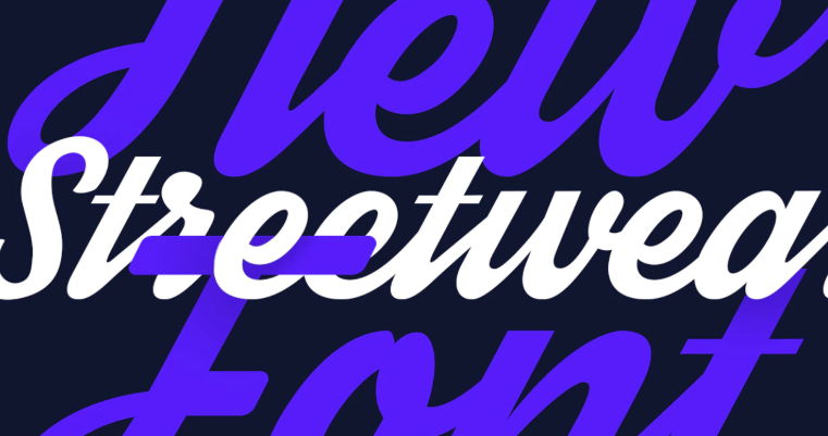
If your goal is to find sources for infographic titles, Streetwear is a good option. According to its creators, this typeface for infographics is inspirational “Bold and elegant retro.”
If you have to do one presentation that evokes the sixties or seventies, this typography for infographics is accurate.
Another suitable use that you can give to this typeface is in logos. His style and presence give a necessary strength and impact to a company name. So, Streetwear is much more than just a font for infographic titles.
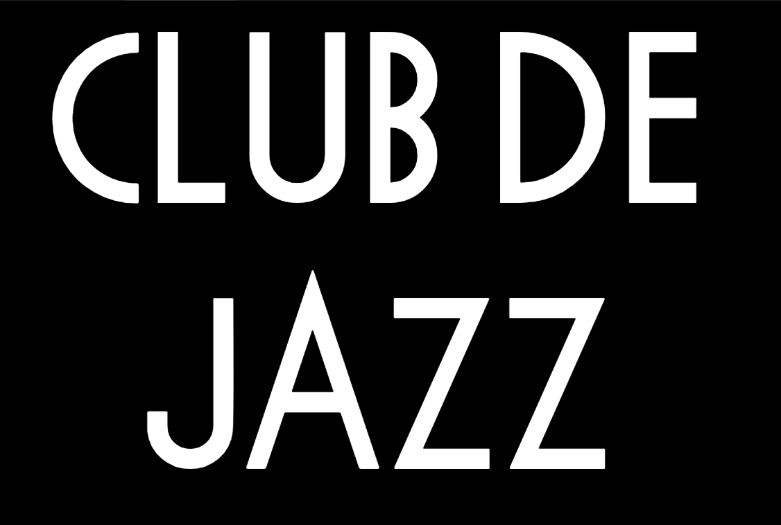
Linear is one of the best fonts for infographics due to the clarity of its design. The straight lines and striking thickness make Lineal can be used as a typeface for infographics.
According to information given by the designer of this typeface, Lineal It is inspired by the song “2870” by Gérard Manset. The creator of this recommended font for infographics is Frank Adebiaye and the style has a bit of geometric, sans serif and brutalist as described by Velvetyne.
This typography for infographics is a free and open source source, this means that you can modify and redistribute the font freely.
Source: Velvetyne
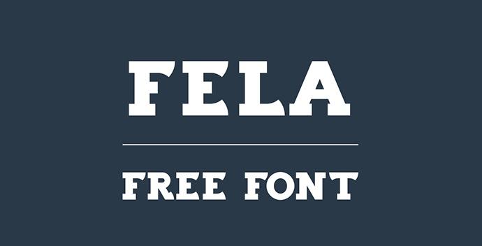
Do you want to use a bold font for your presentation? Fela free font is the typeface for an infographic that wants to attract attention. The thick lines ensure that the phrase written in this font will be the first to attract attention.
This typeface was designed by Laszlo Feja and is one of the best fonts for infographics. In addition, another additional advantage is that Fela free font has a free license, therefore you can use it on a personal and commercial level. Isn’t it fantastic?
Fela free font is one of the fonts that allows you to combine fonts without ruining the harmony, so use it in your designs as soon as you can.
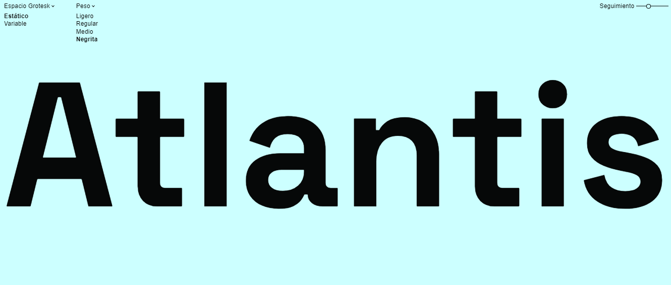
Space Grotesk by Florian Karsten is a spectacular infographic typeface. Designed with straight and firm lines, it is a suitable channel to give a clear message.
Space Grotesk is an open font made as a variant of the Space Mono sans serif typeface. Due to its perfect legibility, it is one of the recommended fonts for infographics.
Source: fonts.floriankarsten
A condensed, geometric-looking typeface, Norwester font was designed by Jamie Wilson and is definitely an infographic font. The reasons are many. This typeface has a uniform pattern that allows it to be read quickly.
Also, if you want fonts for infographic titles, you can count on Norwester because it will always get everyone’s attention and its download is free.

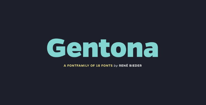
Typography for infographics designed by René Bieder, Gentona It has a curvy and strong style, so it will always be the main point of attention.
The purpose of the Gentona typeface is to pass almost as natural, is a typeface for neutral infographics. It is not distracting, confusing, and reads cleanly. Its Free Demo version is available in two categories: Gentona Extrabold and Gentona Extrabold italic.
Take advantage of these advantages and start using Gentona in the titles of your presentations.
An unusual typeface but one that is perfect as a font for an infographic. Mr. Pixel is that, a typeface that is styled like the pixel of a digital display. Its irregular strokes make Mr. Pixel a special typeface for infographics.
Everyone will say, “Hey, it looks like that free Google dinosaur game,” and the truth is that it does. The design exaggerates those minimal color squares on the screens, called pixels, and They make a typeface for infographics that will hardly go unnoticed.
Mr. Pixel was designed by Christophe Badani and clarifies that it is a typeface without curves. This type of font for infographics is free and open source. It means that you can use it in your personal or commercial designs.

Source: Velvetyne
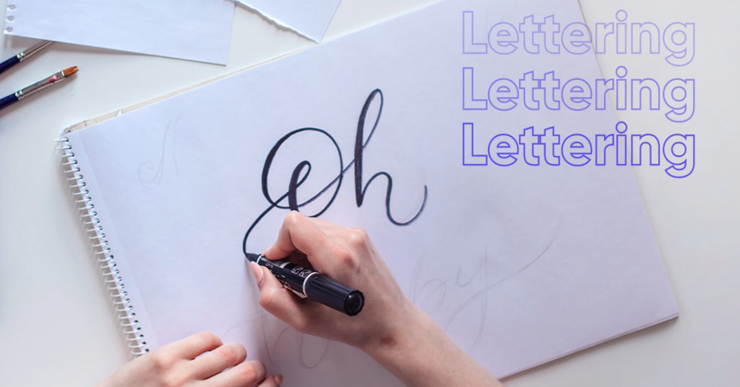
Would you like to learn to make lettering? Download this guide for free and learn from scratch
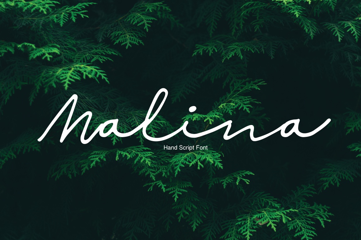
This typography for infographics will help you with secondary ideas. Malina Script is a font that accompanies the central ideas of the presentation in a versatile and pleasant way.
It is generally used for wedding invitations for its elegance and style. It is a typeface for freehand infographics. Its style is italic and it is pleasing to the eye.
It was designed by Paula Create and you can also use it in inspirational phrases. We leave you the demo of this source for infographics.
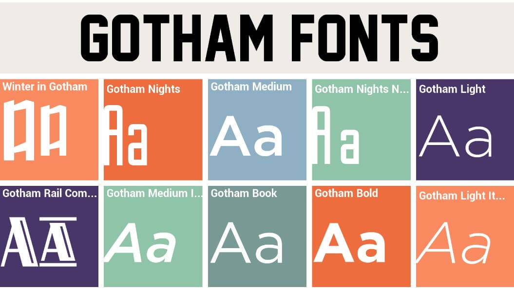
One of the most famous fonts for infographics, banners and newsletters. Gotham font was created by Tobias Frere-Jones in 2000. It was inspired by the architectural design of New York, where Frere-Jones paid attention to the letters on old buildings in Manhattan.
This type of font for infographics has four main characteristics: Linear, geometric, vernacular and North American. Some designers claim that Gotham font is a gringo typeface that reflects the US government.
Anyway, is one of the most popular sources for infographic titles.
Oswald is one of those sources that will always attract attention. It is one of the best fonts for infographics for its easy readability. There is no way of not understanding what is written with Oswald.
It has more than 10 variants and all are sources for an infographic for its clean and clear line for the eye.
Take advantage of Oswald because it is an open licensed source, so you can use it in your designs freely.

Head is an irregular font, perfect if you want to attract attention because of the strangeness of the letters. The special thing about La Cabeza is that, despite the strokes of different proportions, the typeface is recommended for infographics because it concentrates the attention of the eyes.
With letters that switch between thick and narrow, The Head in fact that will serve as the source for the title of your infographic, as long as it corresponds to the topic.
This font is available for personal use, so take advantage of downloading it and sharing your designs with friends and family. You will see how this font for infographics catches their attention.
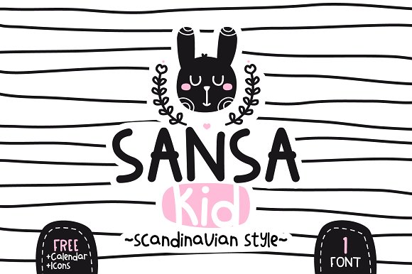
If you have to do child labor, Sansa Kid will help you a lot. This infographic typeface was designed with children in mind. If you are looking for curvy and fun strokes, Sansa Kid is what you are waiting for.
This typeface for infographics combines bold, curvy and a childlike spirit. Do you have to do a presentation for children? Without hesitation, choose this type of font for infographic and do a great job.
Source: uxfree
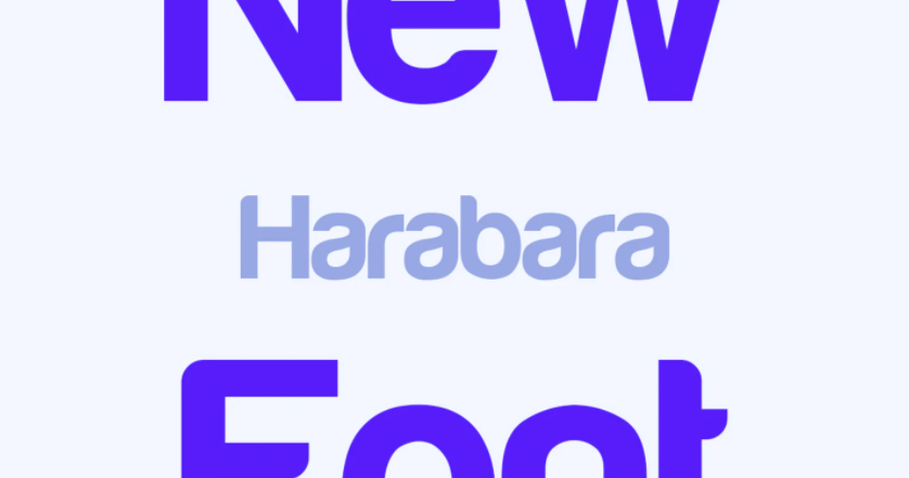
Harabara was designed by André Harabara and it does impress. Due to its clean strokes and thickness it is a font for infographic titles.
If your style is simple and direct, use this font in your presentation and everyone will be able to read your message. The font has a particular style. Between straight and curved lines that look elegant and modern, what is necessary for a typography for infographics.
We have the 2009 version for you and it is the one that is available for personal use.

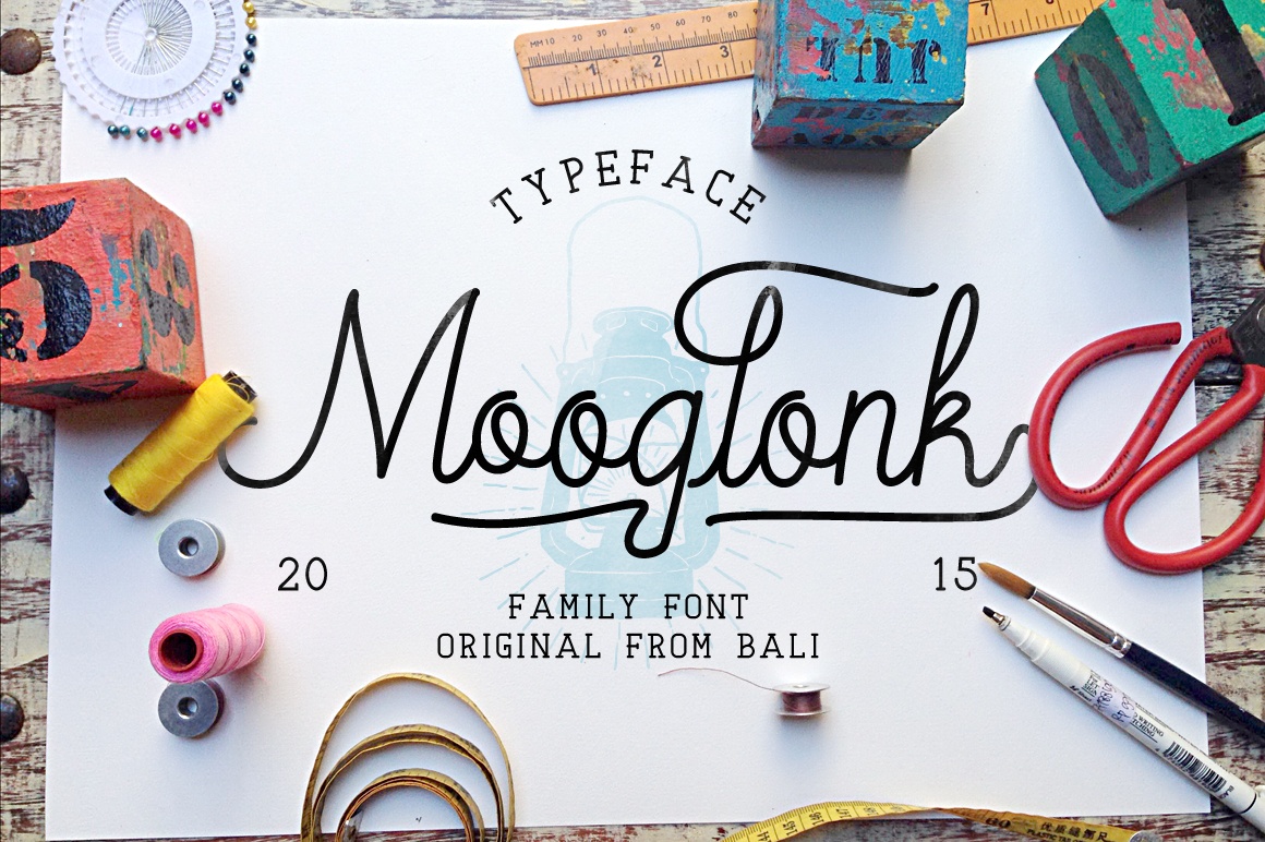
With a classic and elegant style, Mooglonk Font is an infographic typeface that looks a lot like handwriting. It was designed by Alit Suarnegara
A bit italic and with thin strokes. What is necessary to accompany the central ideas of your presentation. Mooglonk Font is that font for an infographic that will give your presentation a fresh look.
Due to its style, some also use it for wedding invitations or presentations, but you know, it’s also one of the best fonts for infographics. Here we leave you the demo version for you to download for free, free for personal and commercial use.
With this list of fonts for infographics titles now are you ready to make a super presentation and surprise everyone.
Remember, Going out of the ordinary is attracting attention and what better if you do it professionally. We assure you that with these fonts for infographics 2021 only you will have the last letters.
We read later. 😎


![🥇 The BEST fonts for infographics [2021]](https://graphichow.com/wp-content/uploads/2021/03/1615427738_The-BEST-fonts-for-infographics-2021-750x536.png)