home
>
Blog
>
Design
>
How to write nice? Learn to design your letters with lettering
How to write nice? …
If you spend it writing the lyrics of your favorite songs in your notebook or you would like to make beautiful titles in your bullet journaling, these 5 basic techniques to write beautiful they’re for you.
Lettering will allow you to create and design words from scratch adding your personal touch. It is not necessary to have good handwriting to write beautifully, the fundamental thing is to develop your style and practice a lot! ⭐
You will learn how to design letters in your notebook and become an artist by following these basic lettering techniques.
And if what you need is inspiration, with these 60 lettering fonts you can give life to your designs.
Index
- What is the difference between lettering and calligraphy?
- Types of lettering to learn how to write beautiful
- How to start writing nice?
- What do you need to write nice? Prepare your tools
- To write beautiful! Golden rules of lettering
- Lettering: 5 basic lettering techniques to write beautifully
- To write beautifully, sources of inspiration should not be missing
At first glance, lettering and calligraphy may seem the same, but they are not.
Calligraphy is known as “the art of beautiful writing” and consists of forming elegant and harmonious letters in a single stroke. For this, fine point and square point pens are used, keeping the same pattern throughout the writing.
For its part, lettering is the art of drawing letters instead of just writing themYou can touch them up, erase them, add layers and improve them as much as you think necessary to achieve the desired result.
If you want to know more about calligraphy, this initial guide can be useful.
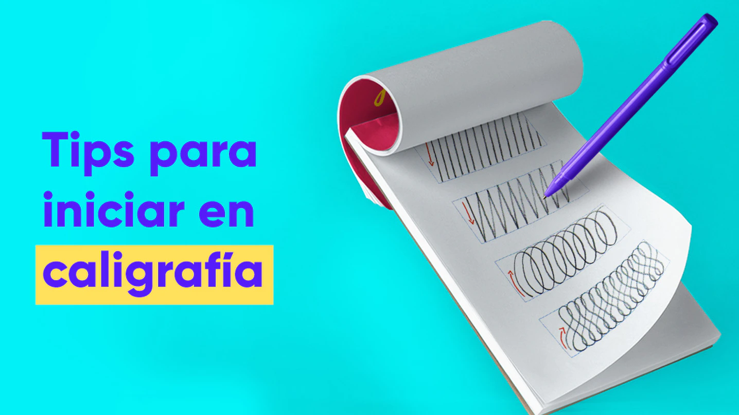
These are 3 types of lettering with which you can start to write beautiful letters by hand:
- Brush lettering: It is done mainly with brushes. Different types of brushes can be used to create effects and create contrast between strokes.
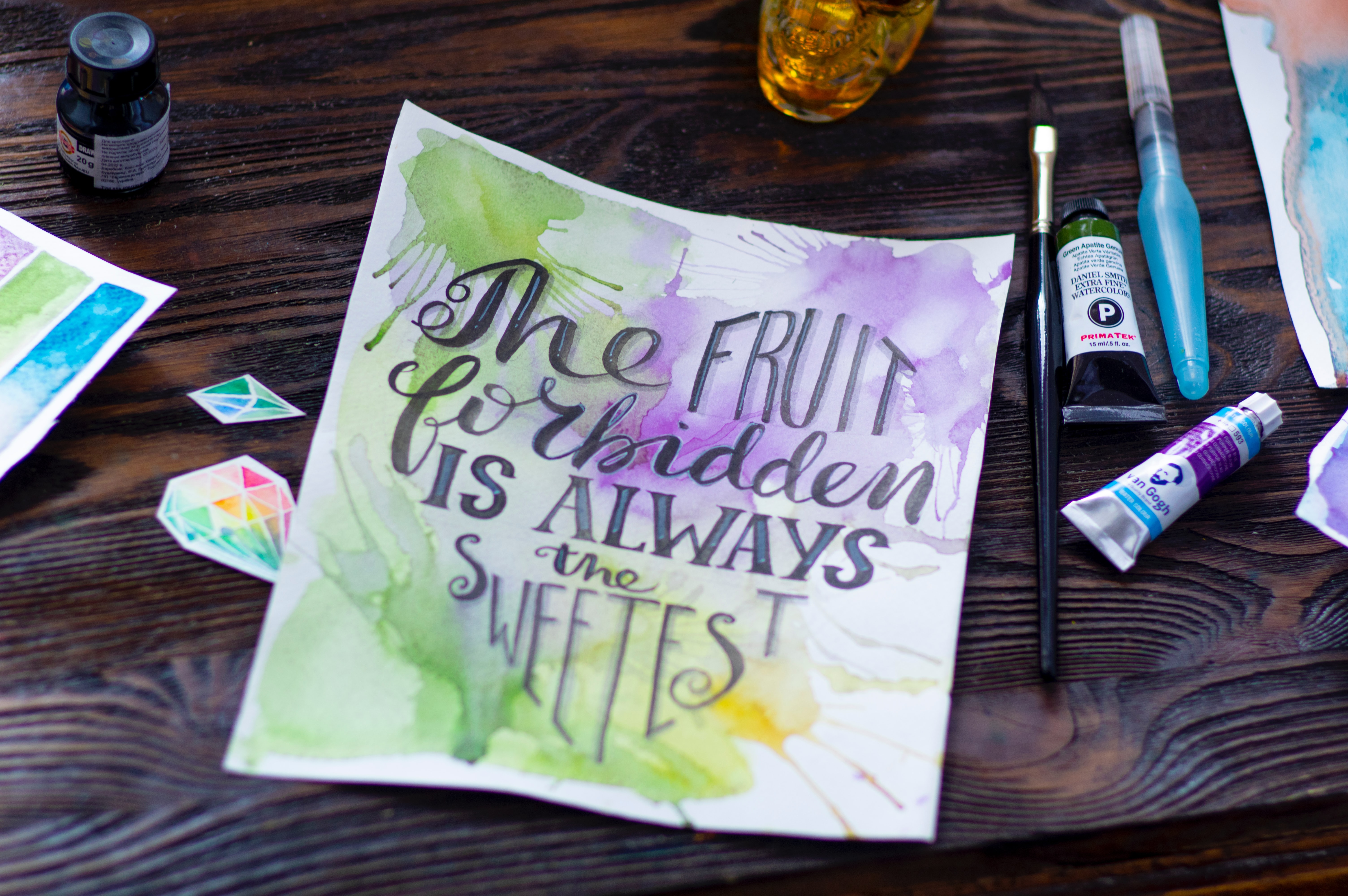
Source: Unplash
- Chalk lettering: It is the lettering that uses chalk as a material, it is usual for the surface to be a blackboard but other less conventional surfaces are also used. You can find it in trendy bars and restaurants.
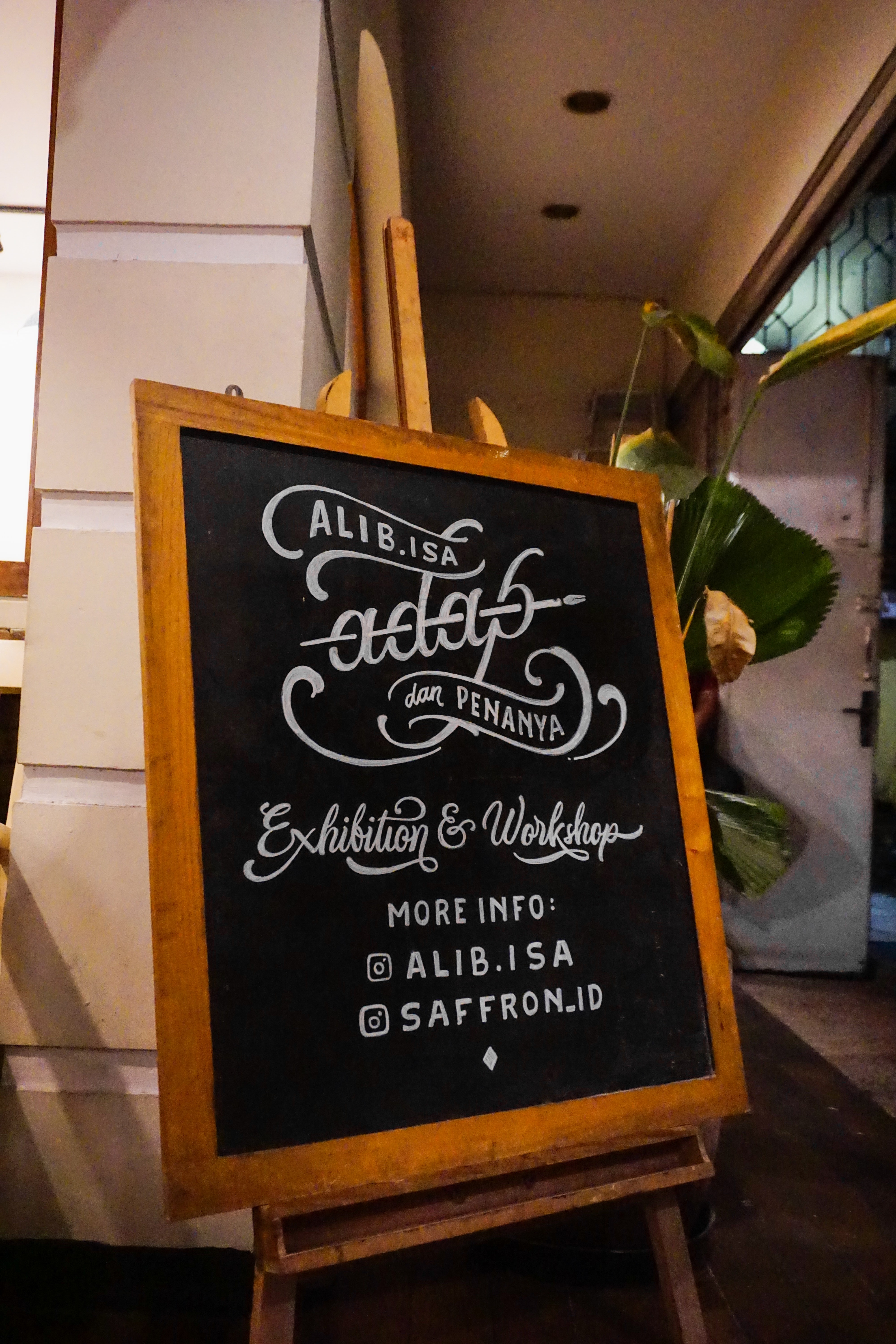
Source: Unplash - Hand lettering: In general, a pencil and pen are used, but other types of materials can be used. As its name indicates, it consists of drawing letters by hand, which is why it encompasses the other two types of lettering.
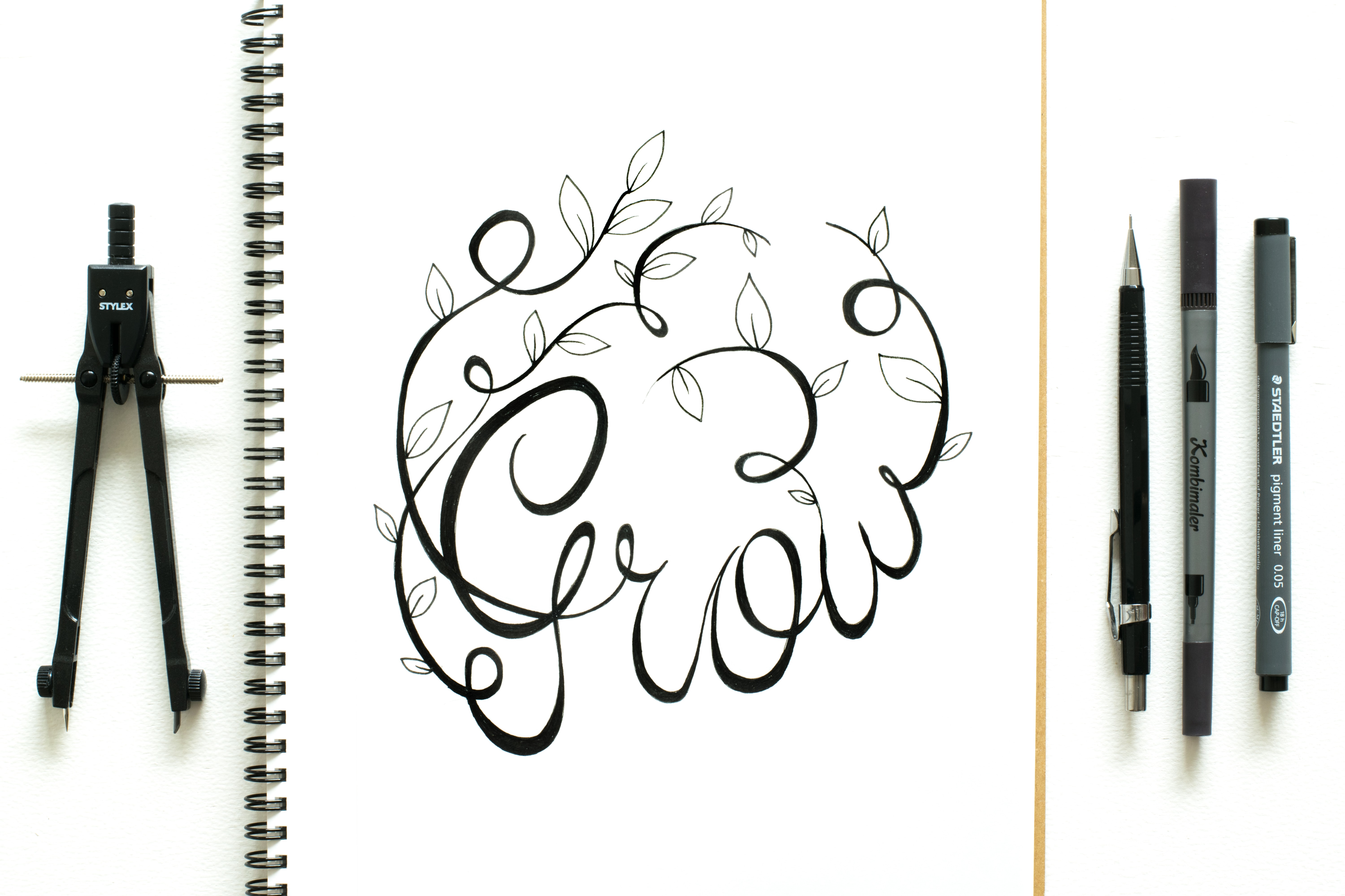
Source: Unplash
Now that we know what it is and we know the styles of lettering, let’s start designing beautiful letters! 🚀
To know how to make nice lettering step by step You can check the article make lettering from scratch.
The difference between a written text and a drawn text is that the latter is unrepeatable. There are as many styles of lettering as so many people dedicate themselves to this technique.
The key to lettering is that it reflects your personality and that is something that you will achieve by practicing and with a lot of dedication. When you manage to identify some shapes and details as your own, you will have achieved your characteristic style of recognizable and unique lettering.
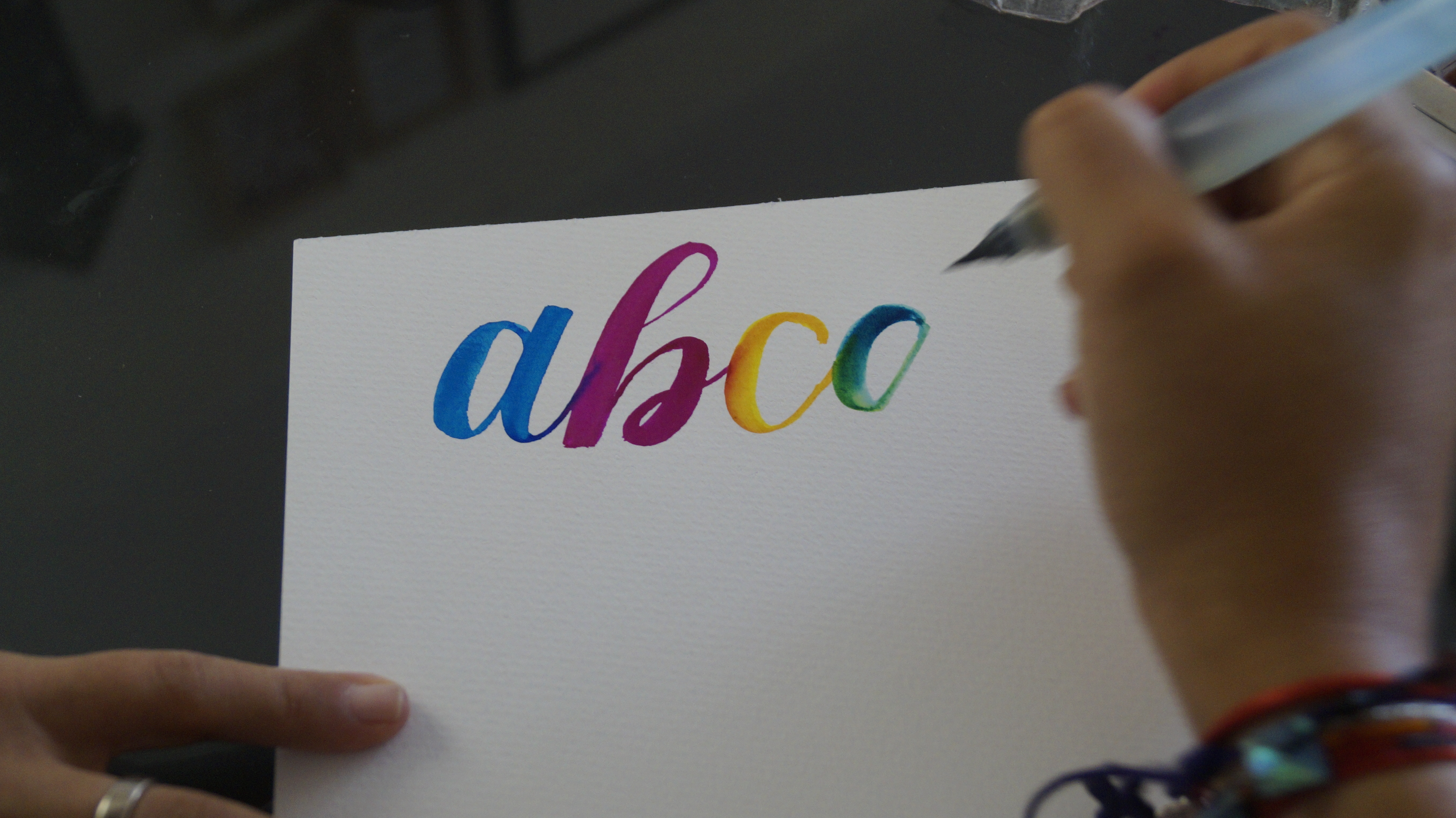
Source: Unplash
Developing your skills and writing beautifully with a pencil takes time, practice, and allowing yourself to make mistakes. Making a mistake when designing your letters can lead to a unique stroke or brush mark that inspires you.
For this, it is essential to have a practice notebook where you can create many versions of each phrase. Before you start writing pretty hand lettering, it is helpful to do warm-up exercises with some squiggles, straight lines, cursive letters, and various ornaments.
I know you’re thinking how to write nice with a marker but to start making lettering you don’t need many tools, fancy brushes or an iPad.
The only tools you will need to learn the art of drawing letters are in your home: pencil, paper, eraser and ruler.
When you have advanced with your sketches, you can invest in professional markers or pens in your favorite colors. It is advisable to start planning your projects in pencil and later start writing beautifully with a marker.
If your idea is to design letters in Illustrator or another digital medium, you will need a graphics tablet or an iPad Pro and Apple Pencil to draw.
Another possibility is to give your handcrafted lettering a digital finish using the tracing option or tracing it with the pen tool in Photoshop or Illustrator.

Ideally, start your first strokes taking into account the basics to make beautiful letters in your notebook:
✅ If you draw letters with a marker, you should hold it with your index finger and thumb and rest it on your middle finger. Use it at a 45 degree tilt.
✅ Practice the basic technique a lot: fine lines when going up and thick when going down.
✅ Identify where these lines go in each letter of the alphabet.
✅ Keep in mind that the horizontal strokes should also be fine and pay attention to the ligatures between the letters.
Lettering, like all art, has its basic techniques, which you should know as soon as you begin this path of designing words.
If you want to know how to make nice lettering step by step And in a simple way, look at these recommendations:
Table of Contents
Basic lettering technique # 1 perform a small warm-up
It is advisable to activate motor memory by writing the letters of the alphabet in italics until the pencil slides naturally. You can make very simple and impromptu sketches to start exercising.
Basic lettering technique # 2 think in strokes
Each letter is made up of basic strokes and the more you practice them the better you will understand their anatomy. Always pay attention to the direction of your stroke and the pressure you exert on the paper when you draw words.
Basic lettering technique # 3 go big
Outline the sketch of the drawing addressing the entire word or sentence instead of drawing letter by letter in detail. In this way, you define the overall composition of the design and once it is closed you can move on to the details.
The advantage of creating several quick sketches that include all the elements is that it gives you the possibility to choose what works best in your lettering.
Basic lettering technique # 4 learn to use the guides
To start drawing the letters we must be clear about the space they cover and consider the four lines:
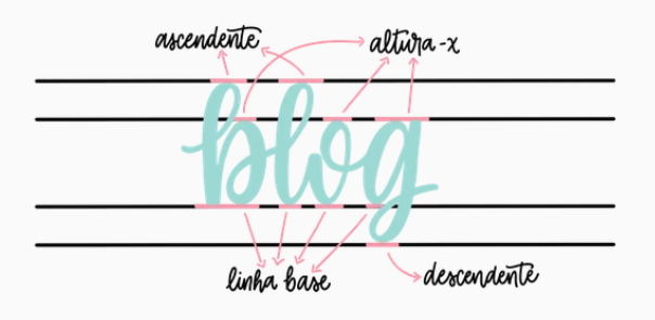
Source: letteringcreative
➤ The baseline: This is where the main body of the bottom of each lettering letter rests and allows them to remain straight.
➤ Height X: This is where the top of lowercase letters, such as “a,” “e,” and “o,” come up. They are located at the base and reach height X.
➤ The upline: It is where the upper part of the lettering letters that have strokes arrives. This includes the letters “k”, “h” and “t”.
➤ The downline: It is where the lower part of the lettering and their “tails” rest. This includes the letters “g”, “q” and “y”.
Luis Luli, Graphic Designer, teaches you how to easily make a lettering template to practice:
Basic lettering technique # 5 how to make letter shadows
Shadows make our lyrics come to life. Including them in the lettering makes it more attractive and realistic.
To make it easier, you should imagine that your letters are an object on a table and that next to that object there is a source of light. The first thing you should do is decide which side the light source comes from to draw the shadows of the letters on the opposite side.
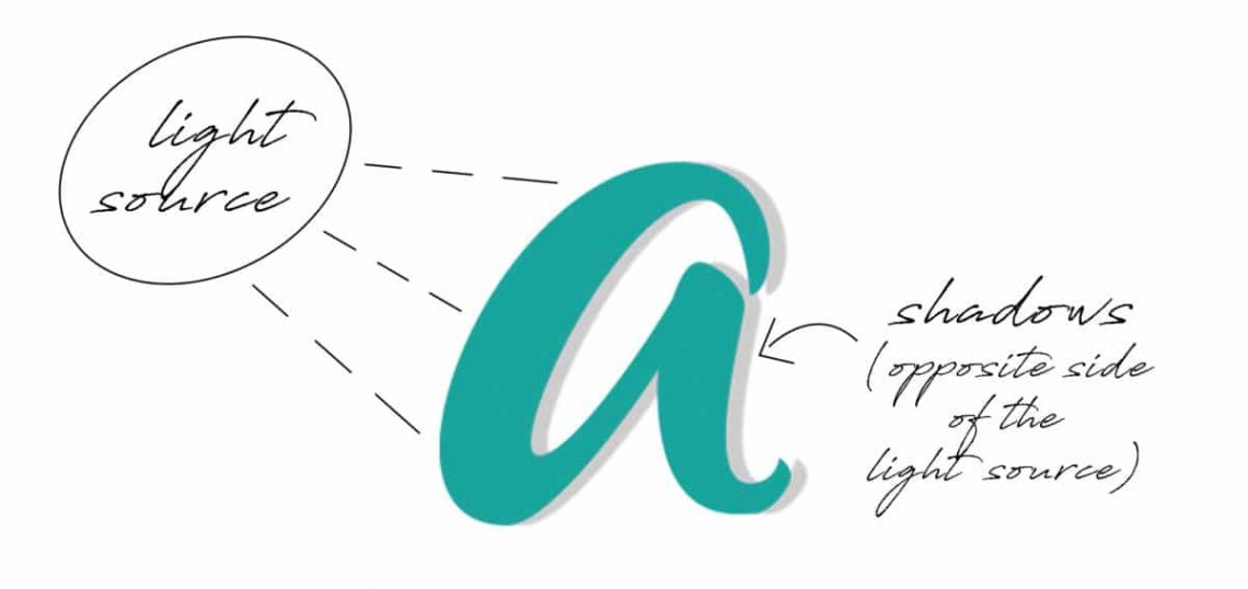
Source: lettering-daily
When the light source is on the left side, the shadows should appear to the right of the letters and vice versa.
You are already clear about the basic techniques that you must handle to start writing nice step by step.
Get down to work, grab a pen and paper, and start practicing alphabet lettering with these downloadable lettering templates.

We want you to know the Instagram accounts of these 4 lettering artists for you to choose your favorite.
When we start any artistic activity we first observe others, see what they do, what techniques and what colors they use can help you to fire your imagination when it comes to cultivating your own lettering style and launching yourself to draw your letters.

Source: homsweethom
4 lettering artists that you can’t miss:
- Laura Hom: graphic designer specialized in lettering. She uses very bright colors and constantly refers to her other passion: cooking.
- Ryan Hamrick: He has studied and worked in the art of letters for more than ten years. Lover of flourishes and details.
- Ken Barber: marker pen, type designer, author and instructor. He has been designing speed metal logos for over 25 years due to his obsession with the shape of letters.
- Joan Quirós: cartoonist and illustrator fond of the historical tradition of writing and lettering. Create a link between the past and the present of this technique with the addition of its contemporary perspective.
Hopefully these tips and recommendations will be useful to you to learn more and more about the wonderful technique of drawing words with lettering.
The key to getting into the world of lettering is Practice, practice and practice! 🥇


