home
>
Blog
>
Design
>
What is a color wheel and how it helps make your designs look more fantastic
What is a chromatic circle …
If you’ve ever wondered what a color wheel is and can’t find a clear answer, don’t worry, in this article we explain it point by point. You may have already heard this name when you first immersed yourself in the world of design, but it never hurts to refresh our knowledge.
Sometimes you don’t know which colors can go well with others? It is a problem that usually happens when we are making a post, retouching a photo or creating an advertising piece. Therefore, we will help you understand the function of a color wheel so that your designs are the best.
The importance of fully understanding how the color wheel is used is that you will be able to fight with arguments against the typical customer phrases “I like this color”, even though you know that it is not correct. Refuting with arguments is relevant to raising your professional status. 🤓
Index
- Let’s know the definition of the chromatic circle
- What is a color wheel for?
- Using the color wheel in graphic design: 5 perfect combinations
- How to use the color wheel in photography
The chromatic circle or color wheel is a graphic instrument represented in a roulette in which colors are organized and segmented based on their tone or hue. In summary, if they ask you what a color wheel means, you can answer that it is a tool that helps us visualize the combinations of colors. 🌈
In theory, it exposes the main colors that are reflected when light breaks down. Yes, those that come out of a prism or like the cover of the Pink Floyd album, “The Dark Side of the Moon.”
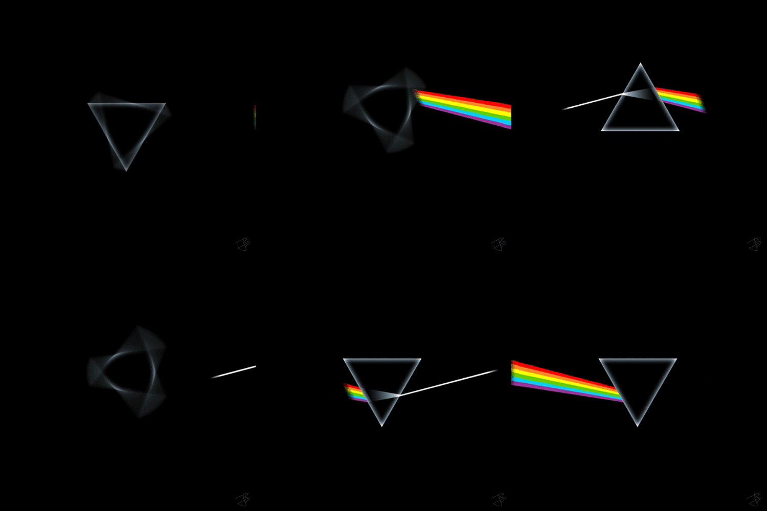
Source: Giphy
Mainly, a color wheel segments the following colors:
🟣 Purple
🔴 Red
🟡 Yellow
🟢 Green
🔵 Cyan blue
🔷 Dark blue
The colors of a color wheel can be classified by families, each having many varieties, of different intensity and hue. In fact, there are color circles that can be made up of 6, 12, 48 or more colors perfectly arranged in gradient.
There are also types of color wheel that are divided into two:
Table of Contents
Traditional color wheel
A traditional color wheel is also known as a RYB for Red, Yellow and Blue. This, because it is made up of the basic colors: red, yellow and blue; and for the secondary colors: orange, green and purple.
There are cases where a traditional model color wheel can combine the basic and secondary colors as follows.
🎨 Orange yellow
🎨 Orange red
🎨 Violet red
🎨 Violet blue
🎨 Greenish blue
🎨 Greenish yellow
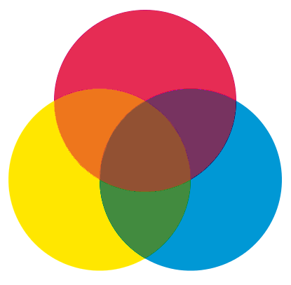
Source: Wikipedia
Natural color wheel
The natural chromatic circle is formed by the colors visible in the spectrum of light, a principle that derives from Newton’s studies and which were later deepened with the appearance of color photography. Have you ever wanted to know the differences of RGB and CMYK? Here you will find the answer.
The colors of a natural color wheel have two models:
Additive model
This model is popularly known as RGB for Red, Green and Blue, and is made up of the primary colors: red, green and blue; along with the secondary ones: cyan, magenta, yellow.
Here we can find the first steps to determine what combinations of a color wheel we can do correctly, since the first opposite colors come out.
For example, we can tell which colors are opposite and do not match:
❎ Yellow is opposed to blue.
❎ Magenta is opposed to green.
❎ Cyan is opposed to the color red
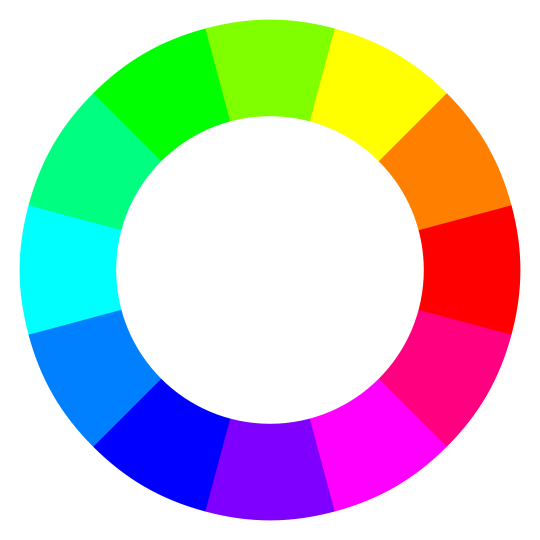
Source: Wikipedia
Subtractive model
Mostly known CMYK whose meaning comes from the English colors Cyan, Magenta, Yellow and Black.
It is made up of primary colors: cyan, magenta and yellow – if we mix them, the black color comes out – and the secondary colors: red, green and blue.
Here you can also see opposite colors of the chromatic circle:
⬅️ Red is opposed to cyan.
⬅️ Magenta is opposed to green.
⬅️ Blue is opposed to yellow.
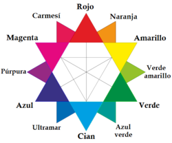
Source: Wikipedia
We can use a color wheel to find the correct combinations based on a very easy-to-use visual model. And, although it makes it easier for us to find the perfect combinations, it never hurts to learn about art and composition, so you will be able to make A-1 designs.
How a color wheel works is very easy to understand because it is based on the following points:
- Identify warm and cool colors. If we “go to the circle”, they are divided between warm colors (yellow, red, orange, among others) and cold colors (blue, purple, green, among others).
- Difference which colors can be combined and who cannot.
- Display the maximum saturation of colors.
- It shows what colors we should use to make a transition or color change.
- It exposes the harmony that all colors have and their coexistence.
- Mix the colors that are opposite in order to turn off the color tone.

The language of a designer starts from colors because they are the strongest elements that capture the attention of all people, emotions and feelings are reflected in them. The meaning we give to each color will be very important to impact the public.
That is why you must be clear about how a color wheel is used in your designs and what strategies we must apply to create unforgettable graphics.

Source: Giphy
If you want to learn more about a color wheel, Adobe has a platform that allows you to know all the available combinations.
Be a master in chromatic circle and know the latest trends of 2021 in graphic design!
How to improve our designs with a color wheel?
Let’s start with the monochrome harmonies
First, a brief summary of what a monochromatic harmony is. It is one that uses a single color in different shades. It is a very easy and fast practice in case you want to apply it to your designs.
In addition, it is very minimalist and elegant without having to explode someone’s head using so many colors. Being the same color, the variations will give a good contrast to your work.
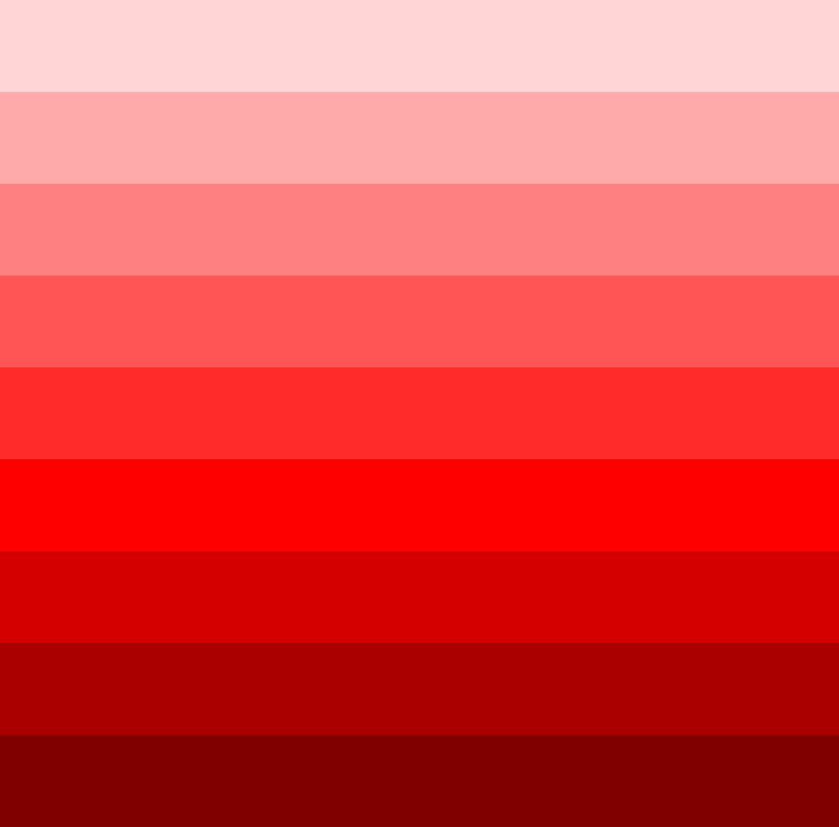
Photo: Wikipedia
Lean on the ease of analog colors
The graphs or images with analogous colors are a very easy and fast way to use in case you don’t have time or you need to deliver your earring in the shortest time possible.
You just need to find a suitable color and combine them with their adjacent variables. That is, if you choose red, you can use red, orange, and orange, or red-violet and purple.

Photo: Pinterest:
Sometimes the opposite combines
Have you ever seen examples of complementary colors? They are very easy to identify, for example: blue with orange, red-violet with yellow-green or blue-green with red-orange.
They are all colors that are in opposition but, for some strange reason, hopefully not because of cupid, they complement each other and create a visual harmony. Some brands joined this trend and applied it to their logos.

Source: BCP
Increase the challenge with indirect complements
It is one of the most complex color wheel color combinations because a base color is mixed with two adjacent colors of its opposite. For example, orange, blue and green are opposites, but they look great when they come together.

Source: Fanta
Triadic harmonies optimize your designs
Triad combinations are formed by drawing an imaginary triangle inside a color wheel and pointing to three equidistant colors. For example, blue-purple, red-orange, and greenish-yellow.
These combinations express a sense of balance and also transmit strength through their contrasts.

Source: DC
And there was light, but also colors. The importance of the color wheel in photography, and videos, is that, as in design, it transmits what you want to communicate.
But first of all, we must understand what each color wants to convey in order to apply it in our shots and thus the scenes, costumes and other elements of your shot work in harmony.

Source: Giphy
Generally, the magic formula for a good shot based on the colors of a color wheel is that one color is dominant and the rest are complementary to the main color.
With this, we want to tell you that before taking a shot you will be able to identify which is the predominant color and find those that will give harmony to your shot. This also happens when you make a graph and use an image bank, depending on what you want to convey, you must select the ideal photo.

Color filters for photos
As we wrote above, one function of the color wheel is to identify warm colors and cool colors. Therefore, we will analyze what color filters we can apply so that the editing of our photos is more professional.
As the knowledge is not absolute, we recommend you to review the handling of Photoshop for photos, or, if you prefer, you can become an expert in photo retouching and complement your knowledge with the information that we will provide below:
🟦 Blue filter for photography: It is used in black and white photographs to enhance and flesh out the appearance of haze.
Source: Unplash
🟥 Red filter for photography: It helps to absorb excess blue and green light giving a better contrast to the photograph.
Source: Unplash
🟨 Yellow filter for photography: It is used in portrait or portrait photos to give the skin warmer tones.
Source: Unplash
🟧 Orange filter for photography: It is used for black and white photographs to add contrast to the environment. It is also used in photos to give a smooth look to the skin.
Source: Unplash
🟩 Green filter for photography: It is mainly used for photos of plants, nature and vegetation, since they help to clarify and give more life to all the captured elements. It also helps make the photo look more natural.
Source: Unplash
Knowing how to combine colors is very important to visually express what we want to communicate. For this reason, throughout this article we emphasize the importance of the color combinations of a chromatic circle.
Put this tool to good use in both visual and photographic compositions, and why not, when making some videos. We do not doubt your great capacity for creativity to make great products. Many successes in all your works!


