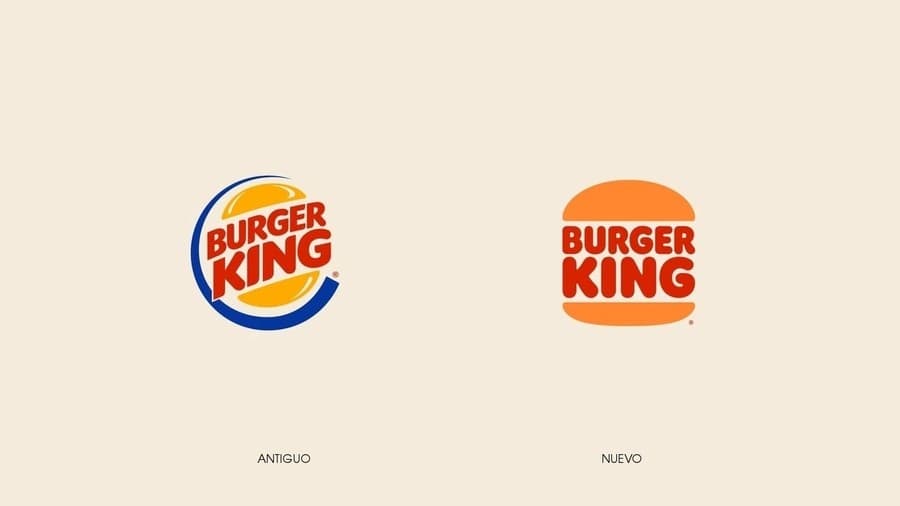
Burger King Debuts Logo Design and introduces a brand font inspired by the shape of their burgers, with a rich new color palette, to create a modern and more digital identity.
The new identity, was designed by Burger King’s in-house creative team together with JKR New York, the brand redesign work lasted 2 years. The new logo is actually not that new because it is an old logo that the company first used in the late 1960s.
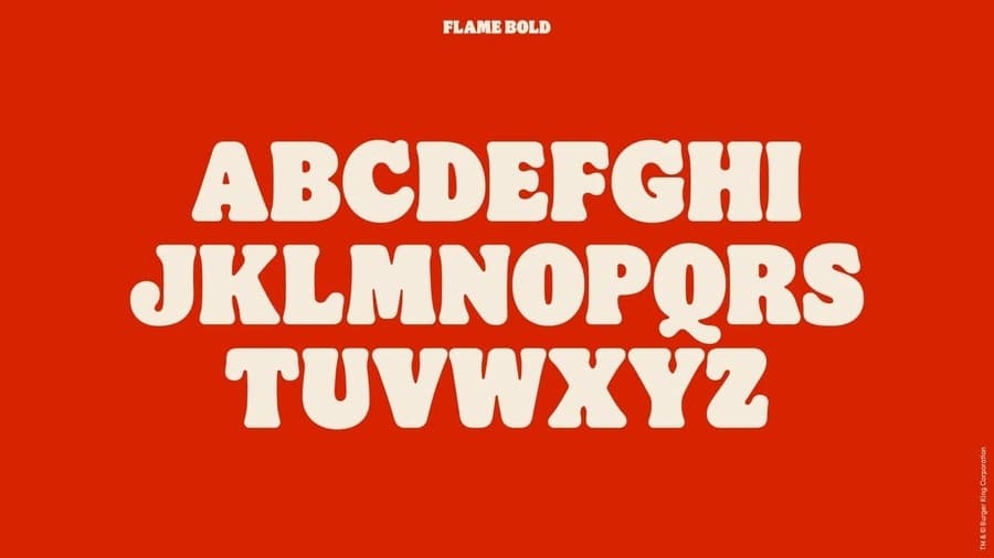
The new logo is made up of three graphic elements. The name of the company is written with a font designed exclusively by the company, the font is called Flame. And for a couple of graphic pieces that refer to a bread, the same one used in hamburgers.
– If you want to download the new burger king logo in vector, just click here. It is a file in SVG format, so you can open it in any vector editor.
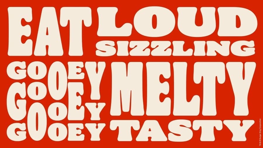
The Flame typography It was designed by the Colophon Foundry in three variants: bold, regular, and sans. The idea of the design of the letters was to imitate the shapes of the restaurant food.
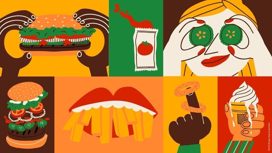
In addition to the logo, new designs were also made for the packaging of all the food, stationery and resources that Burger King uses to advertise.
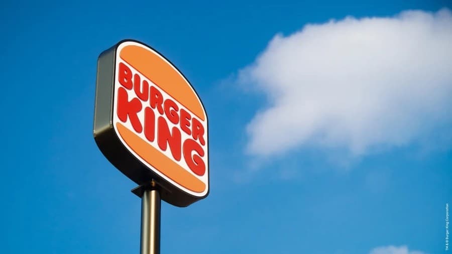
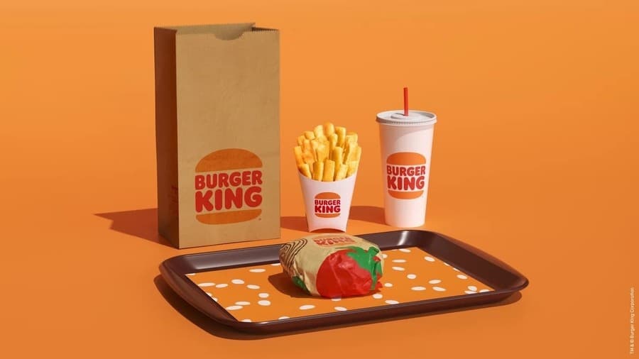
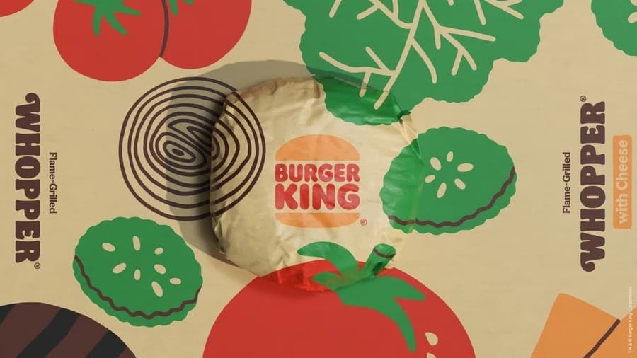
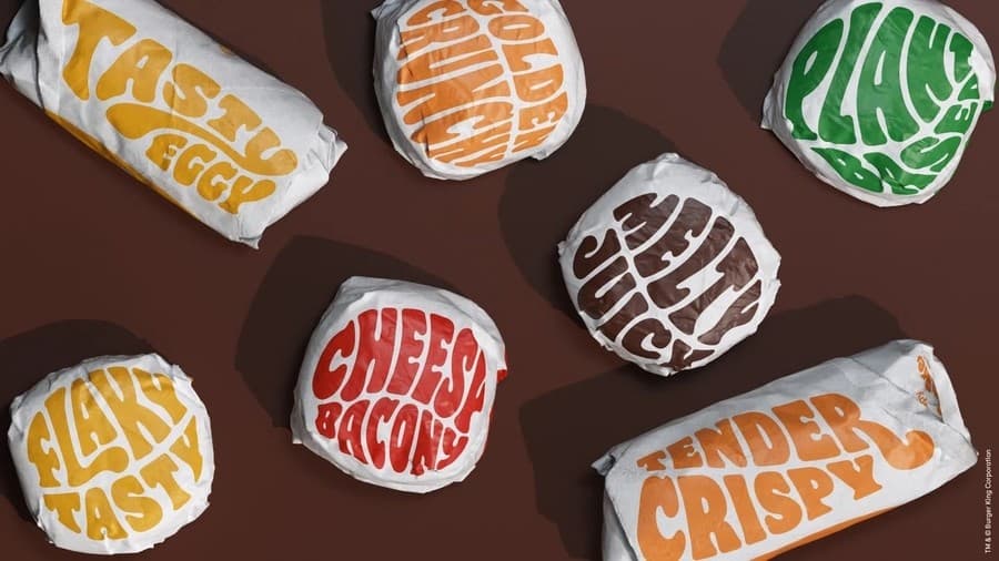
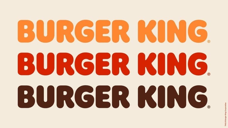
Table of Contents
New Burger King logo inspired by their logo from the 60s
The chief designer of Burger King restaurants, Raphael Abreu, told him the following in an interview for the It’s Nice That blog:
“We redesigned our logo intentionally inspired by our identities from 1969 to 1998, which were authentic, safe, simple, genuinely Burger King.”
“So we modernized a classic, making sure the new design was durable and timeless. We adjust the shapes and proportions of the bun, bringing it closer to our burgers. The typeface is streamlined, round but still retaining some of our fun and friendly personality. We are very proud to be able to find the path to our brand in our own history ”.
Use and implementation of the new Burger King logo
Burger King required a makeover, because the previous one no longer reflected the work they have been doing in recent years. Now the brand is removing artificial flavors, colors and preservatives to all the foods on your menu.
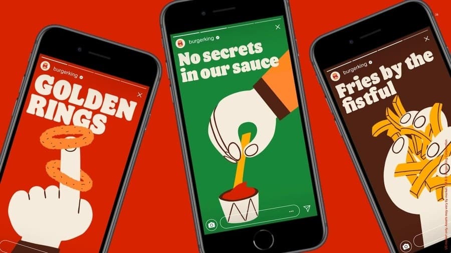
In addition to that they are now turning their efforts to sell their food through mobile devices. And enhance the customer experience when they enter some of Burger King’s 18,800 restaurants.
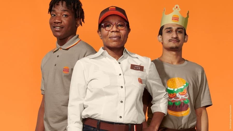
I liked the new logo a lot, especially the version they use with the letter «B»Between two pieces of bread. I want that logo printed on a cap or a shirt.
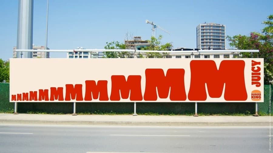
The new logo and visual identity will be implemented throughout the year in all the thousands of restaurants that are spread across different cities around the world.


