
Chicago city released a new visual identity, the main objective of the change was due to the fact that they sought to unify all the municipal dependencies of the city. It is estimated that with this new visual identity, the city can save between $ 5 to $ 10 million.
Chicago copied what other cities had already done successfully, to reduce costs in the city, such as: New York, Boston, Melbourne and the city of Oslo.
The new visual identity of the city of Chicago has as its central point the star icon. That star is based on the flag that Chicago had used for many years. That flag had 4 stars; the first star represents Fort Dearborn. The second star recalls the Great Chicago Fire of 1871. The third star represents the World’s Columbian Exposition of 1893. And the fourth and final star is for the Progressive Century Exposition in 1933, which marks the end of the Great Depression in the United States. United.


New visual identity and logo for the city of Chicago
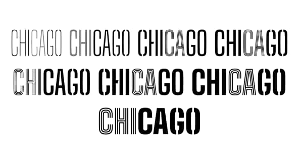
The designers of the new identity wanted to unify the entire history of the city in a single star. The design studio that was in charge of the new design was: Ogilvy. In addition, a new typeface family was designed that was in charge of the typographer: Patric King.
The letters were designed to be legible in print or on digital media. The colors chosen in the new visual identity; blue black and red were selected because offer high contrast.

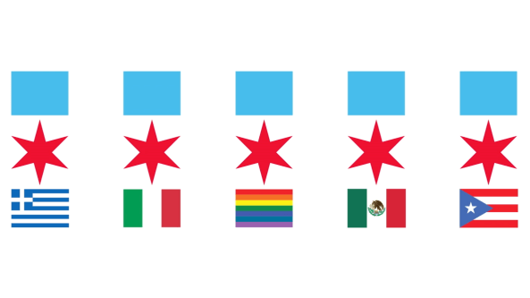
The new logo of the city of Chicago can be used in different versions, to suit all needs. The star and the blue box can be placed in portrait or landscape format.
The intention is that it can be seen well on advertising posters, as in icons used on the website or in the app.

I really liked the new visual identity and the logo of the city of Chicago. I’m a big fan of minimalist logos, because in general city logos are based on shields, with various symbols that have ancient meanings, which can no longer be applied to modern cities.
What do you think of the new logo and the identity of the city of Chicago? Did you like it or are you one of those who prefer classic and old shields as city logos?

