This year 2020 Formula one celebrates 70 years of existenceTo celebrate the anniversary, they presented 3 new logos that they will be using throughout the year.
They are 3 versions of the same logo, but with small variations in design. What does not change in two of the anniversary logos is the logo design that they have been using since Formula One, has new owners.
It is that logo that nobody likes, but there is no other option but to get used to seeing it.
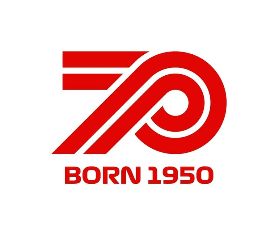
There is a positive part of the presentation of these three new logos, is that one of them does not use the current Formula One logo. That is why it is the best design, of the three existing versions of the anniversary logo. It is the logo that has the number 70 together with the phrase: «BORN 1950».
That logo is perfectly embroidered or printed on caps, t-shirts, sweatshirts, jackets and other products that Formula One uses to advertise and promote.

New Formula 1 logos to celebrate its 70th anniversary
The other two logos are the ones that look really weird, there is no harmony or balance in its design. By mixing the two logos with such different designs, there remains something that is visually a mess.
The design of one of the logos is horizontal, it begins with the Formula One logo – which nobody likes – along with the phrase «SEVENTY»With a typeface that tries to imitate the layout of the race tracks.
As the Formula One logo is made with letters, when placed next to more letters, but of a different size and design, the logo looks strange. That happens because there is no balance in the design.

It is the same with the third anniversary logo. They put the Formula One logo, along with the number «70», But the two logos are of a different size and of a different weight. There is no way such a design can create harmony, that’s why it looks so weird.
In summary, I hope that Formula One will use the design where its logo does not appear – which nobody likes – throughout the anniversary year, because it is the best of the three – or at least it is the least worst.
What do you think of these three new logos? Did you like all of them or just one version?


