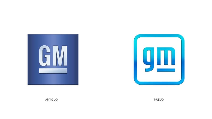
General Motors presents in the first days of the year a new logo, which will help reflect the company’s commitment to the production and sale of electric vehicles.
The new General Motors logo maintains the 2 letters G Y M of their old logo, but now they are the same letters but they use them in lowercase. In addition, the letter m is underlined, so that an electrical plug is formed in the negative spaces.
– You can download the new General Motors logo in vector clicking here. It is a file in SVG format, which you can open in any vector editing program.
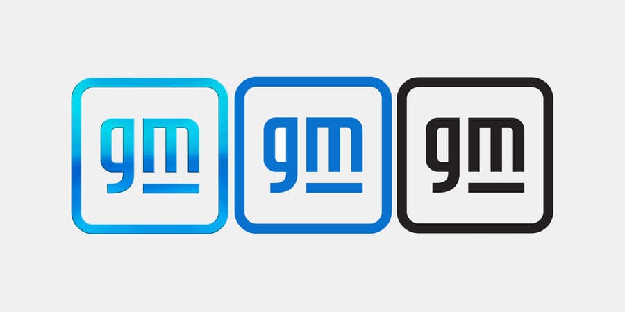
GM’s main logo features a vibrant blue tonal gradient, evoking the clean skies of a zero-emissions future.
But there are also two other versions of the new logo without any fading colors. One version is in a flat blue color and the second version of the logo is in a dark color.
Each version will be used by the company to use the logo in different media. For example, for web and mobile applications they use the version with a flat blue color. The logo with gradients will be used for commercials and videos that are uploaded to their different social networks.
Table of Contents
New General Motors logo with a hidden object in its design
Along with the logo General Motors also released a new design on your website and an advertising campaign which bears by name: “Everybody In”.
In addition, during the days of the CES, the company will be presenting different vehicles and new technologies that they will implement over the following years, in all their vehicles.

The new GM logo that looks like a subway station logo
I didn’t like this logo at all for a couple of reasons. One is that when I see the new logo, I don’t associate it with a company that makes electric cars.
The symbol of the electrical plug that is created in the negative spaces of the letter “m” seems to me to be a very forced feature.
In fact, I have been reading a lot on social media that the new General Motors logo closely resembles a logo of a new metro station in Mexico City.
There are very few days of the year, but this design already enters the list of the worst logos of the year, so it is seen that it is a serious contender to win the award for the worst logo of the year.
What do you think you like the new logo, when you see it you think of electric cars?


