home
>
Blog
>
Design
>
How to make infographics that fall in love?
How to make infographics …
We talked with our teacher Ana Cuna, Illustrator and Designer, of the course of “Design of Infographics: Creativity and visual narration”. We asked all about the infographics and tips to make a high impact infographic, and this is what he told us.
Table of Contents
What is an infographic?
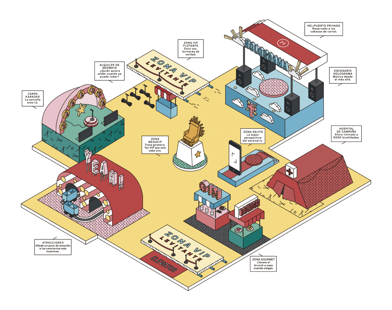
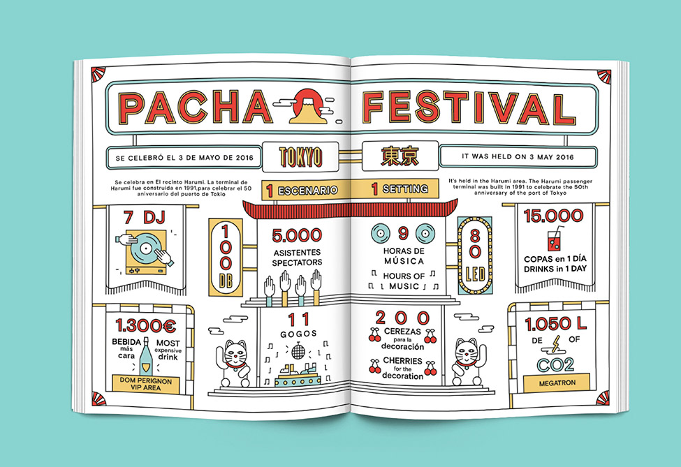
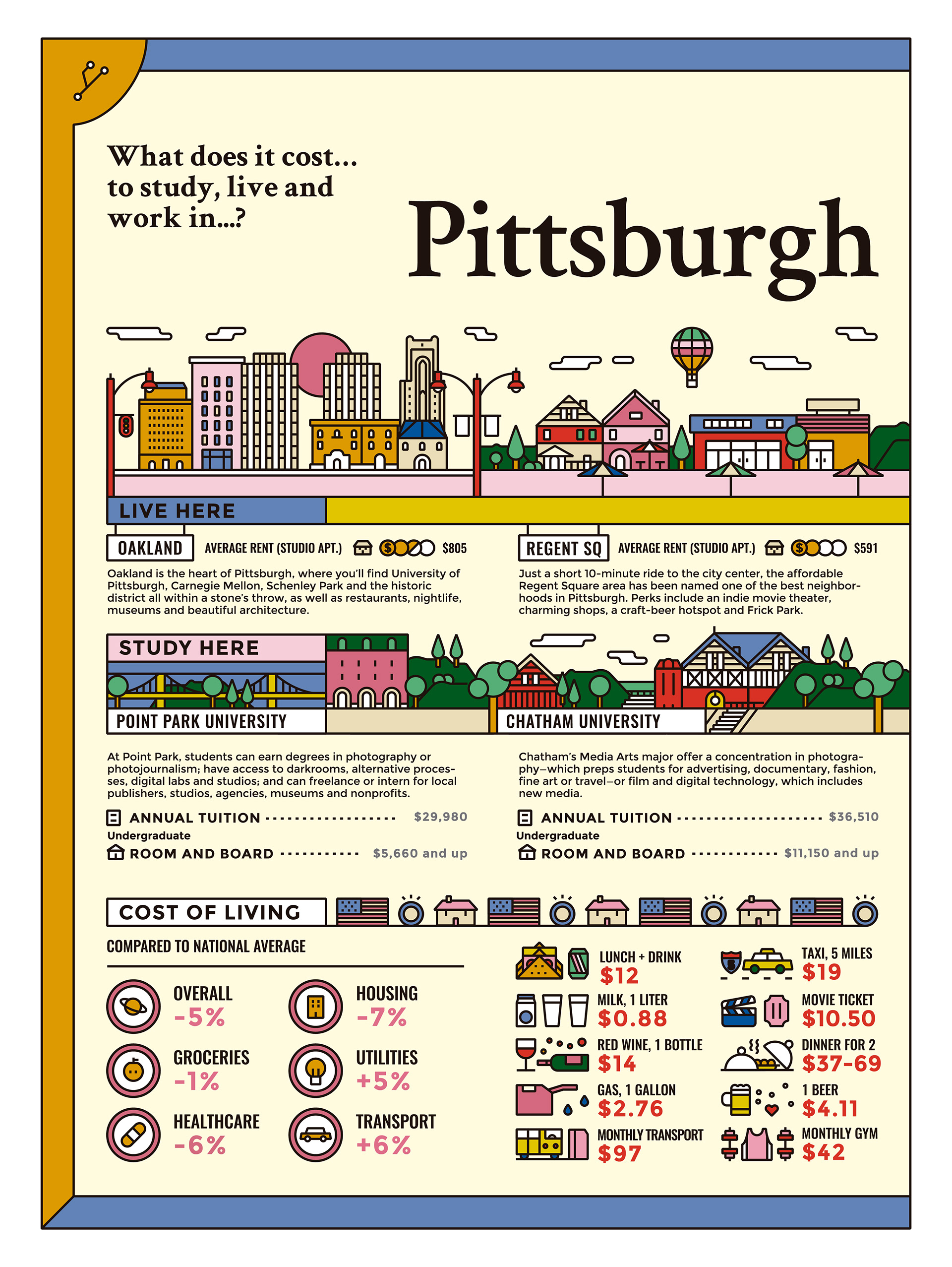
AC: We can’t find a single way to tell what an infographic is. We could say that it is a graphic representation that shows the information in a synthetic, orderly and hierarchical way, mixing visual elements with text and data. It is like a machine that swallows dense information and transforms it into something lighter and visually more attractive so that the reader wants to dive into the content.
An infographic usually combines typography, data and some visual element, be it an image, an illustration, a photograph, so that the arrangement of all these elements is placed so that the viewer can better understand the information.

Ana Cuna infographic
What are the techniques that are most used to make infographics? Are there types of infographics?
AC: There are as many techniques as people who do infographics, from a very traditional illustration and digital infographics that mix typography and illustration to physical or corporeal infographics, where there is a data installation, in which it is seen in a luminous poster for people, for example.
What do you think are the benefits of doing infographics?
AC: I think that the spectators are more open to understanding the information when it is told in an easier, and even more fun way, than simply if they tell it to us in a text or present us with data without more. If information with a lot of data is accompanied by something like an image or icons, it is less difficult for us to understand it, in fact, the brain is configured to better interpret an image or icons, than just text.
Where do you think infographics can be used?
AC: The interesting thing about infographics is that you can use them everywhere, from a giant panel that explains how an event is to something that is smaller and more iconic that will be used for an app. The medium is super open, it is very important that the infographic suits that medium in both sizes and legality. The medium may be what you want, although, today, it is in digital where it is being used more.

Ana Cuna infographic
What is your process when you do an infographic?
Normally the first thing I do is try to keep the information closed. Once with her, I try to understand the information, synthesize it and see if something is missing at the content level. Then, I usually do a moodboard that portrays the context of that project. Imagine that it is the map of a city, what I do is research on the city, see the color palette that it uses, what fonts can be inspired by that place and based on that, I start making the sketches, the iconography and typography , and what style the illustration can have. When I look for references, normally the search I do is for information, I try to do research on the subject and try to get the art direction out there. Already when I have all this clear, I begin to design and illustrate.

What are the tips you recommend to make different types of infographics?
Have the information very clear and closed from the beginning. If you already have the structure and the content changes, it is very difficult to do it again.
Understand the content well and contrast it with your editor or the client.
Follow the guidelines that you set within your process, because in the end in an infographic you take the heavy information and the idea is to lighten it. The clearer the process is for you, the clearer the outcome will also be.
What are the types of infographics that you most enjoy doing?
Those that have a funnier theme, which is not so much about talking about data or figures, but that they tell more anecdotal and fresher things.

In your course with Crehana, what will we see?
AC: What I propose is to make an infographic based on the lyrics of your favorite song. To focus the content we mix: we go through the lyrics of the song and explore its historical information and that of the artist. For example, to get there, we usually see which phrase is repeated more to include it in the infographic and give it more weight. I love this project because it gives a lot of play. It is designed to take the text and the story of the song and turn it into an infographic.
Sign up for the Infographics Design course
Do we need to know how to illustrate to make infographics?
In principle not, in the course, for example, we make very simple iconography with tips that I give. Illustrating is always a resource that comes in handy, but you can use the technique you want.
Do not miss the course with Ana, where you will know everything about the world of infographics. Do you dare to register?
Bonus track
Programs to make simple infographics
Here are some free online tools where you can make simple infographics if you have very short times.


