home
>
Blog
>
Design
>
The 7 typographical sins. The fonts you must overcome
The 7 typographic sins …
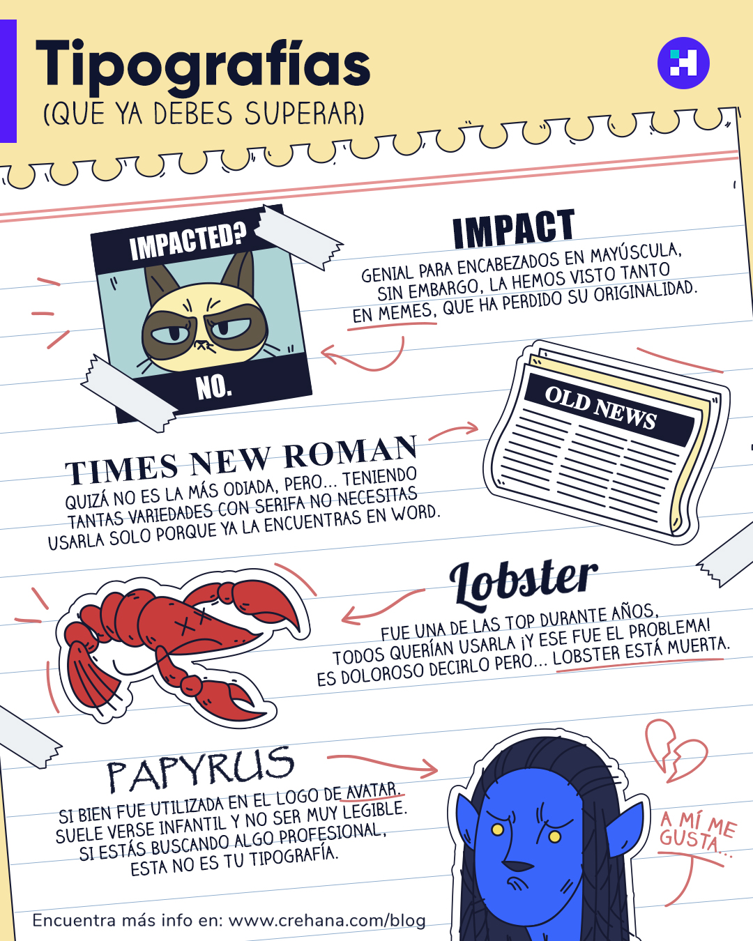
The fonts can be either very simple or very complex. As the internet was born, some fonts were introduced that Microsoft presented to us and that are now a bit obsolete. Surely many of us have used them in our childhood, however, today it is a sin to incorporate them into our design, therefore, in this note we share 7 fonts that you must overcome.
If you want to create personalized letters from your creativity, we recommend you take our “Lettering for design and advertising” course.
Here is the list:
Table of Contents
1. Impact

For years it was the typography we use to make our elegant designs. Sometimes it is good for headlines, the problem is that this typography lost seriousness because it was the official memes.
Bad Luck, Impact!
2. Comic Sans

Surely when you saw the title of the article “Comic Sans” was one of the first that came to mind and you guessed right because this typeface has been very popular, especially in school projects and Power Point presentations. Currently, among graphic designers, it is considered a sin, because this type of letter does not convey formality or seriousness in the works.
Be honest, when was the last time you used it?
3. Papyrus
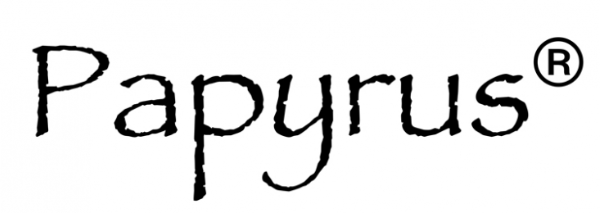
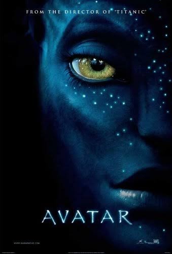
A curious fact of this typography is that it was used in the posters and posters of the Avatar movie, being objective is a somewhat childish and unreadable letter. We can advise you that if you are looking for something professional, we are sorry to say that Papyrus is not your option.
4. Lobster
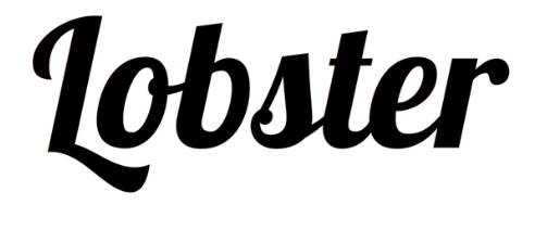
It is painful but we have to recognize that it is a mistake to use it. For years it was top and many customers wanted to have it, however, that was the problem that triggered everything because it is the official typography of brochures … and restaurant titles.
5. Times New Roman
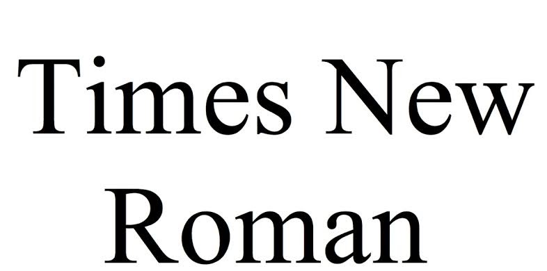
Perhaps it is not the most hated especially for newspapers, magazines and books. What is a fact is that this typeface is not very useful for designs but it is very good for your Word documents.
6. Western Cowboy

When someone tells you that Western is ideal for titles:

It is a very inelegant typeface and it would ruin any design you are making. The details it has on the banks of each letter really break down any artistic creation.
7. Arial
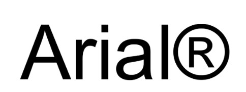
Like Times New Roman, this typeface is ideal for documents, however we advise you not to use it for your designs. It is a letter that is symmetrical but is excessively serious so it would not give personality to your piece.
Be honest! How many of these have you used? We hope these tips help you, see you in a next article.


