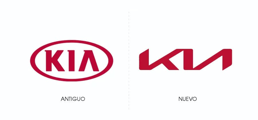
Kia Motors the South Korean automaker has introduced a new logo, which connects the letters of his name in an unbroken red line.
The symmetry of the new Kia logo tries to represent trust, according to Karim Habib, KIA’s Chief Designer.
In addition, the new Kia logo was designed to represent the “new purpose of the brand and its values.” Because now the company will focus on creating electric cars and other mobility services beyond traditional cars.
If you want download the new Kia logo in vectors click on this link. The file is downloaded in SVG format so that you can use it in any project.
The new logo was unveiled at an event where there were fireworks and many drones. There were so many that the company set a world record, for most UAVs, which launched fireworks at the same time.
Table of Contents
New Kia logo
Kia posted a video on its YouTube channel where Karim Habib talk about the new logo. Like any good designer, he justifies working with a lot of concepts. One of them is the rising lines of the logo, which according to the designer represent Kia’s growing ambitions.
What matters in the end, all the justifications from Kia’s creative team aside, is whether the new design adequately represents the brand.
It seems to me that the new logo makes the brand look modern and avant-garde. When you see the logo on Kia brand cars, you immediately think that they are modern and have the best technology.

Visual problem in the new Kia logo
But I have a problem with the new logo, when I see it from a distance, I see a letter «N»Inverted, when the letters«I” Y “TO».
But I suppose it will be a matter of getting used to it, as time goes by it will no longer bother me to see that «N»Inverted. I even feel that this feature was made on purpose, to cause a certain discomfort in people and that it ends up becoming a difficult logo to forget.
In my case, every time I see a Kia car with the new logo on the street, the first thing I will look at will undoubtedly be the logo (to see how the final two letters of the brand name come together).
What do you think of the new Kia logo, did you like it, do you also see an inverted “N” in the logo?


