
The results of the survey that I published last week are ready, to choose the worst logo design ever released in 2020.
This time I was surprised by the result of the logo that won first place. Because when I posted the logo review, I was saying that I hadn’t liked the design. But through messages to my social networks, designers wrote me saying that they had liked the logo.
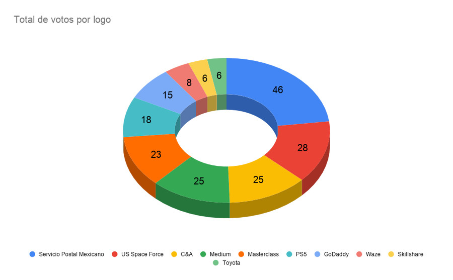
I thought that the first place would go to the US Space Force, but the logo of the Mexican Postal Service won him almost double the votes.
Here the detailed results of the survey.
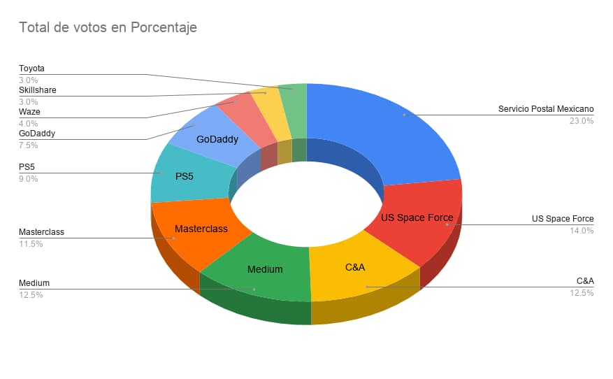
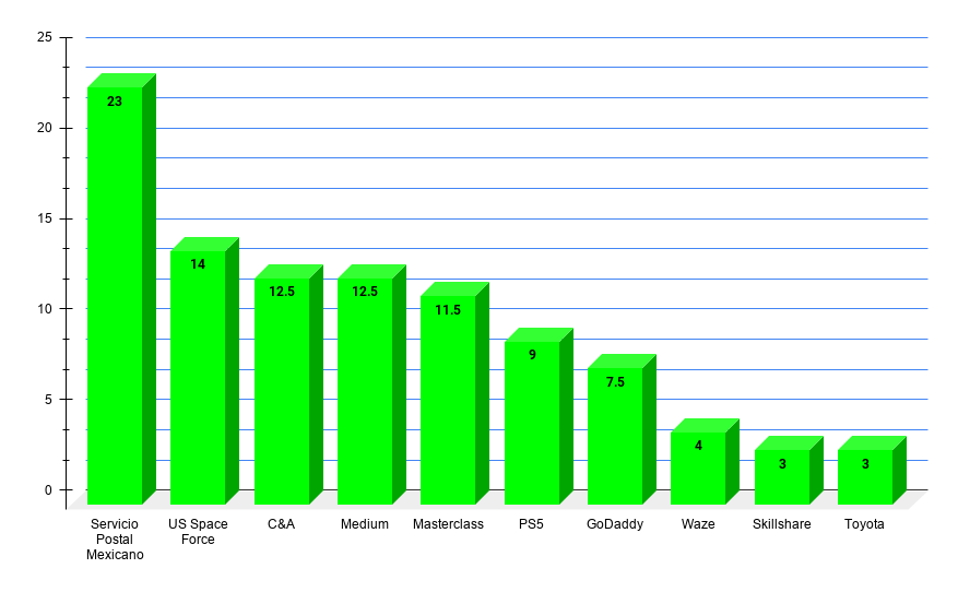
Table of Contents
Winning logos for the worst design of the year 2020
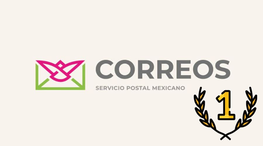
First place: Mexican Postal Service
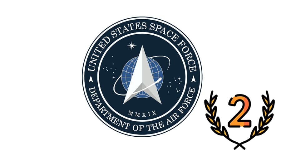
Second place: US Space Force
Third place: C&A and Medium

Fourth place: Masterclass

Fifth place: PS5

Last places: GoDaddy, Waze, Skillshare and Toyota
Did any of the results surprise you or did you expect it? Missing to include a logo in the list?
Thank you very much to everyone who voted, I hope the logo you chose as the winner for the worst logo has won.
See you next year, to choose the best and worst logo of 2021.


