home
>
Blog
>
Design
>
What do you think of the new Duolingo logo?
What do you think of the new l …
They say that speaking more than one language is essential today and there are applications that help you achieve that goal. Duolingo is one of them and in this article we will not focus on how this application works but on the change of its logo.
Table of Contents
Logo change
Next we share the evolution that this logo had. The one on the left was in 2012 and the one on the right is the current change.
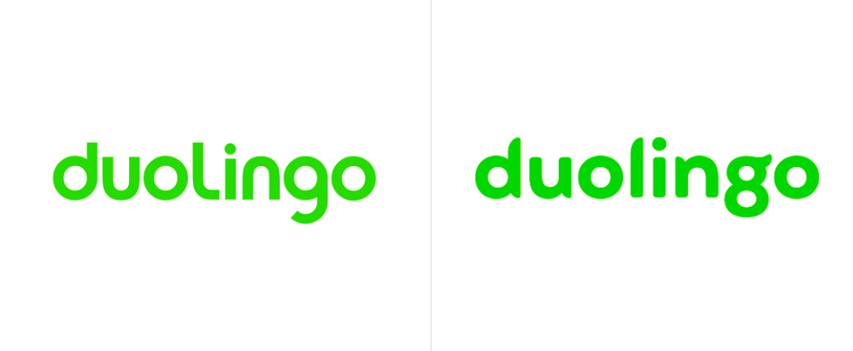
For some it was only to put command + B and make the lines of the letters thicker but no, even if you don’t believe it, this logo change complies with very good visual practices that we will discuss below.
Typography: The secret behind the logo
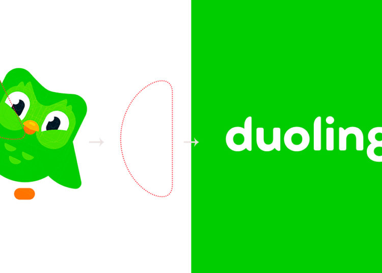
Interestingly, the brand created a typeface very attached to an owl that is the official mascot of the brand and used several aspects to create their own letters. We will exemplify this with two letters in particular. Are you ready?
The eyebrow and the letter “g”
In broad strokes the element that appropriates this typography is the edges of the letters that allude to the owl’s feather.
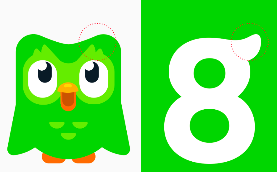
This element is also accentuated at the edges of the “m” and “n”.
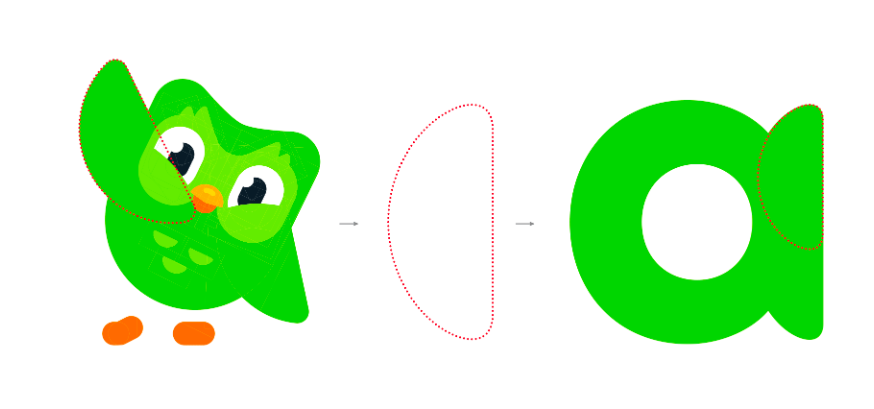
The pen and the letter “a”
Another element they used was the plam of a wing to make the edges of the straight lines in the letters. Here we show you the example:
The logo change
Since we tell you what happened with the typography now we show you how this impacted the logo.
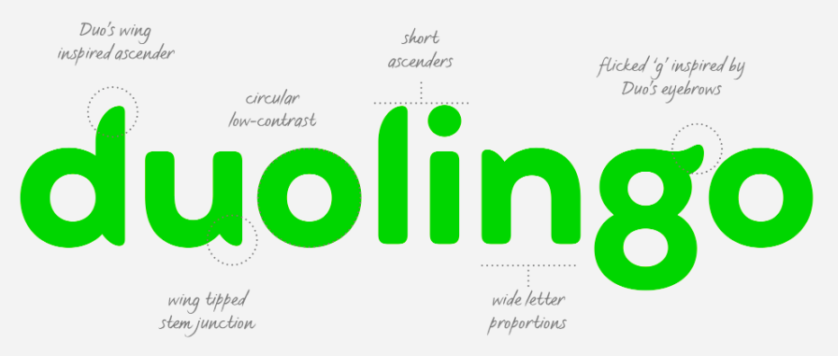
In the “d” we can see at the tip of the line with the Duo wing inspiring progress; same case with the letter “l”. On the other hand we see that the “u” has an inclined wing showing intersection. The letter “n” shows us that the proportions of the letters are wide. Finally, we can again notice the eyebrow of the owl in the letter “g”.
Here is the end result:

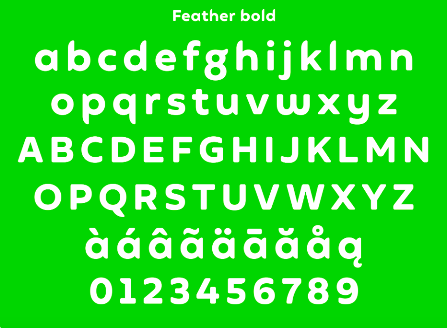
Full typography
Here we show you the typography with the details that we comment on the top
Communication
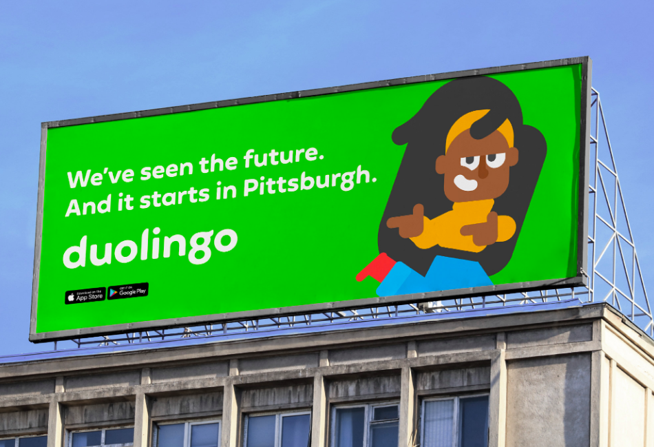
If you wonder how it looks in communication displays, here are a couple of examples for you to have your point of view and share with your acquaintances if the Duolingo change was successful or is a design that was due.
OOT
This is what a Duolingo ad looks like in the streets.
Graphic manual
We share these pictures showing the progress of how the graphic manual of the brand evolved.

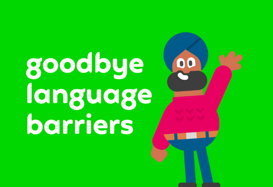
Network Communication
These are some of the Duolingo arts for social networks.
Did you like the change?


