home
>
Blog
>
Design
>
Differences between isotype and logo Stop calling everything a logo!
Differences between isoti …
These are times of entrepreneurship and many friends or acquaintances have formed their companies. It could even be your case. If you have this initiative or are getting involved in the world of graphic design and want to be your own boss, It is essential that you know the differences between isotype and logo.
To help you, we have prepared this article where you will learn not to keep making mistakes. Because, although it is a common mistake, not every emblem that characterizes a company is a logo. So be careful, don’t get distracted, because yes or yes you will understand what a logo, isotype, imagotype and isologo are.
Follow me the good ones. 😎
Index
A logo is the name given to the representation of a brand when it only has calligraphy. That is letters or words. Although many think that knowing what a logo is is not so necessary; In fact, defining the logo concept is a good start in the whole process of identifying a brand.
Our teacher of the Logo Design from Scratch course, Castor Vera, comment on this:
We must never forget that the logo does not exist independently. That does not happen. A brand logo is part of other superior systems that shape what we call a brand. What matters to us as designers is that we must be aware that the logo exists within the system called: Brand identity.
Returning to the topic, one advantage of having a logo is its ease of reading, since use words in your design. There are many brands that have preferred to have only one logo, a clear example is Google.

However, a logo cannot only understand words, It can also be made up of acronyms. The Swedish company H&M, for example, bets on the acronym in its representation, like the famous Calvin Klein brand. Another form of logo is signatures, an emblematic case is that of Oscar de la Renta, although a better known example is that of Walt Disney.
Therefore, if you were one of those who thought that everything was a logo, don’t ever make the same mistake. Now that you know what a logo is, it would be good to review the parts that make it up. Thus, little by little, you can learn much more and you can correct your friends.
📌 Typography of a logo
As we already have a clear definition of a logo, we know that it is a specific level of signs and that a logo it is made up of letters or words.
In this way, the typeface is essential to be able to identify a brand. Let’s think about the Coca Cola logo. That typeface is a quintessential definition of a logo. Can you imagine Coca Cola bottles with the logo written in Arial? Impossible. 🤯
If you fell short on font styles for your brand, we recommend these 30 fonts so that you do not continue using Comic Sans or WordArt.
📌 Logo font color
Can you identify the colors of the word Google? The internet giant uses alternating colors to identify the services it offers. Although sometimes the colors of the typeface may vary, generally, Brands define the main color of your logo.
So if you think about the parts of a logo, font color is important. Colors convey emotions and at the same time identify. For this reason, many companies and professionals want to learn how to create color palettes.
An isotype is a graphic representation of a brand. It is an image, regular or irregular shape that can be related to a company, without the need for the isotype to have the company name written on it.
To answer what an isotype is, we can also analyze the word. The prefix “iso” comes from the Greek which means equal. Thus, isotype can be understood as “equal to type”, that is, equal to the brand.
By the way, we have an article where you can learn everything about the NASA logo and travel through space for a while.
Just as there are brands whose identity we remember only by the letters of their logo, there are others that we remember by their isotype and in fact one of the functions of an isotype is that a brand is easier to remember.
The isotype is what could be called the image of the brand. For example, a brand that we can all recognize only by its isotype is Apple.
Benefits of an isotype
✅ Unforgettable: Since isotypes are graphic representations, this visual element generates greater recall. In simple terms, what is an isotype? It is the figurine that represents your brand.
✅ Versatile: In the graphic design of events or publications, brands struggle to place their isotypes, so that they can be identified. In addition, it is easier and more versatile to put a graphic.
✅ Universal: visual graphics have no language, don’t forget. So that you are clear about what an isotype is, remember that they are visual elements that will identify your brand in the world.
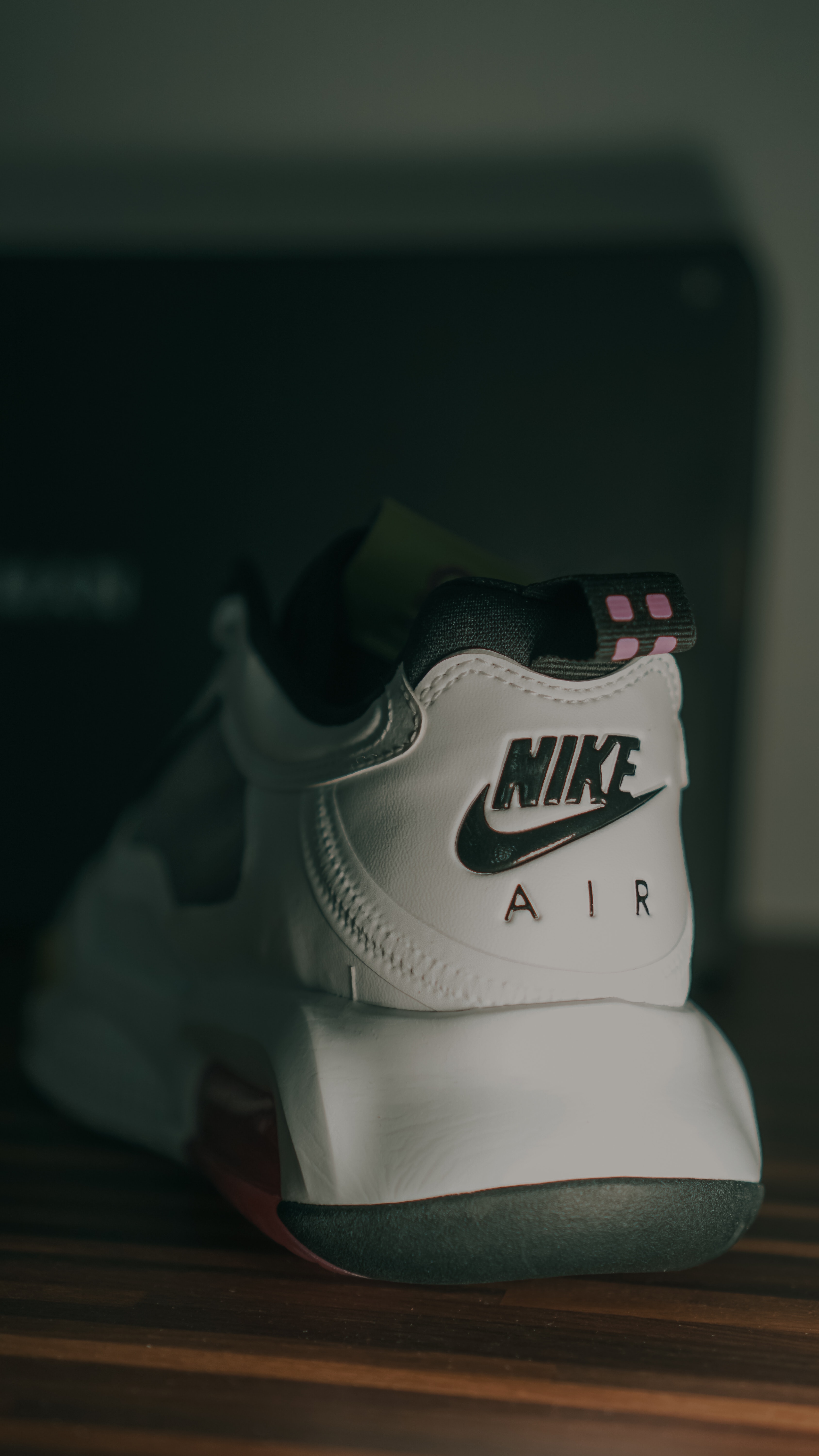
✅ Visual impact: Let’s think about the Nike company and its isotype, one of the most famous and visually impressive. This company can make huge panels and just put your logo on it. Everyone will recognize it!
Nike
Source: Nike
One of the most famous isotypes is that of Nike. It was designed by Carolyn Davidson and charged just $ 35 in 1971. She was inspired by the Greek goddess of victory: Nike. Can you imagine being able to interview her and ask her what an isotype is? She has all the authority to answer.
Manzana
Source: Apple
Apple’s bitten apple It is also known worldwide. That is the best of the most famous isotypes, without the need to add any more elements, everyone recognizes it.
Android
Source: Android
Google’s smartphone operating system is also recognized globally. The Android isotype relates us to a robot with human and technological characteristics.
Do you want to know the trends of graphic design 2021? Download this Ebook for free and find out everything
Now that you are clear about what a logo is and what an isotype is it is easier to mark the differences between the two.
🔤 The logo is made up of letters or words of the brand name.
🔤 The logos they design fonts that defines brands.
⚠️ The isotype has no letters, but they all associate it with a defined brand.
⚠️ It is a graphic symbol that identifies the brand without naming it.
These differences between logos and isotype are recognized by specialists in graphic design. Although it is a mistake, most people use the term “logo” to interchangeably name any element that identifies a brand.
Now that you are clear about the differences between isotype and logo you have already taken another step in the creative world. 😎
Do you want to start or specialize in graphic design? Sign up for free to these courses
Both of them, they are the way a brand is represented graphically. Generally, companies usually have a logo and an isotype. Sometimes they even have a mixture of both, but this fusion already receives another name.
The most important common aspect between the logo and the isotype is their objective: Both identify the brand. Furthermore, there must always be a harmony between these.
Source: Nathan J Hilton
Do you want to design faster? Download this free Photoshop, Illustrator and Indesign guide
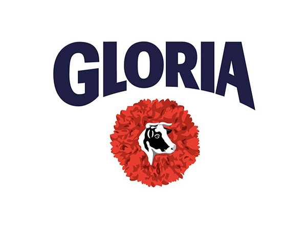
It is called an imagotype when a logo and an isotype are together, but they can be separated without affecting brand recognition.
Leche Gloria, for example, has a representation made up of its name: “Gloria” (the logo) and the image of a cow on a carnation (the isotype). Both representations can be together and harmonize, but they are clearly differentiated.
In a hypothetical case, both elements could be separate and could identify the brand. If you want a formula about what is imagotype, it is this: logo + isotype.
Source: Gloria
Remember that the key to imagotypes is that both elements are independent. Neither depends on the other because they have their own meaning, but together they strengthen the image of the brand.
Source: YouTube
Another example is YouTube. Google’s video service unites your logo and isologo in its visual identity. But what is an imagotype? We’ll see it in 3, 2, 1 …
Do you see that not everything is a logo?
Spotify

Source: Spotify
Adidas
Source: Adidas
Huawei
Source: Huawei
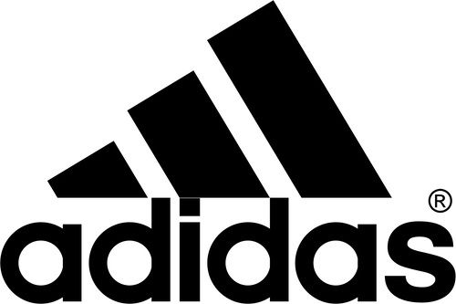
In this representation both text and image are found, but unlike the imagotype these are mixed in such a way that it is impossible to separate them. And, in fact, they work in combination. The representation of Fanta is a good example of an isologo.
So that you do not get confused about what an isologo is, you must be clear about what it is a single element. The same is not the case with the imagotype, where we speak of two. In the isologo, both text and symbol are indivisible and they cannot be separated. If they separate them, it would be very difficult to identify the brand.
Still don’t understand what an isologo is? Remember, it is a composition; letters plus the graphic part, which cannot be represented separately.
BMW
Source: BMW
Burger King
Source: Burger King
Lays
Source: Lays

If it is a question of being clear about the differences between the imagotype and isologo, here we point them out.
🔙 What is an imagotype? The logo intentionally combines text plus the symbol. Together they generate greater visual impact but they can be separated and still represent the company.
®️ What is an isologo? The isologo is an element made up of two inseparable parts. It is known that this “R” wrapped in a circle means “registered”. The same goes for brands that choose an isologo as their visual representation.
The graphic way of representing a brand may varyIn fact, many have changed their original designs, just look at the Apple logo that became the isotype that we all know. Let’s not forget McDonald’s, a brand that had a logo and currently uses an image logo.
In short, a logo can be read, an isotype can be seen, but not read, since it is an image. On the other hand, The imagotypes bring together, without mixing, text and image. Finally, we have the isologists that mix images and text, in such a way that it is impossible to separate them.
If you made it this far We are sure that you already know what a logo, isotype, imagotype and isologo are. Now, you can rub shoulders with some agency graphic designers and pass off as a good beginner. Even, can you propose a change in the visual identity for your company or the place where you work.
See you at the agency. 😎


