I don’t know if the same thing happens to you, but when I am commissioned a job or when I need to layout something, one of the first creative decisions I like to make is what fonts to use. For this, I usually go to Google Fonts, the typographic bank par excellence, and I can spend an hour trying to find the most suitable one.
There are thousands and thousands of fonts, and it is not always easy to combine them. So, in the end, I have chosen to make a list of fonts that I like and fonts that look good together. A bad typeface combination can ruin a design.
To inspire you, I am going to share part of my list in this post, I will tell you which are the 7 modern fonts that I like the most and what do I use them for, in addition, I will provide you with some combinations with these fonts that remain of scandal. But before getting into the subject, let’s define what modern typefaces or fonts are.
Table of Contents
What are modern fonts?
Paradoxically, when we talk about modern fonts we are not referring to “new” fonts, but rather to those typefaces created from the early 20th century that, inspired by modern graphic design, marked a before and after in the history of typographic design. Are very legible and clean types. There are them with and without serifs, but in both cases, with more or less decoration, legibility is not sacrificed for beauty. Today, modern typefaces are very present in web design.
Modern design and modernist design
Before continuing, I think we should remember that modern graphic design is not the same as graphic design based on modernism or Art Nouveau. Art Nouveau is an artistic movement that developed in the late 19th and early 20th centuries, characterized by its ornamentation and its inspiration from nature. He had a great influence on graphic design, designers like Alphonse Mucha belong to this trend.
But… What do we mean then when we talk about modern graphic design? Well, also in the early twentieth century, the need to simplify and refine designs to make them more functional. Some designers chose to free their pieces from artifice, adopting a simpler style. We must look for the antecedents in the Bauhaus school that, under the motto “form follows function”, reformed the foundations of graphic designor.
All these features that we mentioned of modern design can also be attributed to type design. In the words of typographer Douglas McMurtrie, “the primary function of typography is to convey a message in such a way that it is understood by the readers to whom it is addressed.” Thus, typographic design will embrace this function of fonts to adapt its form to it. Modern typography will be characterized by taking care of legibility above all.
My 7 Favorite Modern Typefaces and How to Combine Them
Lato
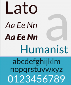
Lato is a family of typefaces created in 2010 by Polish typographer Lukasz Dziedzic. The Lato family has become one of the most used for web design, is free and consists of 18 typographic styles.
Regular Side
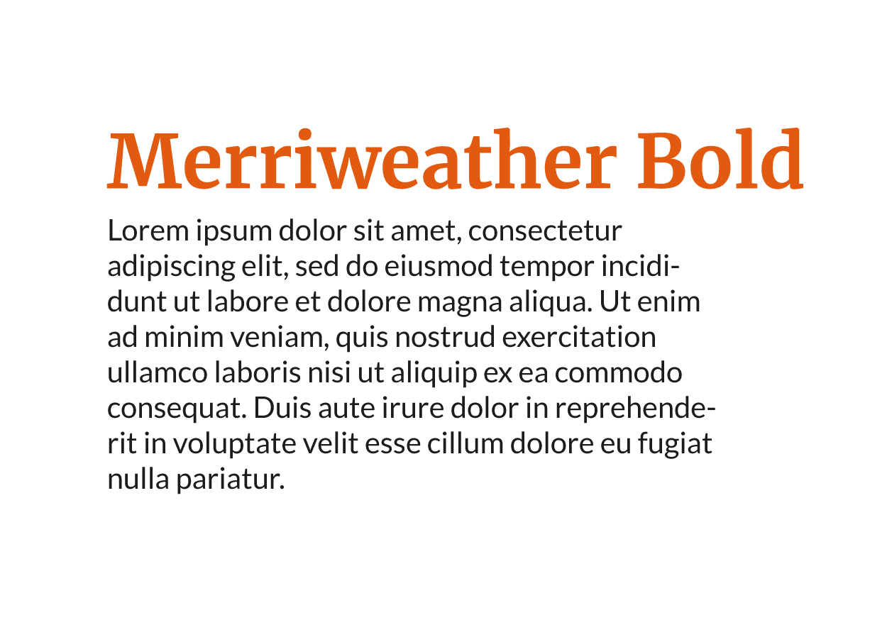
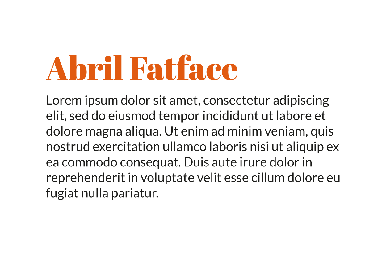
What I like the most about the Lato Regular is its versatility, It is a very neutral source, dry wood and that it is suitable for almost all types of projects. Normally, I use it for the body of text and, as in this of the type combination the contrasts work very well, I usually accompany it with letters with serifs and curves. I share with you two combinations that I use very often.
Lato Bold and Lato Black
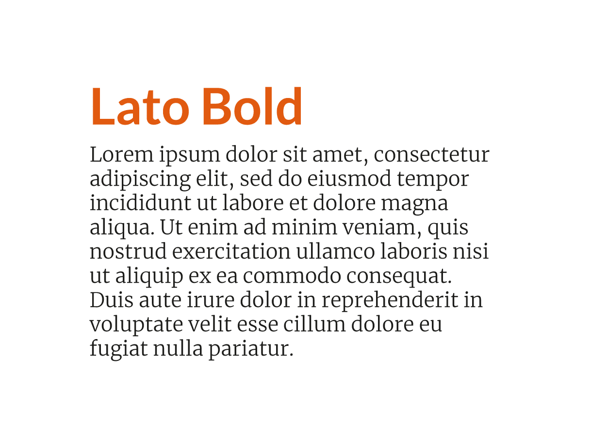
These Lato family styles are a good choice for your headlines and higher-ranking texts. I like to use a thick dry stick typeface, like Lato Bold, for headlines and accompany it with a very fine serif typeface, as the Merriweather light. This combination seems like a bomb to me.
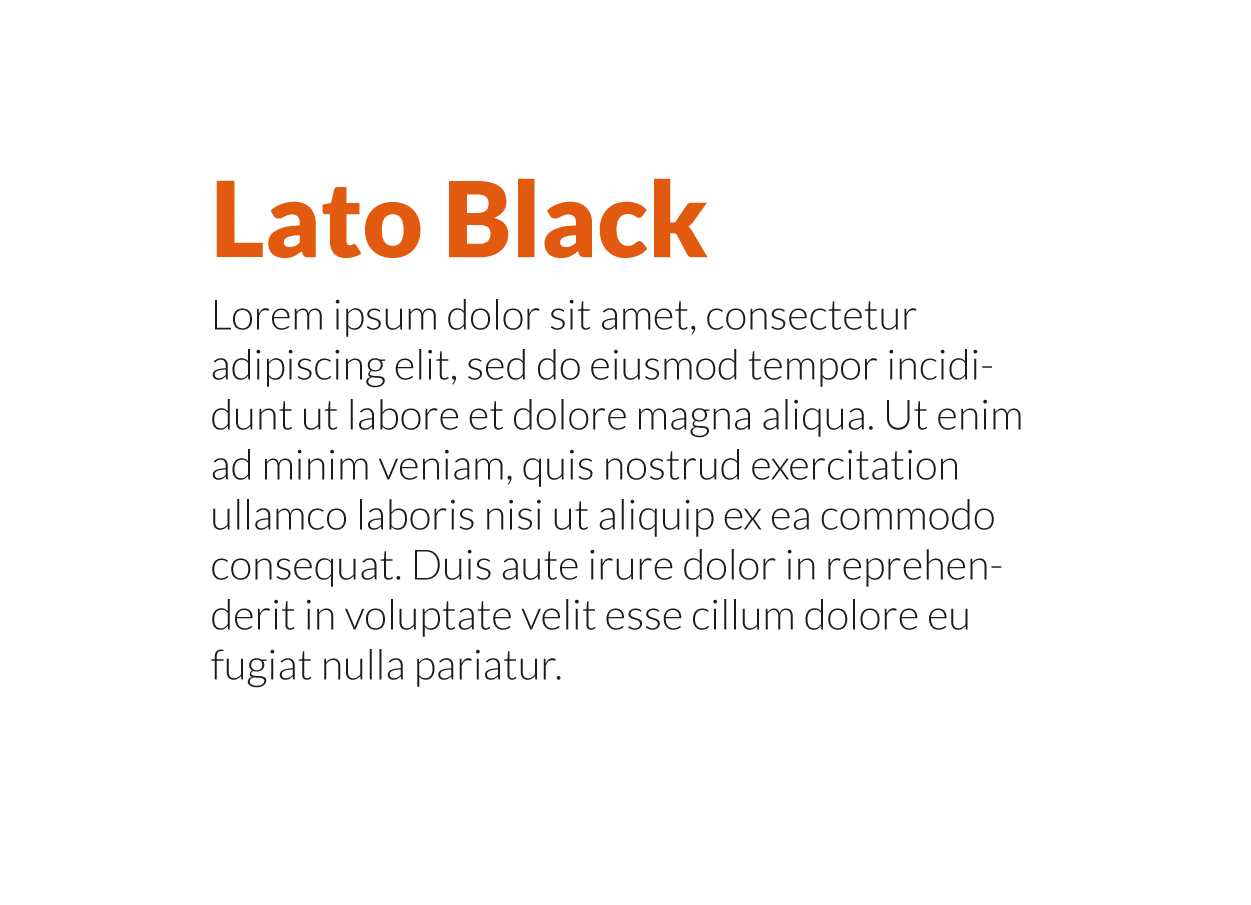
At first, I didn’t dare to combine fonts from the same family. However, it is something that, if done right, playing with the contrast of thickness and size, it works. Combine, for example, the Lato Black and the Lato Light, I find it interesting.
Future
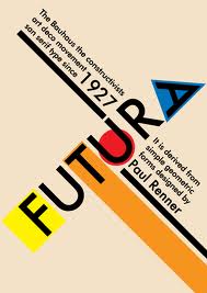
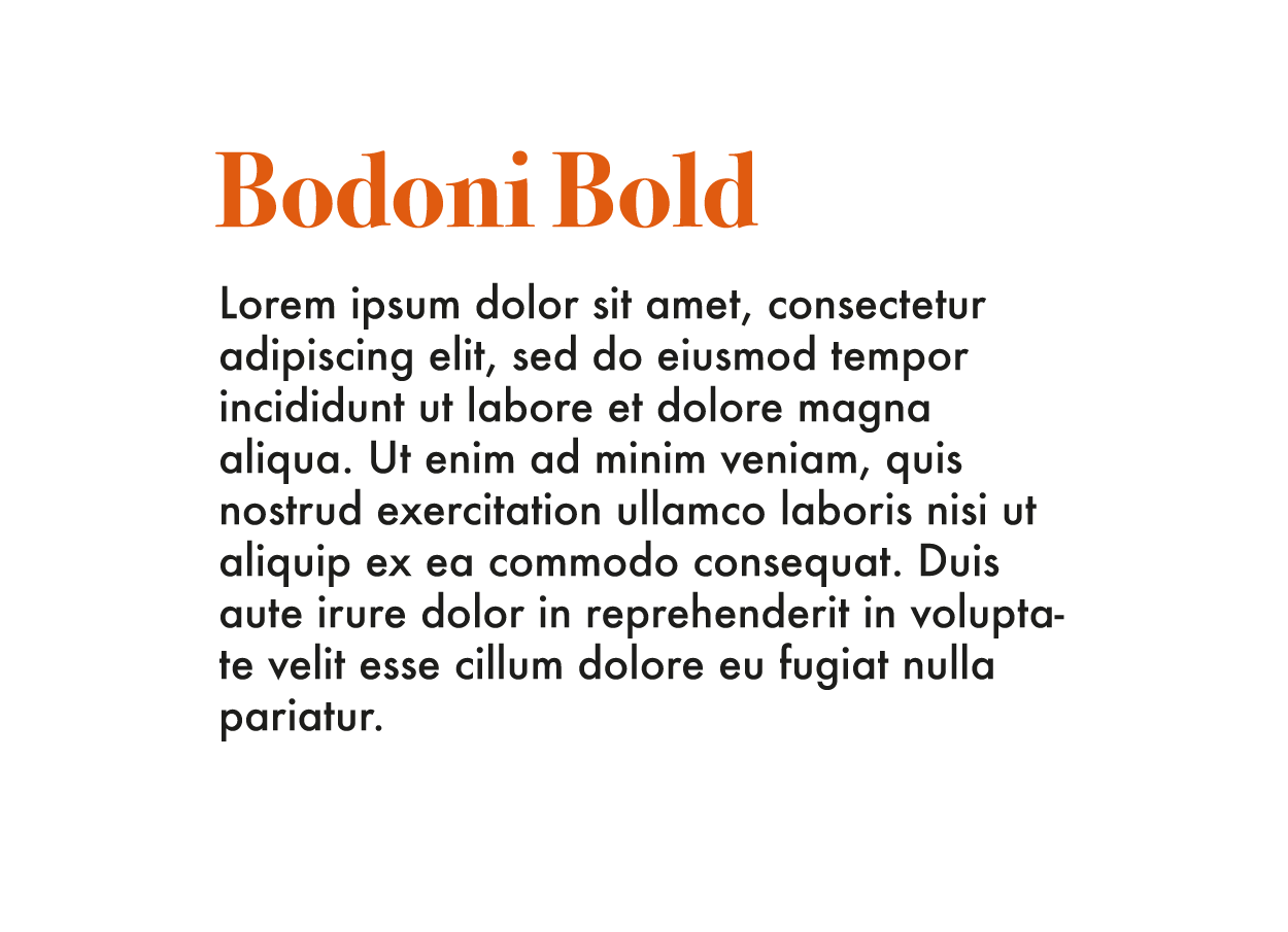
The Futura family, made up of sans-serif typefaces, was created in 1927 by Paul Renner, one of the most important graphic designers and typographers in history. Based on geometric shapes and in line with the Bauhaus style, this typeface family continues to be one of the most used. So much so that well-known companies and entities such as IKEA, Volkswagen and even NASA have used it at some point in their corporate designs. If you want an elegant and attractive combination, I recommend that you try to use the Bodoni bold, serif typeface that will sound like the logo of Vogue magazine, next to the Futura Medium for texts of lower hierarchy.
Black File
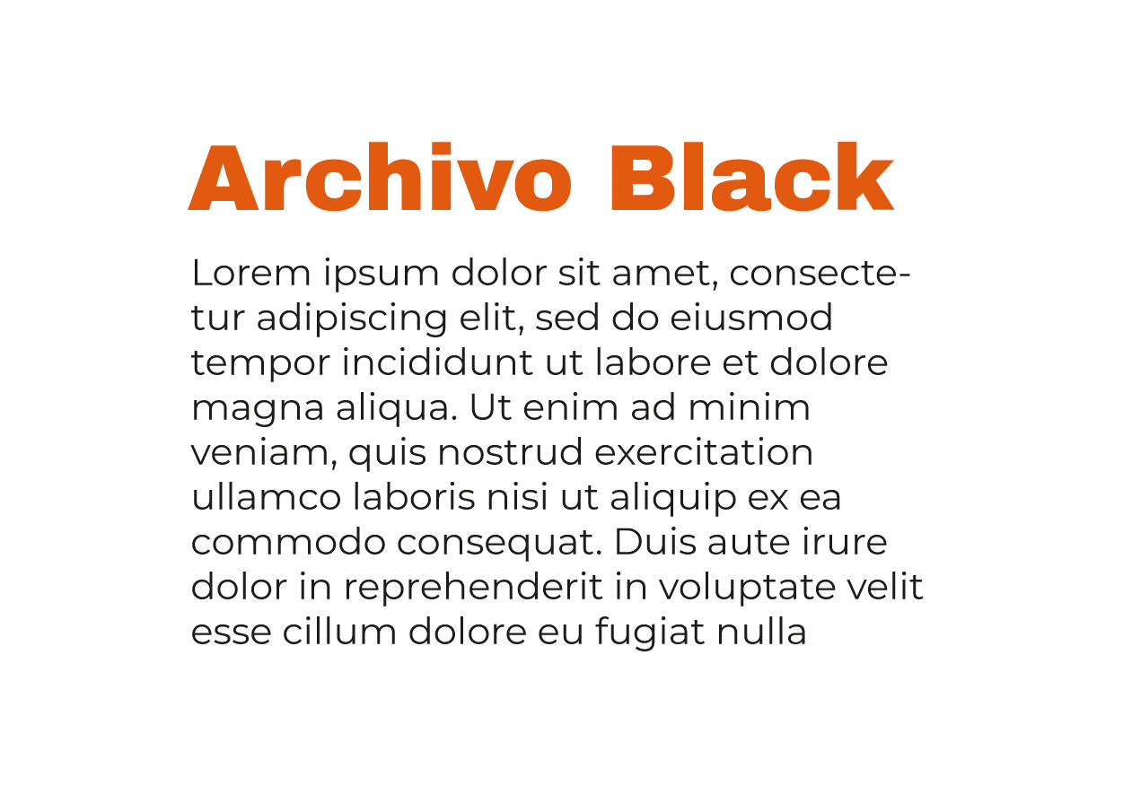
Black Archive is a sans serif font from Omnibus-Type, a font distributor that makes free and free fonts available to the user. What I like the most about this font is that works great on paper and web. Therefore, if you are looking for fonts for a project that is developed simultaneously on these two media, this font could be a good option. Usually, I don’t usually combine fonts that look alikeIt is too risky a decision. However, I have to admit that I quite like the combination of the Black file for titles with the Montserrat for the body of textOr, from my point of view, it works.
Drink Neue
This typeface is one of the ones I use the most for headlines. Created by Japanese designer Ryoichi Tsunekawa, it is a font that stands out for its elongated shape and simplicity. The only drawback I find is that only have capital letters, so you will not be able to use it for text bodies, It is intended for short sentences, headlines, slogans… However, the family has different styles and is very versatile, it is difficult to combine it badly, it looks good with very different fonts, from serif fonts, such as Georgia, to sans serif typefaces, such as Montserrat Light.
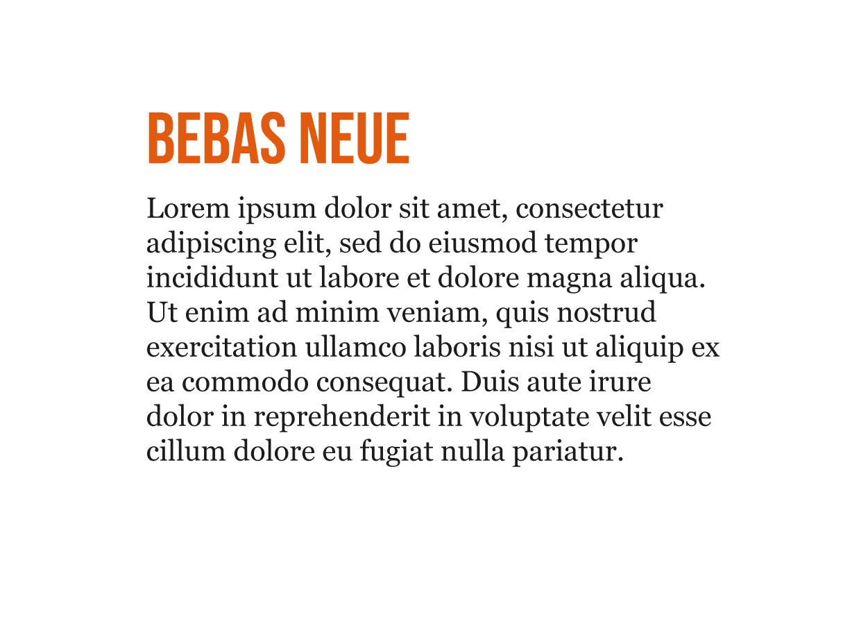
Bebas Neue + Georgia
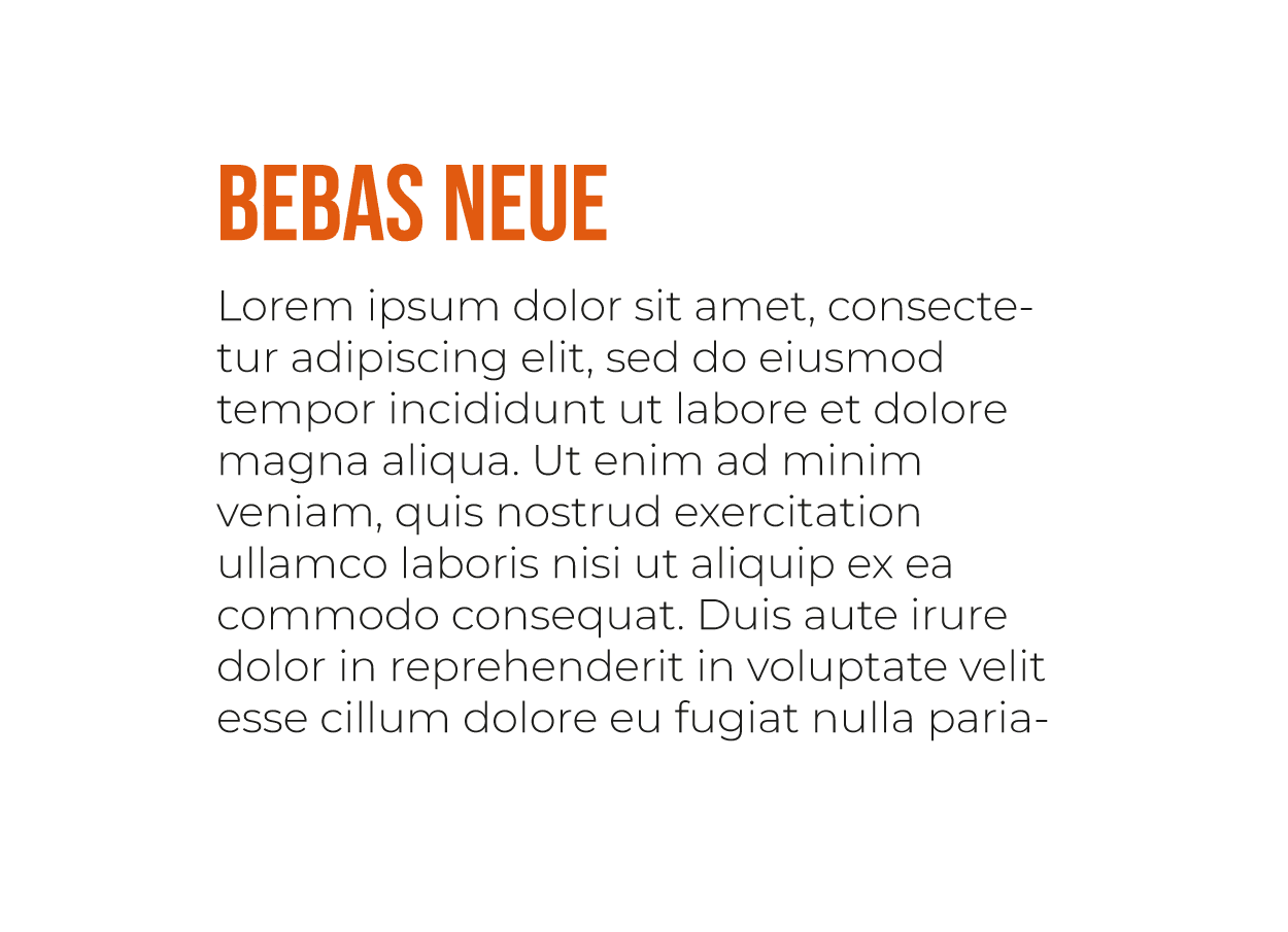
Drink Neue + Montserrat Light
Univers
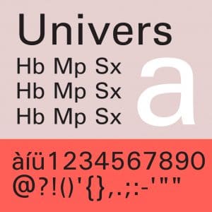
This wonderful typeface family was created by the Swiss Adrian Frutiger in 1957. It is one of those fonts born in the context of the renewal of the typographic style and the revaluation of sans serif typefaces. It became highly recognized at the end of the 20th century.
The Univers is a clean geometric typography, has a lot of presence, so it is very good choice for your headlines and blends seamlessly with more classic serif typefaces such as those based on the Caslon or la Baskerville.
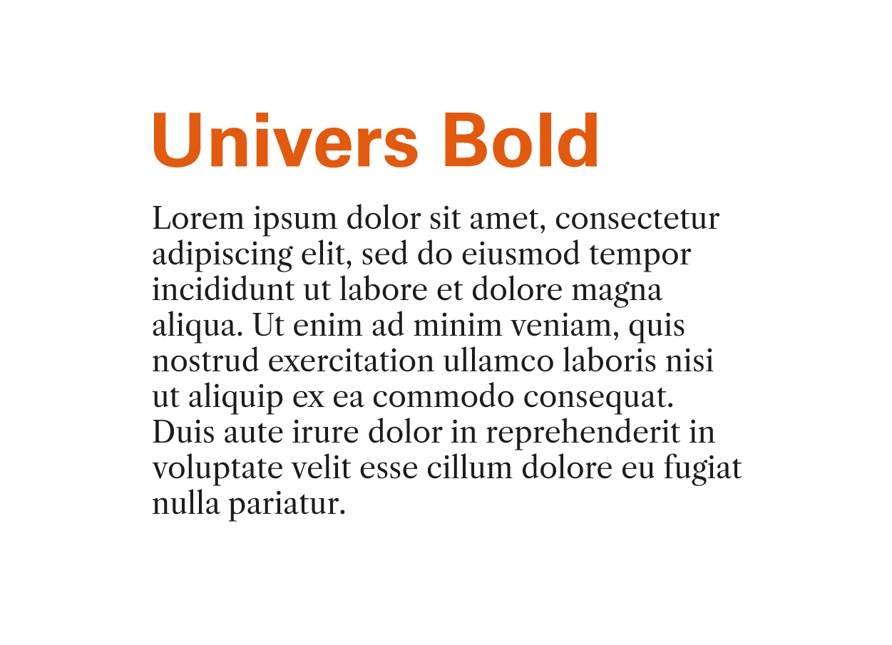
Univers Bold + Free Caslon Regular
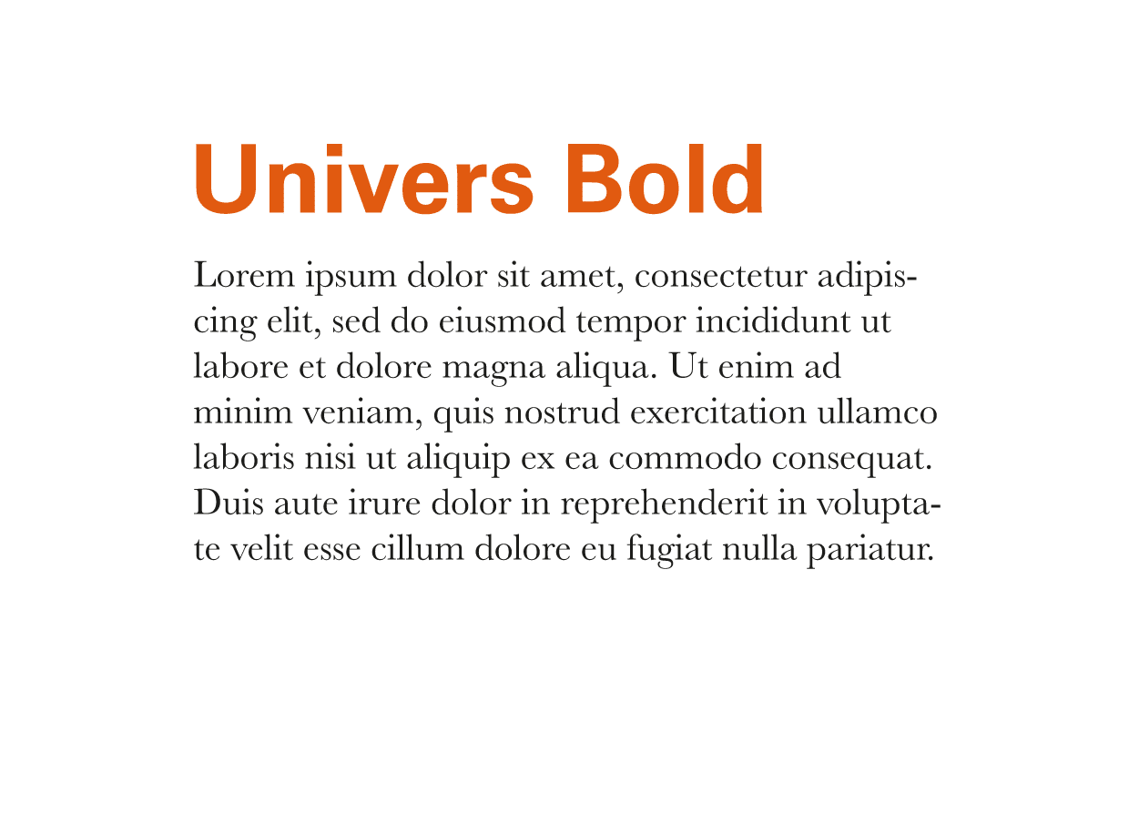
Univers Bold + Baskerville
Helvetica
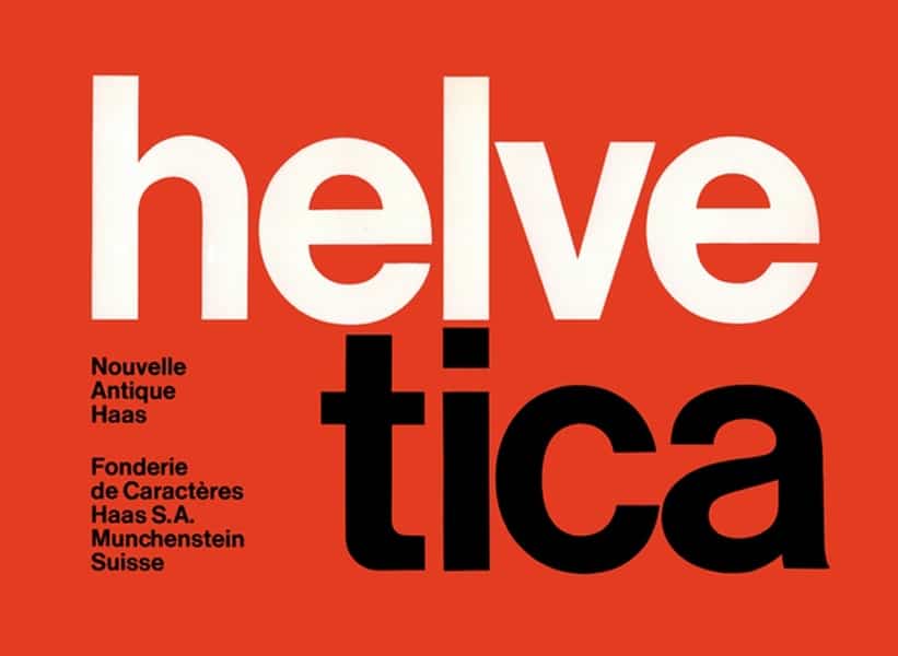
Helvetica is another of the typeface families that appeared in the 20th century to stay in our lives. It was created in 1957 by typographers Max Miedinger and Eduard Hoffman on behalf of the Hass foundry, which sought to modernize its sans-serif typefaces.
Today it continues to be one of the most used fonts by graphic design professionals. Big brands like Jeep, Toyota or Panasonic have used Helvetica in their logos.
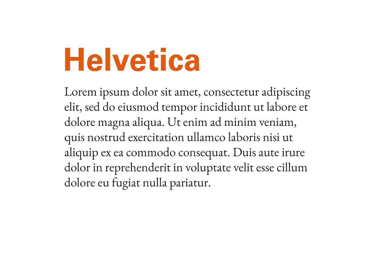
Is a very versatile typeface family, sans serif and rounded. It has many styles of different weight, so its use is very versatile. A combination that I use a lot is Helvetica, for headlines, with the Garamond, for body text.
Roboto
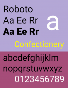
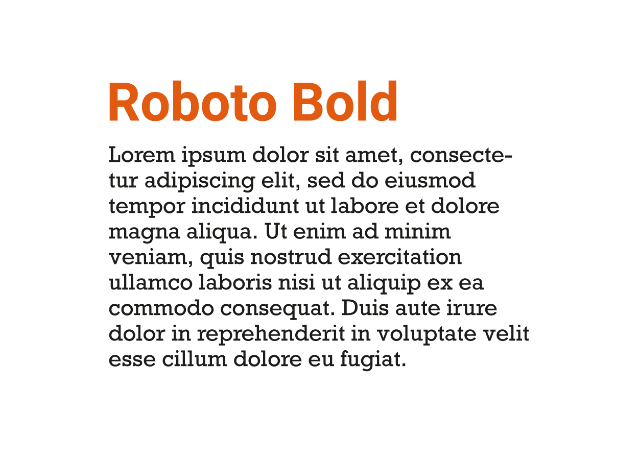
I’ll close my list of 7 modern fonts with the Roboto. This family of sans serif fonts was created for Google by interface designer Christian Robertson, as the source for the Android 4.0 operating system. What I like the most about the Roboto is its readability and what is a relatively easy to combine typography. In addition, it is one of the most used fonts on the internet, so, being present on numerous websites, it gives us a feeling of familiarity that can play very in our favor if we implement it in our designs. Combine a sans serif typeface, such as Roboto, in a chunky style with a serif typeface such as Rockwell I think it is a great success.
Remember that the list of 7 modern fonts that I offer you and the hints on how to combine them are just some suggestions that can serve as inspiration. The choice and typographic combination it is a task that requires testing and testing, until you find sources that harmonize perfectly. Thus, I recommend that you experiment and look for the combinations that are most useful, personal and appropriate for your projects. Use simple rules, look for contrast, take into account the hierarchy of the texts, take care of legibility and, above all, unleash your imagination to create your best design.


