Who would have thought that Adobe already has more than 50 apps or programs. And it seems that it has started with the renew your own brand identity and that carries a new and refreshing logo.
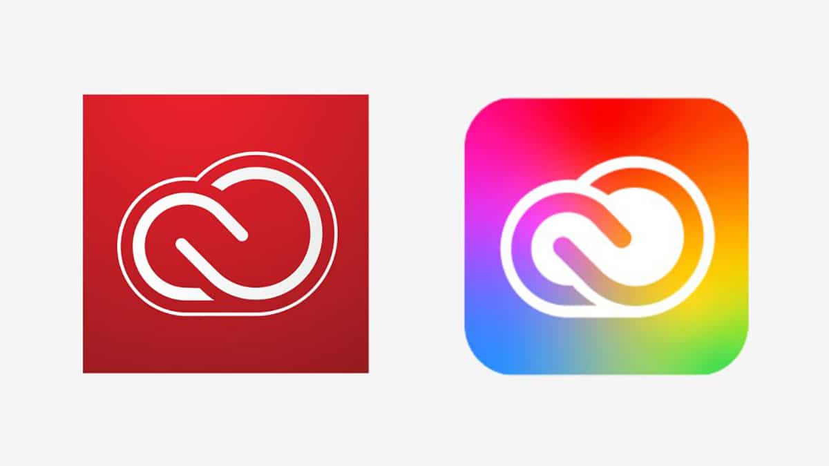
Yes now we have an Adobe logo With a greater bet on red, the Creative Cloud logo becomes more colorful and with which it is intended to express the great diversity of its suite of programs under monthly subscription.
It has caught our attention all that colorful and bright Creative Cloud and with which it includes all those programs with which we can unleash our creativity. Adobe’s own goal is to bring identifiable product brand colors to those Photoshop, Illustrator, and more.
The main Adobe logo takes on a “warmer” shade of red to be more modern and contemporary, and like other brands it is renewed to keep up with the days that we have.
But they are a lot of apps that have received noticeable changes to go further if it fits in the curves of Adobe Acrobat Reader with that ‘a’ that leaves no one indifferent.
In general terms Adobe has commonly applied some changes to all their logos such as removing the corners and the addition of rounded edges to those logos that were angled. Adobe has also made it clear that it wants little by little to use color to differentiate the different categories of apps. In other words, categories such as Video & Motion will be grouped under a color in order to differentiate their different tools or programs.
Adobe has been updating for a few weeks with important news with that new color wheel in Adobe Color.


