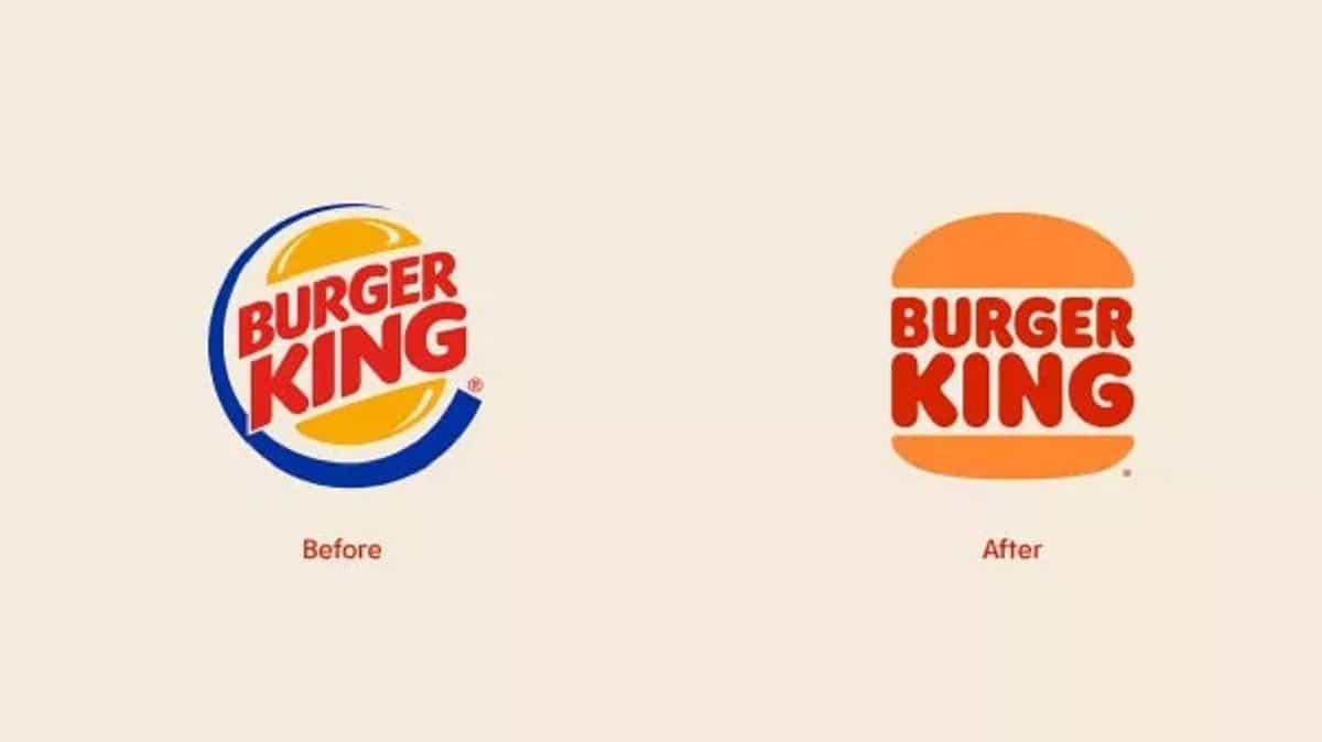
The spot colors have taken center stage in recent years and it is perhaps for this very reason that Burger King has made a “rebrand” of their logo to leave us quite astonished by how well they have used that way of understanding design where shadows and other artistic tasks do not fit.
And is that the company in charge of bringing us that well-known fast food who are in charge of supplying from their establishments, is in the task of bringing new visual melodies to their brand.
Of course, with those flat colors as the central axis, the retro appears back for a series of images that show us the great touch in the even design of a new typeface with that “bold” that takes so much prominence.
We must also add that custom color palette Which takes us directly to the psychedelia of the 70s (yes from those movies like Easy Rider).
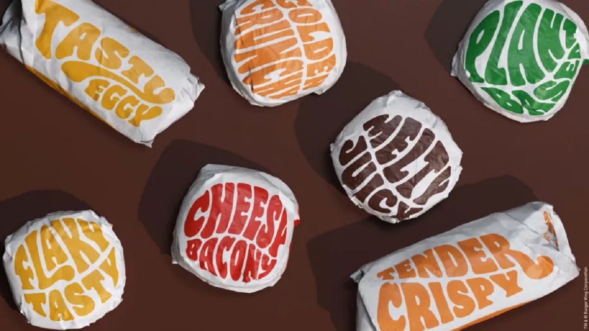
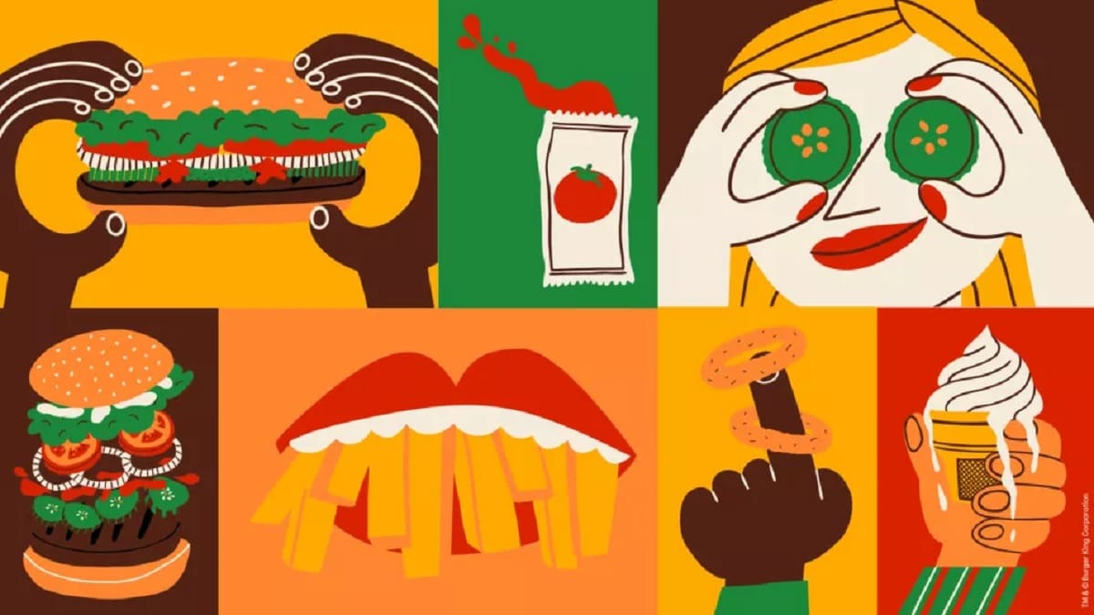
The Jones Knowles Ritchie agency is in charge of the “rebranding” from Burger King, and it is that it has brought with it a new packaging, menu design, merchandising, decoration and even everything related to social media.
And for those who they are a few years old, this new logo has its very close similarities to Burger King’s 1969 one. So we find a new logo in which the two words are the content of that hamburger so rich in the visual and that stays with its two emblematic colors.
The old blue disappears and we go to a new packaging with that typeface so “psychedelic” that to tell the truth, it hits a lot for Burger King. That font is «Flame» and it is inspired by the same visual aesthetics of its most emblematic dishes.
The flat colors take Burger King back to the 70s so that we want to drop by their restaurants or order something at home to spend these days of snow in these parts. A year in which Burger King has had some curious proposals like those masks …


