When presenting a work in class or when you need to present a project at a professional level, have eye-catching visual supportWith a touch of design, you can make the messages you communicate more attractive and therefore, your work will have more value.
However, and this is no secret, sometimes we are so caught on time that we do everything at the last minute and we do not stop to make a proper slide that can help us to capture the attention of our receivers.
There are tools that are great to get us out of this kind of trouble. I resort a lot to Canva, this app, available online without downloading, is a simplified design software that will allow you to create presentations, infographics, posters and other elements in a very short time and in a super simple way, through templates.
In the post of today I will teach you to create more attractive presentations for your Canva jobs and I’ll give you some tips to get the most out of this app.Keep reading this post and say goodbye to boring slides!
Table of Contents
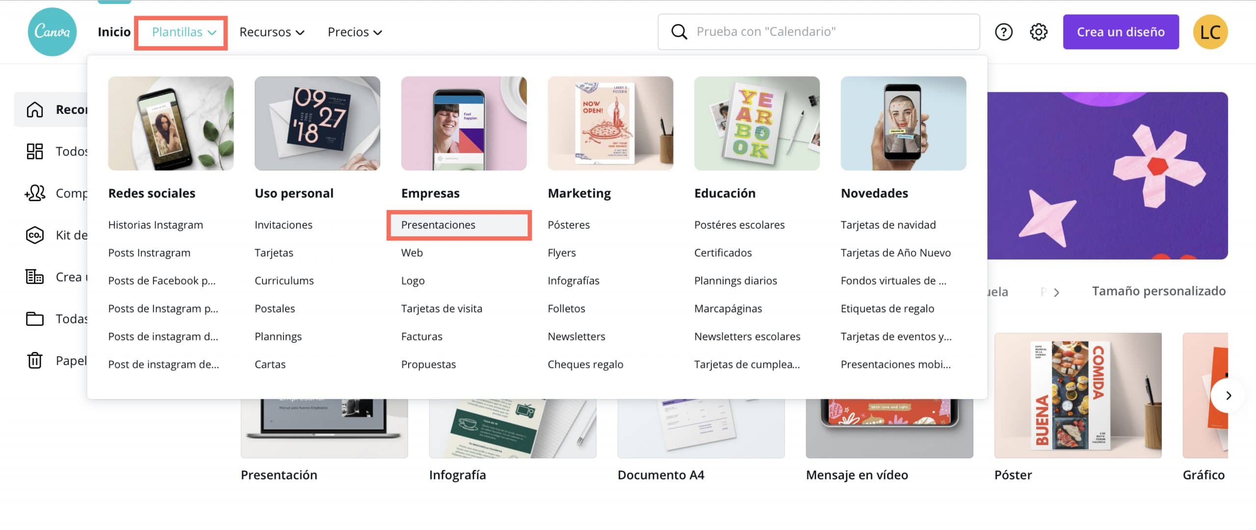
Choose a suitable template for your work
Canva offers endless templates and the designs are very well done. With perfectly distributed spaces and well-harmonized colors. Therefore, to take advantage of the potential of this app, the ideal is to choose a template that matches the needs of your work, in order to make the least possible changes. You can even filter by color, to see what designs fit the identity you had in mind.
You will always be able to change the templates promptly to customize themYou can even change the design colors based on another palette. This will be very useful if what you are presenting is a brand or your own product and you need to adapt the presentation to the colors of a corporate visual identity.
Add slides that help count the content
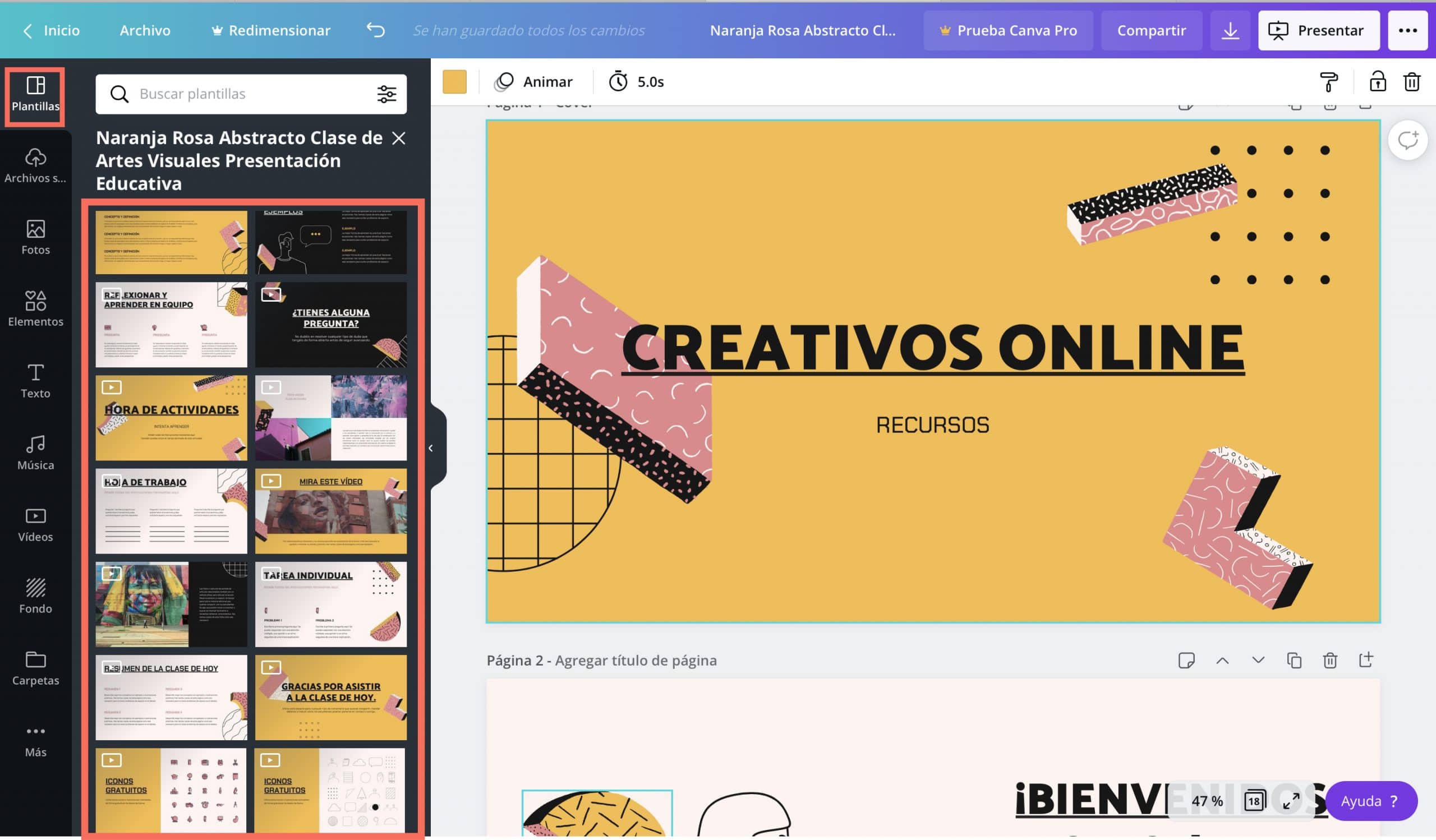
When you choose a template, In the “template” tab Canva shows the different slide layouts that exist for the model you have chosen. Now it’s a matter of reviewing those options and seeing what type of slide helps you to better count your content.
One of the most typical problems we make when making presentations is putting too much text. By having a template with limited space, we will also be forced to select what information is important and we will tend to summarize better.
Take advantage of Canva resources
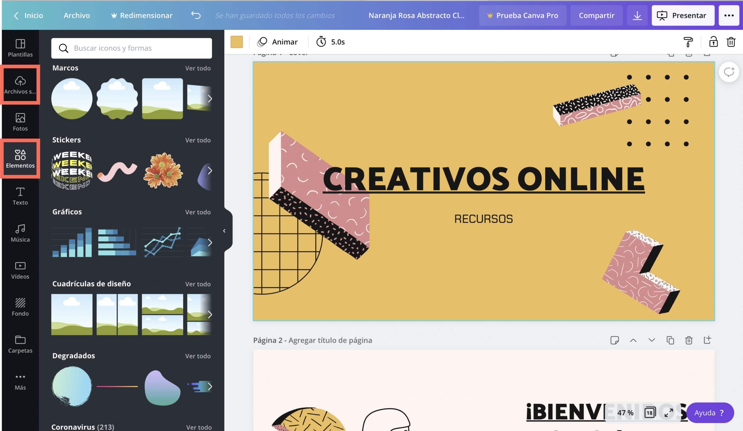
Canva offers a lot of resources for free, from illustrations to general images, and even videos. You can take advantage of these resources in your designs and combine them with images, logos or elements of your own creation. To access Canva resources you just have to click the elements tab. If you want to upload your own resources, click on the tab “Uploaded files” and simply by dragging what you want to use or accessing your computer you can upload the contents and elements you want to the Canva cloud.
Canva enables teamwork
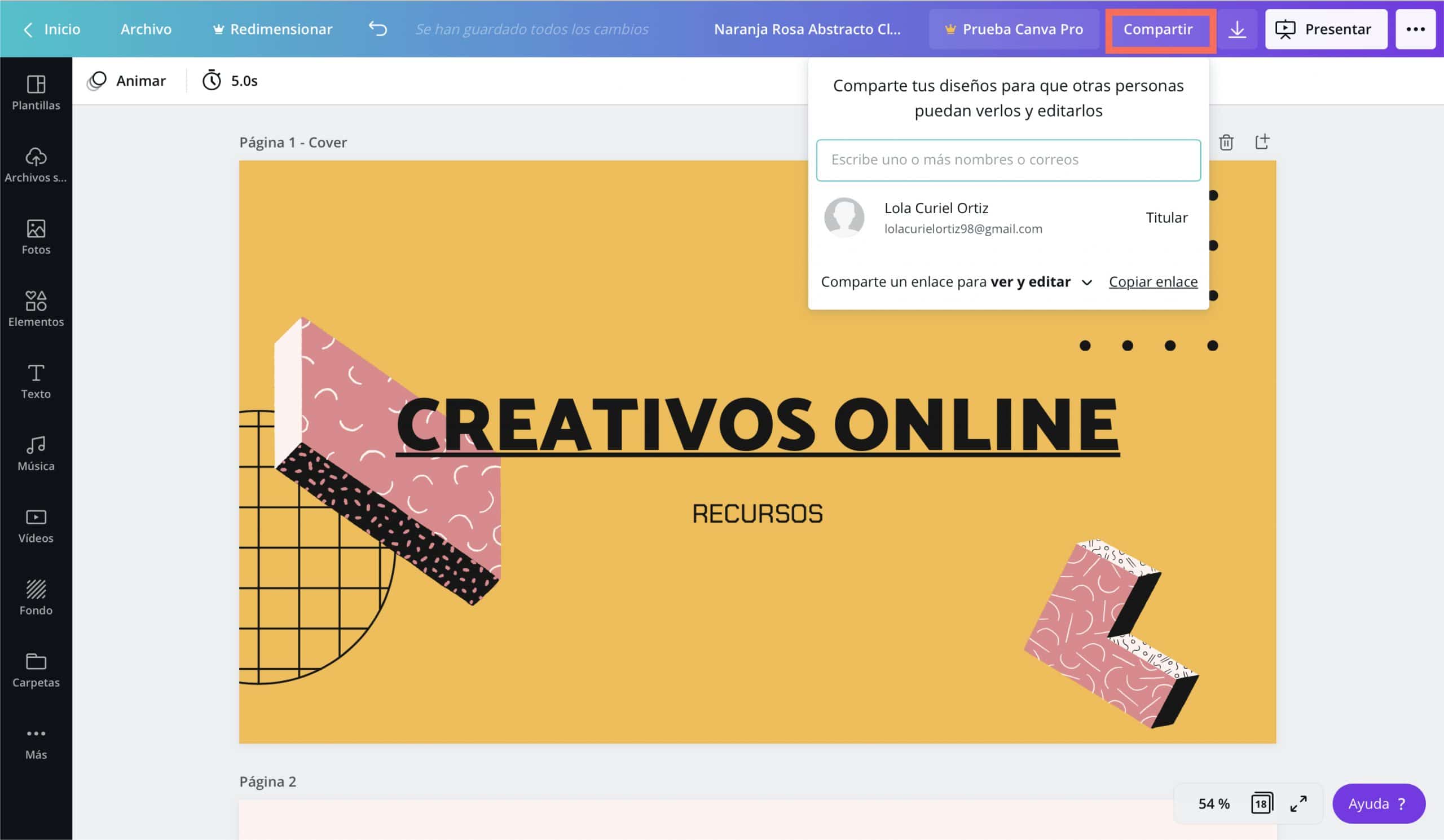
If you work as a team, Canva is also a tool that can be very useful when organizing collaborative work. In a very simple way you can give others access to your presentation and enable them to edit.
To do it, you just have to press the «Share» buttonat the top of the screen and enter the email addresses of the people you want to work with. They will be able to access and you will be able to work simultaneously and from totally different places.
How to save jobs
Canva automatically saves everything you do on your profile, so you won’t have to worry about losing the presentation. It stays in the cloud and, from anywhere, by entering your username you can access all your designs.
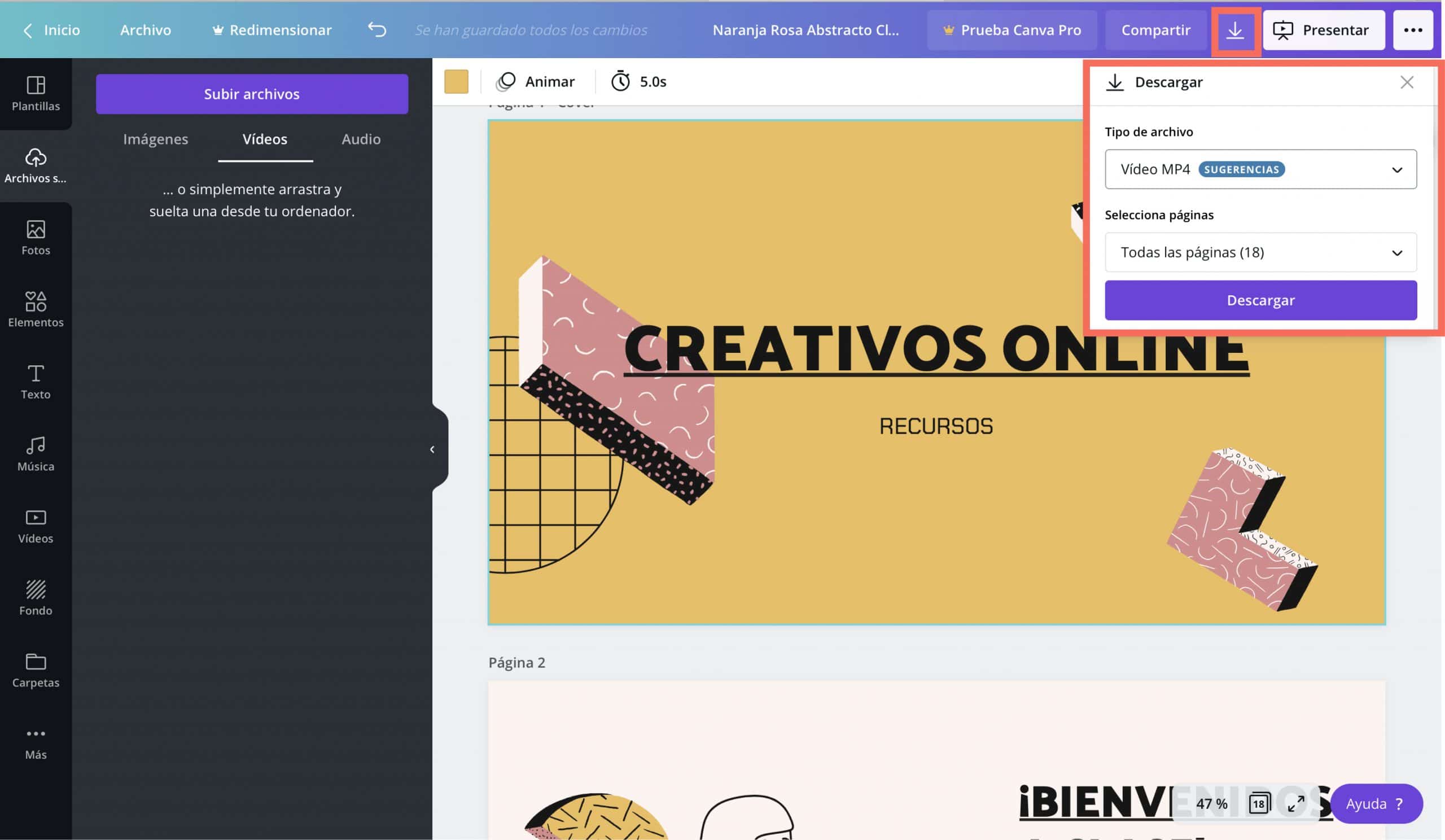
However, if you want to have the presentation on your computer, either because it gives you more security or because you need to send it, Canva save in the following formats: PNG, JPEG, standard PDF, PDF for printing, GIF, MP4 video. Keep in mind that if your design has some kind of GIF, video or animated image, if you save it in PDF the movement will be lost. Review your design and choose the format that is most useful to you.
Tips for creating a good presentation
So that you can squeeze the full potential of this incredible tool, take into account this small guide that I am going to offer you to create creative presentations that hook your receivers.
Everything communicates and if it does not communicate better, do not put it
Every element you introduce on a slide should communicate a message. If you introduce elements that are merely decorative, you should be careful and do it with some measure because you can confuse your recipients and your message could lose force.
In fact, if you work with Canva, I would recommend that you try not to use illustrations and decorative images and that you limit yourself to adding these resources when they have something related to the information you are giving. The templates in Canva are already decorated enough, so I don’t think they need much more.
If you fill your slide with text, you will saturate your receivers
As I said before, it is one of the most common mistakes. When we create a slide, sometimes we have so much to tell that we start writing and fill an entire page with explanations. It is not necessary and, what’s more, it could negatively affect your presentation.
When as receivers we see a slide full of text, our brain tends to disconnect. We directly thought: “What a sheet they are going to let me go” and we listened to the presentation with the preconceived idea that it was going to be too heavy and intense.
To avoid that, try to transform your text into key ideas and relate the fundamental concepts of your explanation with images and illustrations that represent what you are going to be telling. Visual communication can be very powerful and in many cases, a symbol, a photograph or a drawing can communicate much more than a sentence. Not only will this help your recipients follow the story better, it will serve as a script for you when it comes to speaking.
Filters, an ally to harmonize images
If you use images from image banks, and even the images that Canva offers you, their treatment may be completely different. A trick that I find very useful to give continuity and harmony to the design of my presentation is to put the same filter on all the images. I usually play a lot with black and white.
eye! This does not always work, you would have to try a filter that looks good with all images and there will be jobs where you will not be able to do it because you need to show the image as it is.
Find the balance
It is inevitable that, when building an exhibition, there are points that are much more extensive than others. Nevertheless, you should try to balance the weight of your slides and not have some very loaded and others practically empty.
If a point is very long, divide it into two parts. It will also help your receivers to follow you, when you change slides, you attract their attention and if someone has gotten lost they could re-engage.
Make your identity clear, but without drowning out the main motif of the slide
If you are part of a company or if you are trying to sell your own project with the presentation, you need to make your identity very clear. Enter your logo And if the content allows it, you can even design based on the colors of your company or your personal brand.
However, if what you are trying to sell already has its own identity and your corporate identity is very far from what you say, it is better to go into the background, so as not to downplay the message. Insert your logo, as a signature, in a place that does not steal too much attention and prioritizes the main reason for the presentation.


