Adobe Photoshop offers amazing blending tools. If you know how to use it and if you pay attention to detail, with them you will be able to create endless very realistic effects. In graphic design, as in fashion, everything comes back and this year we have witnessed how the 80s aesthetic became a trend again. Striking colors, dark images, different textures, neon lights, these elements have flooded posters and advertising campaigns, taking us back to the decade of transgression.
Neon lights are a classic of advertising from the eighties, so I wanted to recover them for this post. A) Yes, I’ll show you how to create neon text with Adobe Photoshop in 5 easy steps.
Table of Contents
Select a suitable background
Although it is true that you can apply it on different colored backgrounds, if you choose a dark background, the result will be better and much more realistic. You can do it directly on a black background, or you can choose a texture. In this case, I have selected a background that simulates a dark brick wall and I am going to work on an A4 size file in a horizontal position.
Selection of font and text size
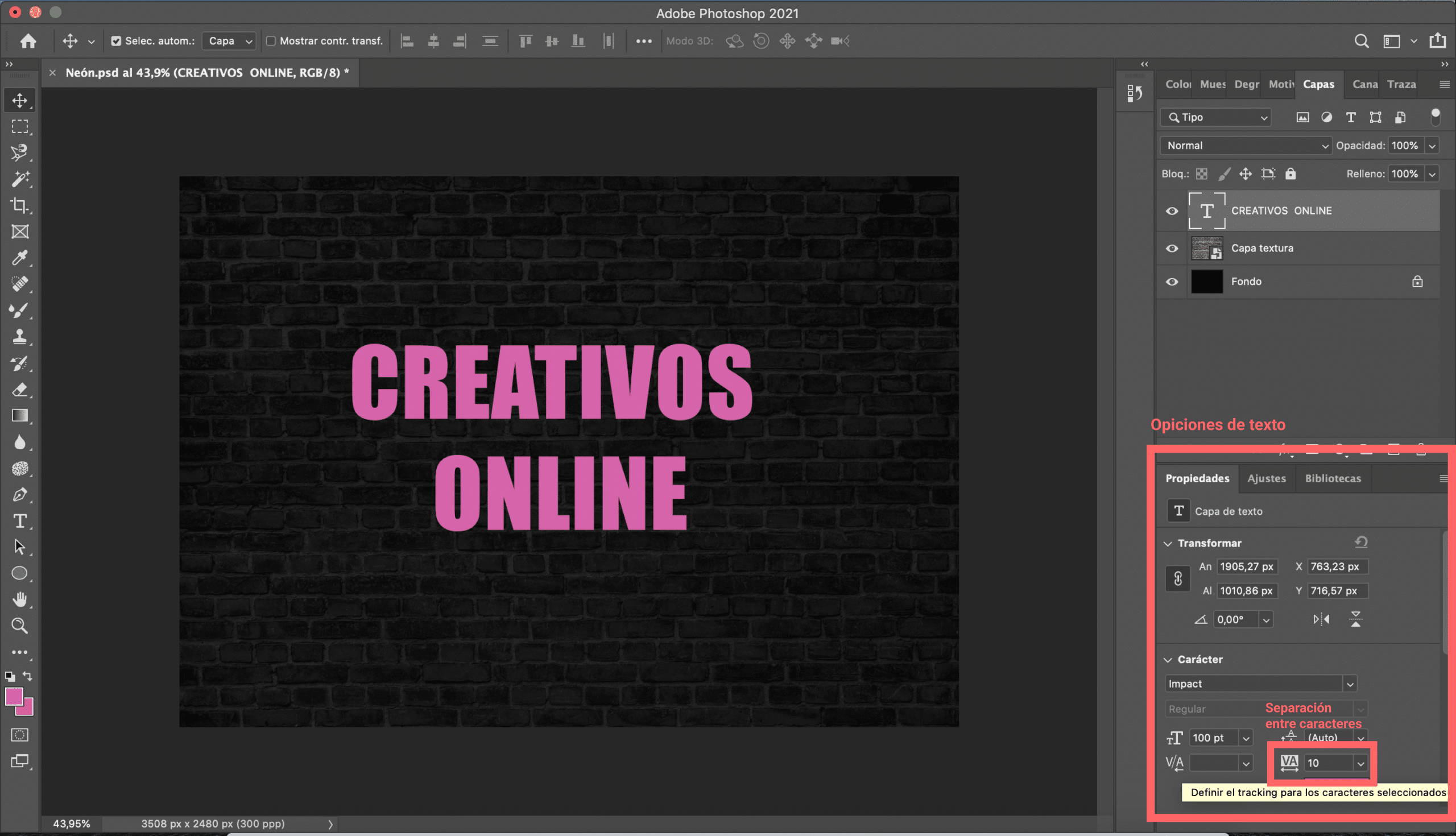
To create your neon text I recommend choosing a thick font, heavy and a bit elongated, no longer just because when applying the effects it will fit you better, but because thick typefaces were very fashionable in the 80s. size, it will depend a lot on the needs of your design and the font you choose. However, I warn you that this effect is not intended for small texts, but rather for big eye-catching texts. Another thing that you must take into account is the space between charactersIf you choose a font in which this default space is very small, you will have to enlarge it. Don’t worry! Now we will see how to do it.
In my case, I have opted for the «Impact» font and I have given him a 100 point size. Since the space between characters was small, I gave it a value of 10 when traking. By altering that value we modify the space between each character.
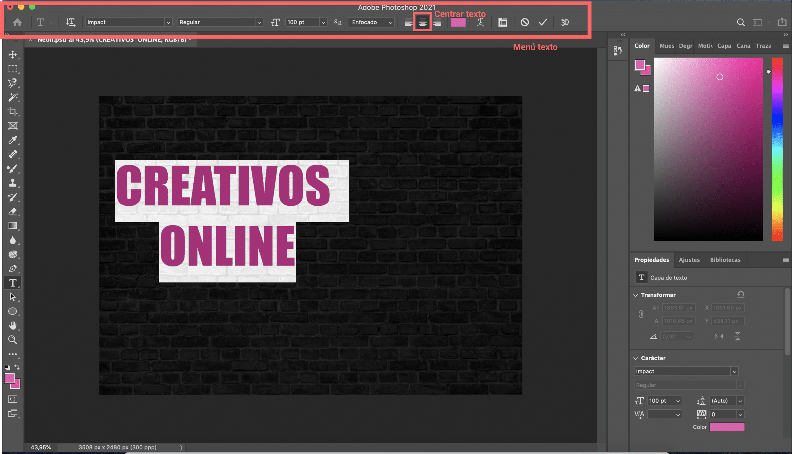
To give this alignment to the text simply I have modified the alignment option in the “text menu” which normally appears at the top of the screen. You will have to select «center text». To place it in the center of the page, press control + T (if you work on Windows) or command + T (if you work on Mac) and you can move it freely.
Modify the style of the text layer
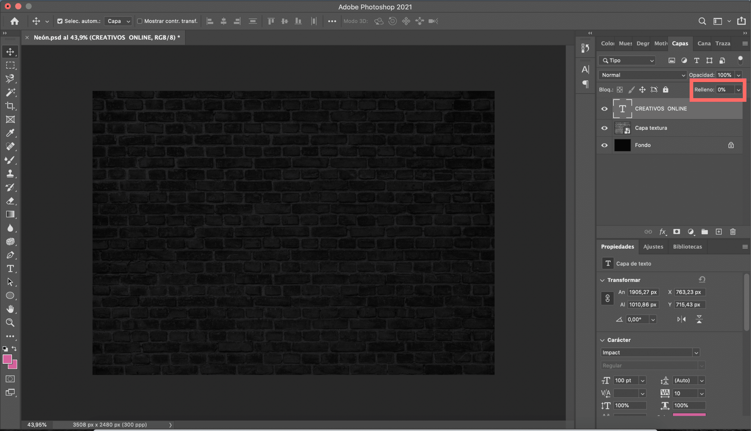
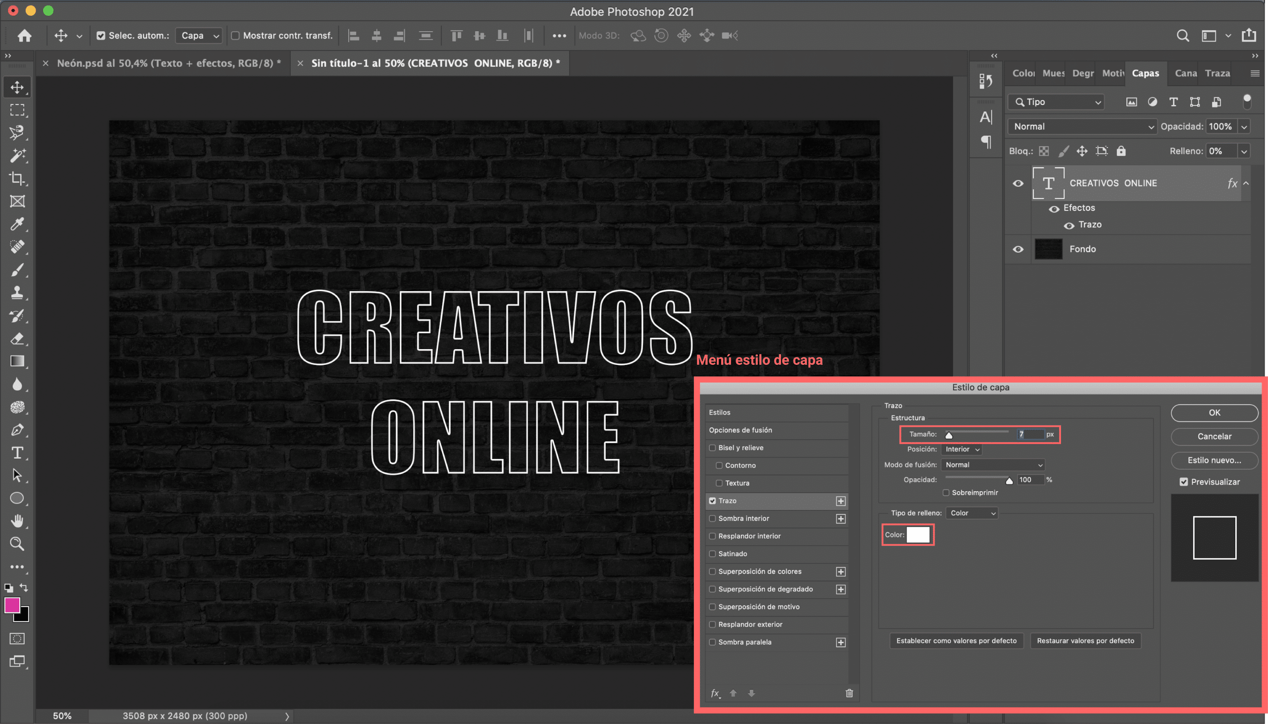
Once you have created your text, what you are going to do is lower the fill to 0%. The text will disappear, but don’t be scared, you haven’t done anything wrong, it’s just what has to happen.
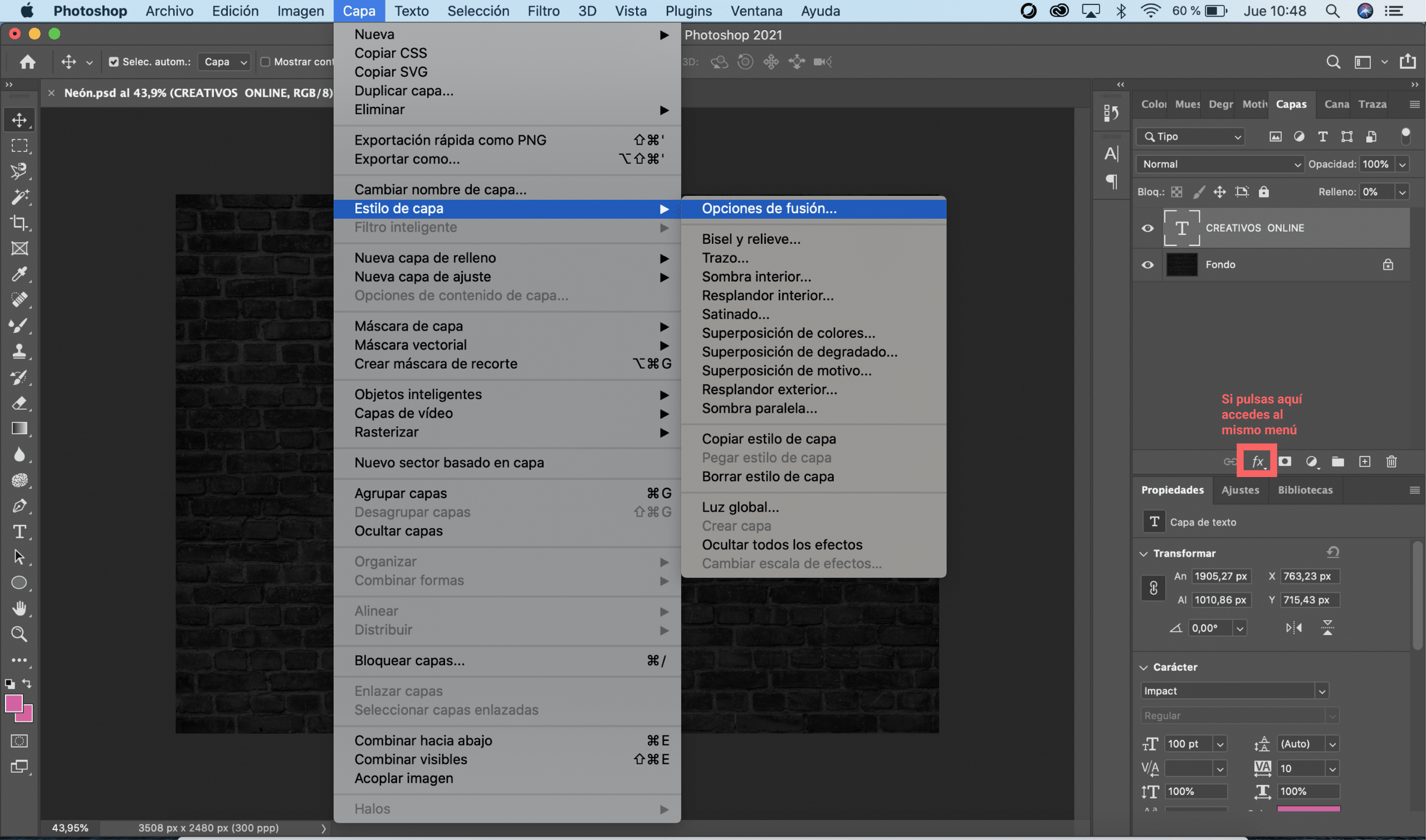
Next, we will proceed to modify the style of the text layer. For this you have to open the layer style menu: hovering over the “layer” tab you will open a drop-down menu, hover over “layer style” and click on “fusion options”. A menu will open, you have to select the stroke option and modify the following elements: size and color. For color select a target. For the size I cannot give you an exact value because it will depend on your typography and the type of font chosen. In my case, I have fixed stroke size in 7, The important is not too thick so you don’t lose readability when adding effects.
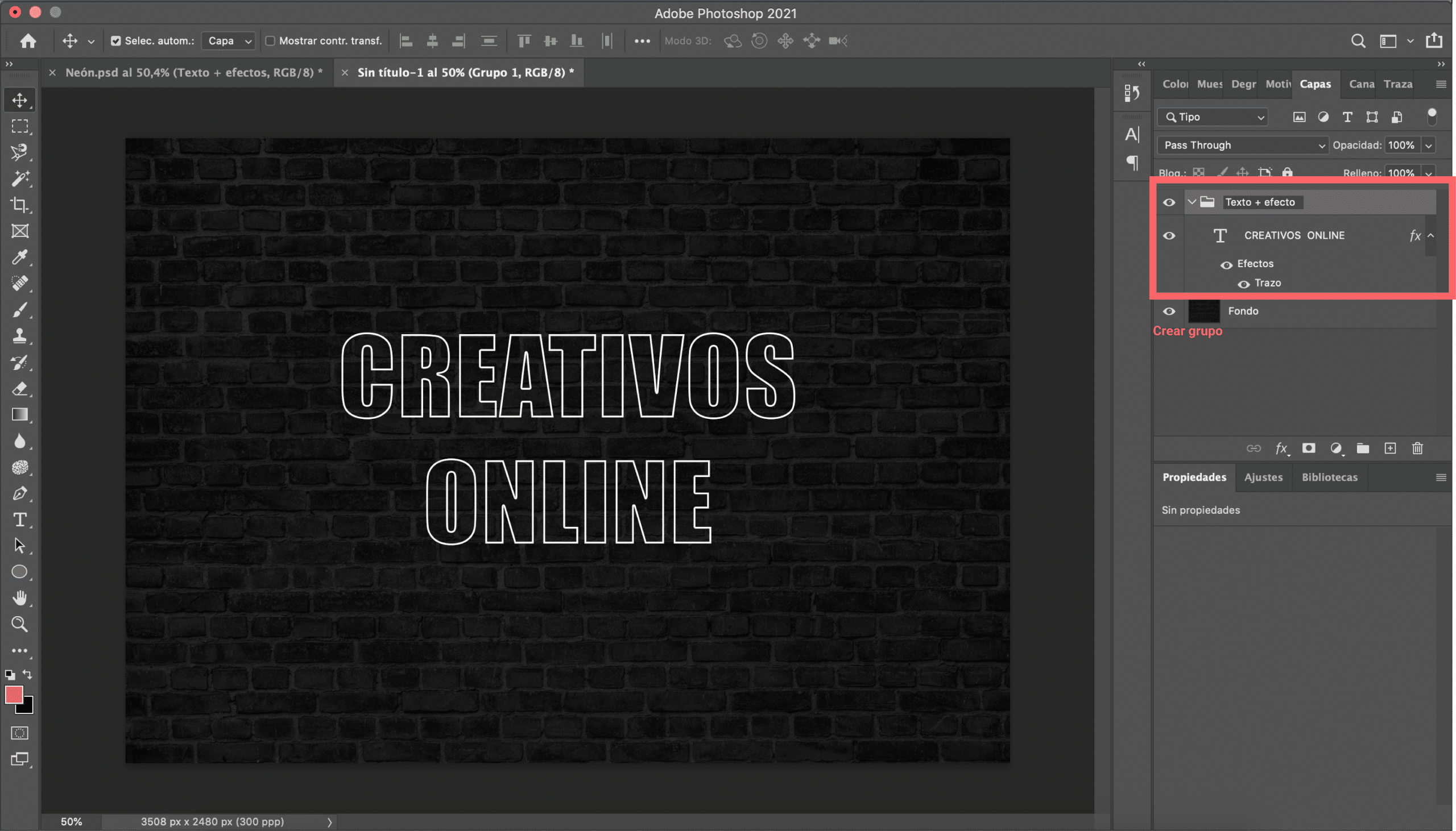
Before continuing, we will create a group with the text and the effects (trace effect). To create the group, simply Choose the text layer and hit command + G. From now on we will apply the effects to that group.
Apply the neon effect
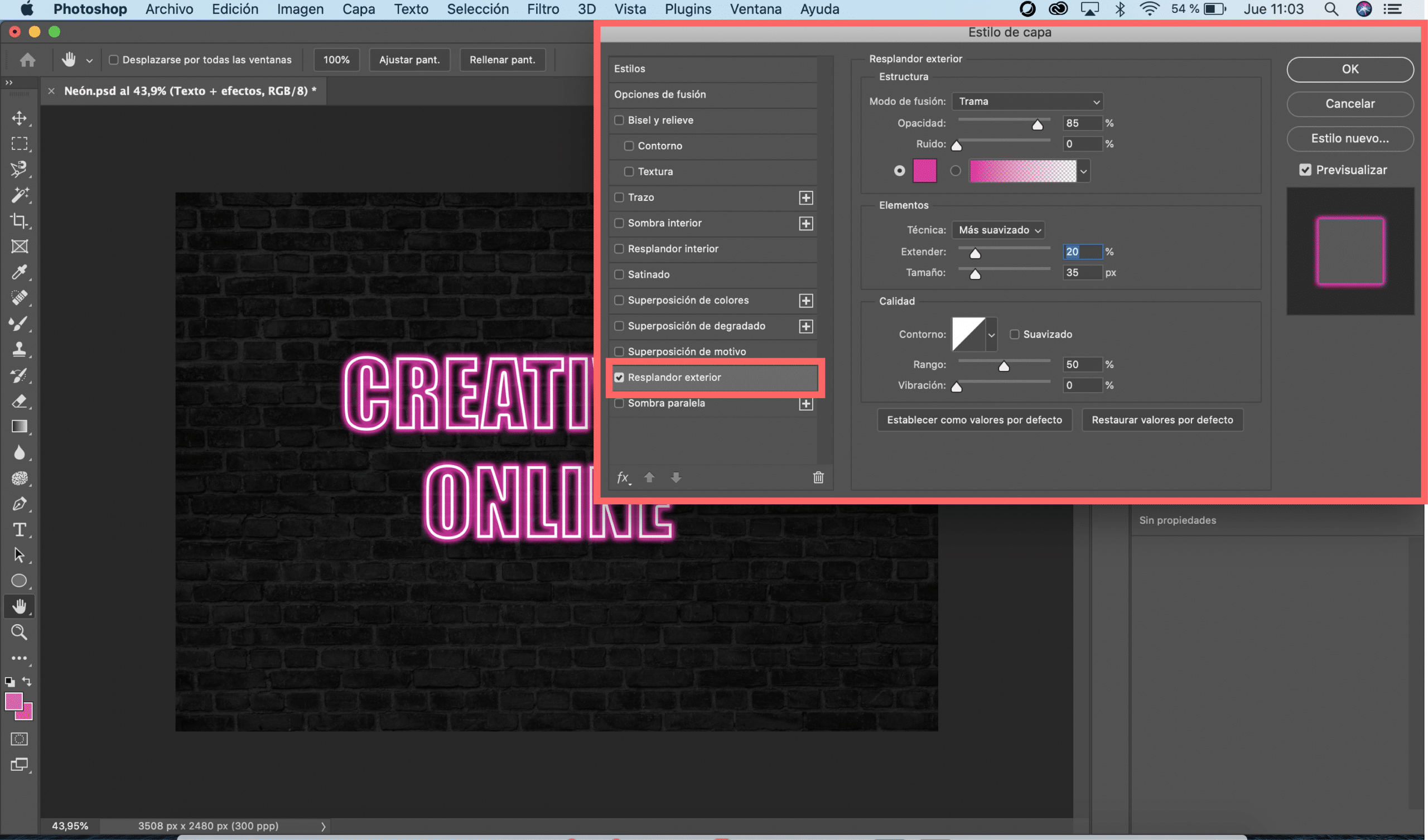
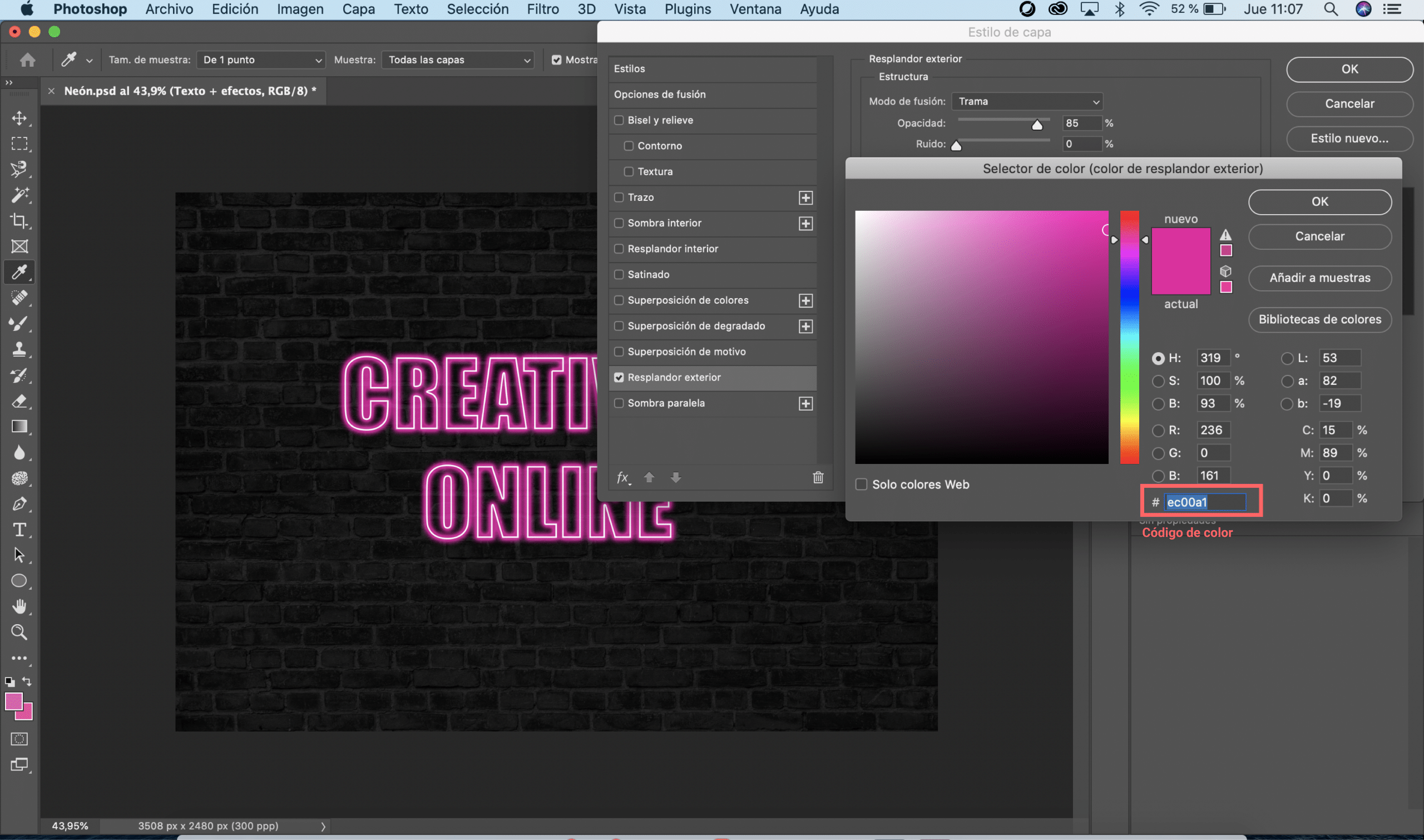
Now get ready to pay a lot of attention because the most interesting begins. Selecting the «group text + effects» we will reopen the layer style menu (Remember that you can also open it by selecting the “fx” symbol). Then check the “outer glow” effect. Once again, the values that we will give to this effect will depend on the needs of the design, activate the option «preview »to simultaneously see how the settings are. In my case, I have opted for a striking pink color and I have selected one 85% opacity. You will also have to choose a technique, I recommend that you select the “smoother” option and adjust the “extend” and “size” values. I leave you below a screenshot with the values that have served me for my design.
Get more realism
As you can see, what we have could already be considered a neon text, but how we want the result to be as realistic as possible I am going to give you some more tips to improve the design. Real neon texts give off light Can we simulate that light with Photoshop? Yes, of course we can and you will be surprised how simple it is.
Select and configure the brush tool
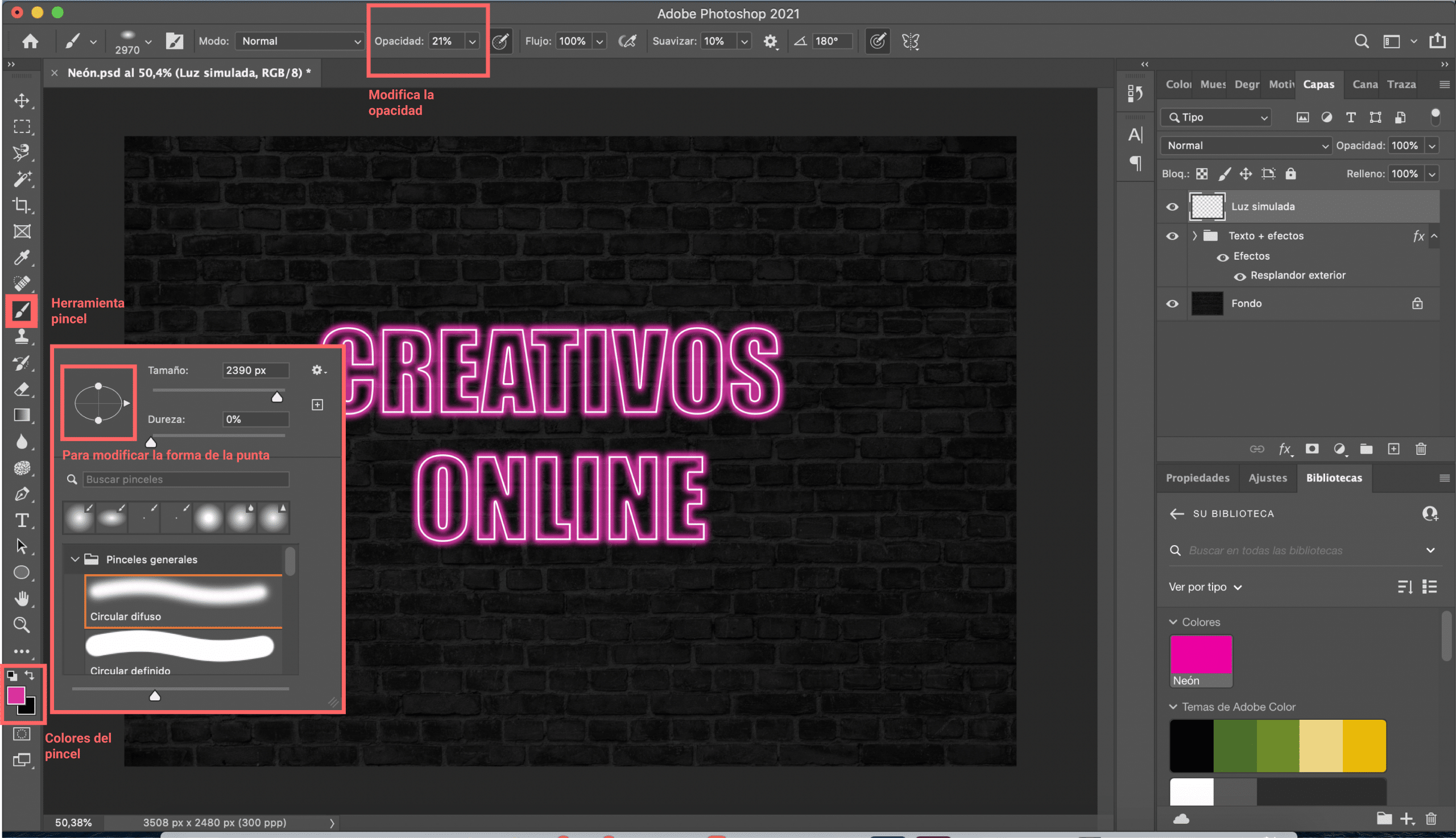
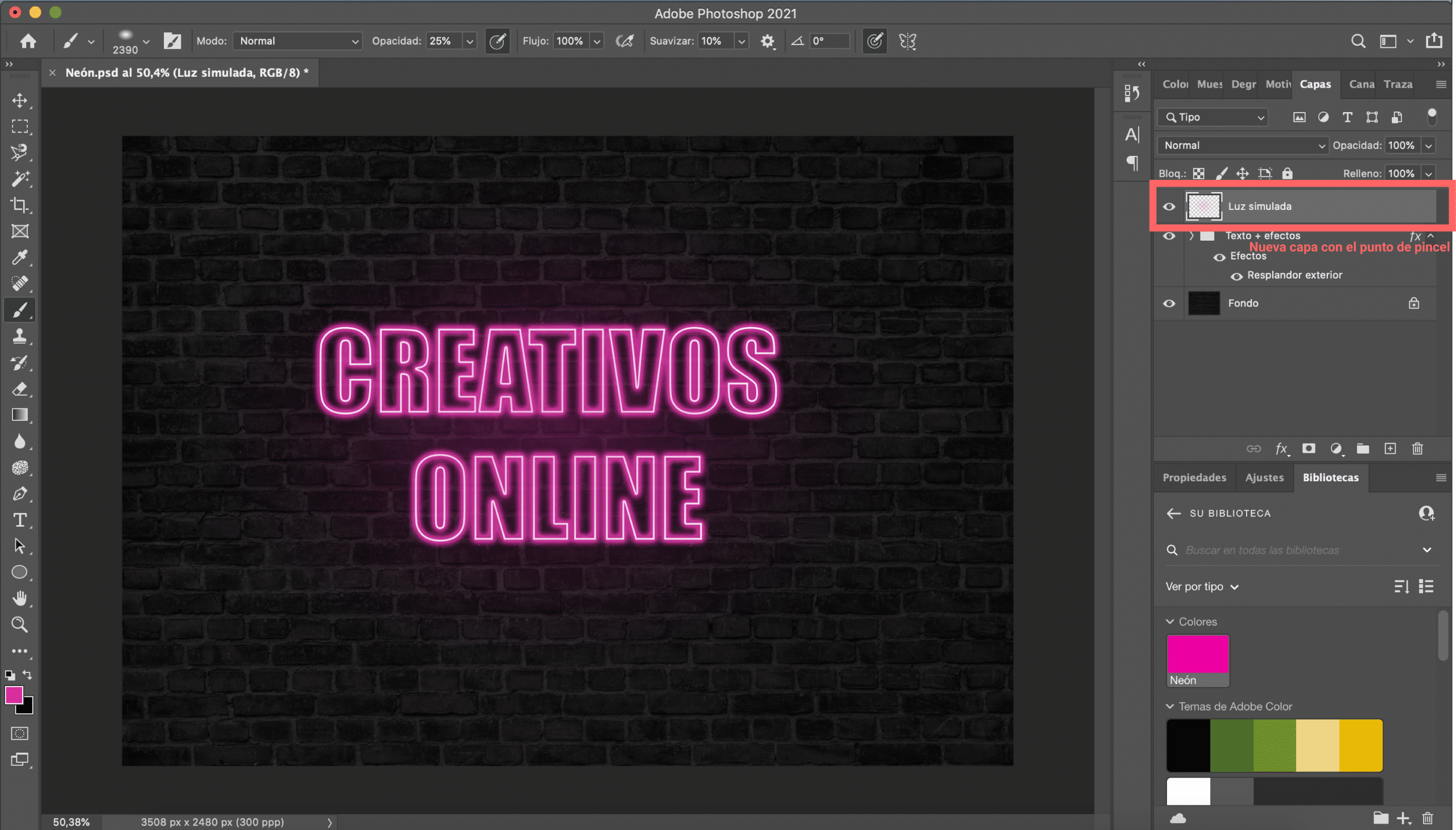
The first thing you will have to do is create a new layer. Then select the brush tool and choose the “diffuse circular” tip. You will have to customize the characteristics of your brush. We will start by modifying the size, the ideal is that the thickness of the tip is slightly larger than what your text box occupies (I needed to give it a value of 2390 px). You will also have to change the shape a bit of the brush, to do this move the white dots present in the graphic of the brush menu, flatten the circle a little so that it better adapts to the shape of your text. We will lower the opacity, this depends a bit on the personal taste of each one, I like that the effects are soft, so I have lowered the 21% opacity. Finally, select the color of the brush, the fill should be exactly the same color that you gave the outer glow (pink in this case). To make the color the same you have two options: you can copy the given color code or add that color as a sample to your library.
Get a soft light effect
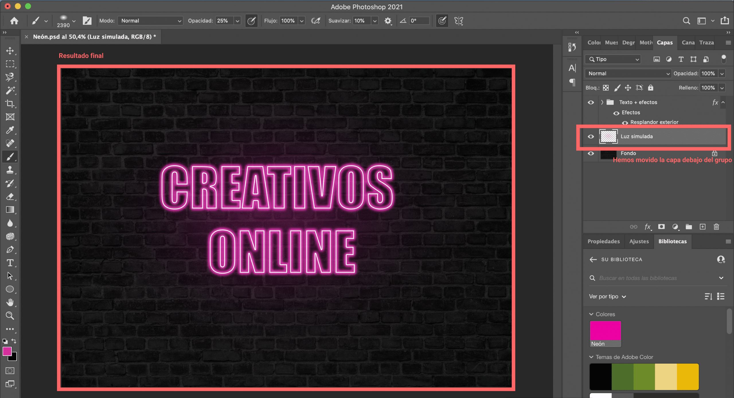
When you have your brush set, just you will have to click in the center of your text to paint a point. That point will already simulate a light, but to achieve a finer result I recommend that you place the layer below the group of “text + effects”. I hope this tutorial on how to create a neon text in 5 steps with Adobe Photoshop has helped you.You are ready to make this design your own!


