
It is true that logos can be confusing by being very conceptual. It is the idea behind these redesigns carried out by a designer, and that taking a look at some of the work, he has ended up redesigning them as it should.
Some they are very popular with logo design, and not because of how well they are made but the other way around, so his proposal has become viral so that it also passes through these lines because of the fun and humor of some of his logos; and for what we should never do.
Emanuele open started fixing the worst logos that he had seen for his project ‘The Worst Logos Ever Redesigned’. They have been nine of the worst logos that he has been able to find to analyze the problems of those logos and put himself in the work of improving them.
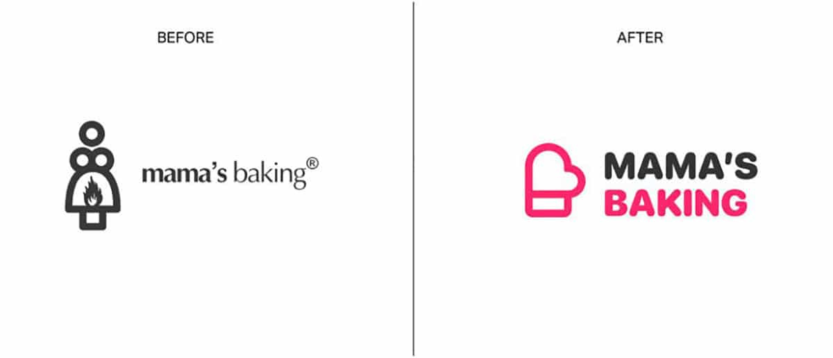
The improvements have been more than evident in some cases. The interesting thing about this work carried out by Abrate is that it visualizes the amount of logos that contain some details that can lead to confusion. The funny thing is that sometimes they are not seen at first, so it is always interesting to share them so that different people can find faults or meanings different from the main idea.

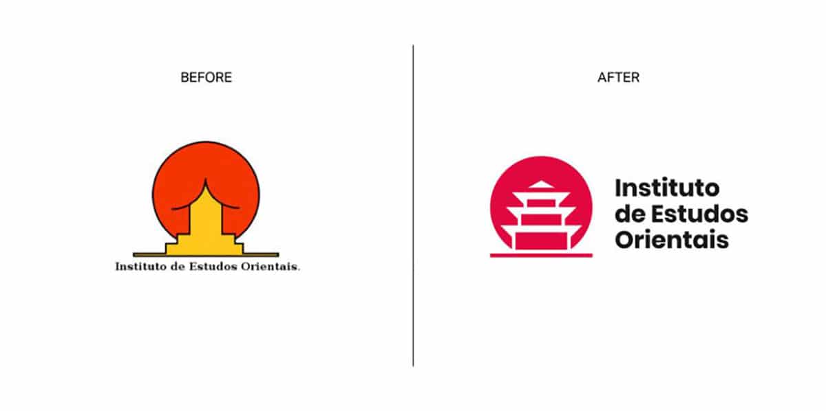
The one that wins the award is the logo design of The Instituto de Estudos Orientais about which it is not necessary to say anything because it already says it all. It is very clear that for this man’s project that logo is the perfect one to design it properly and give the impression that it has to give. Not that one that seems …
But come on, what there are so many logos that it is to take them with tweezers. We are not going to comment on anything so that you can make your own conclusions. But come on, that has also happened to McDonald’s.