Facebook began little by little to give us the possibility to use the dark mode. Now, after seeing it even on Facebook Watch, you can activate it in the settings to enjoy a different experience of the social network.
Just this dark mode comes with that redesign that many have been able to activate to find a better interface adapted to the modern times they play; as if they weren’t anymore (but we know that if you don’t change in a few years the trends will change and your app is left behind).
The dark mode is being so popular because it ensures that so much battery is not consumed (at least in those mobiles with AMOLED screens), and because it allows the screen in the dark or in poor lighting not to become another source of light.
What we do stay with from Creativos Online is with the design of the dark mode and that is on par with what we have seen in other renowned apps from other technology companies; same WhatsApp already has its dark mode, although there are many who have returned to the usual.
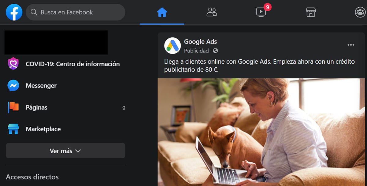
But this is where it comes in let’s know how to choose a color palette with those grays and some bright colors that accentuate some aspects. In the dark mode of Facebook we have those colors in the icons of the different important sections of Facebook and the reactions that follow with the same color palette.
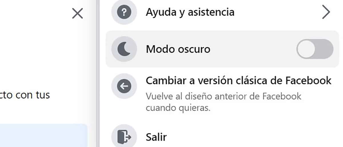
To change the dark mode on Facebook in desktop version is quite simple since the new redesign. We are going to the menu button at the top right To extend all the sections and just below Help and assistance we will find the button that activates the dark mode.
What we do miss is that we can activate this dark mode according to the time of day, since it is understood that we may need it more at night. A Facebook that continues to bet on improvements, such as that idea of eliminating the likes …


