In this tutorial we are going to show you how to make a round button with CSS. This is very simple and at the end of the tutorial you will be able to make your HTML buttons look like a circle.
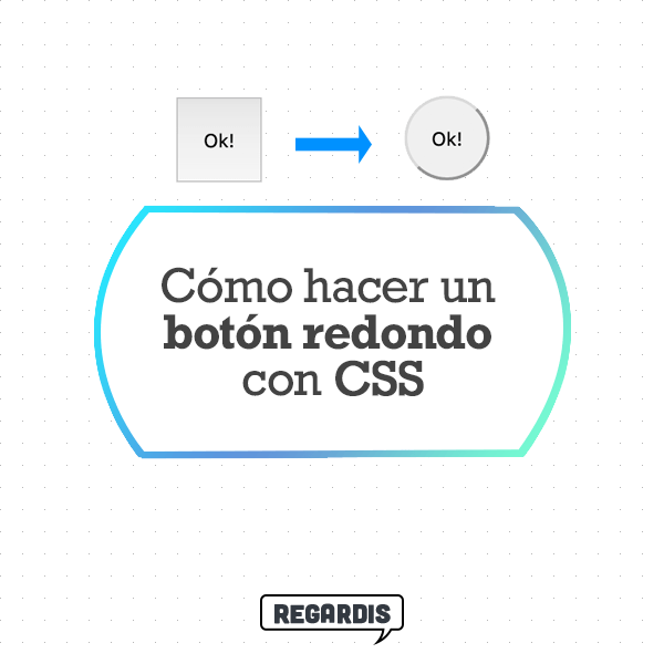
Table of Contents
Step 1: Define a button in HTML
The first step is always the simplest and most direct. So we define the structure of a simple button with HTML, and we put a class on it so we can style it with CSS later.
<button class="redondo">
Ok!
</button>
Step 2: Turn it into a square button
For our button to be a circle, we are going to need the button to initially look like a square. I mean let’s do that the width and height have the same measurement. In this case we are placing 50px.
.redondo{
  display: block;
  width: 50px;
  height: 50px;
}
Step 3: Place a 50% border radius with CSS
Now, we are going to make our square have rounded edges. With a 50% edge radius, we will make the button look totally round.
.redondo{
  display: block;
  width: 50px;
  height: 50px;
  border-radius: 50%;
}
Why a 50% edge radius?
The CSS property ‘border-radius’ gives each corner a specific border radius. If we use the value ‘50% ‘, we are indicating that the radius border is 50% of the width / height of our element. In the example, the result would be the same if we put ‘50% ‘as’ 25px’. 50% is used because it applies to any element size.
Below is an example diagram to understand how the ‘border-radius’ works in elements:
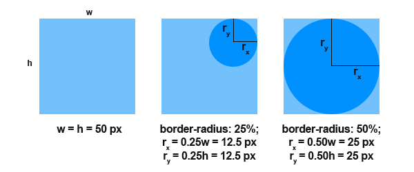
Remember that you are placing 50% radius to all corners of the button. So the end effect is that the square becomes a circle.
Result: Round button
The end result is a round button, like the following:
If you wish, you can vary the colors and more with CSS. Tell us if you have any problems or questions. Remember that the same can be applied to more elements, not just buttons.
You might also be interested …

How to put comments in HTML

How to put a background image in HTML with CSS

How to modify opacity of modal in Bootstrap?

How to create links within the same page with HTML?

How do VW and VH viewport units work in CSS?
