
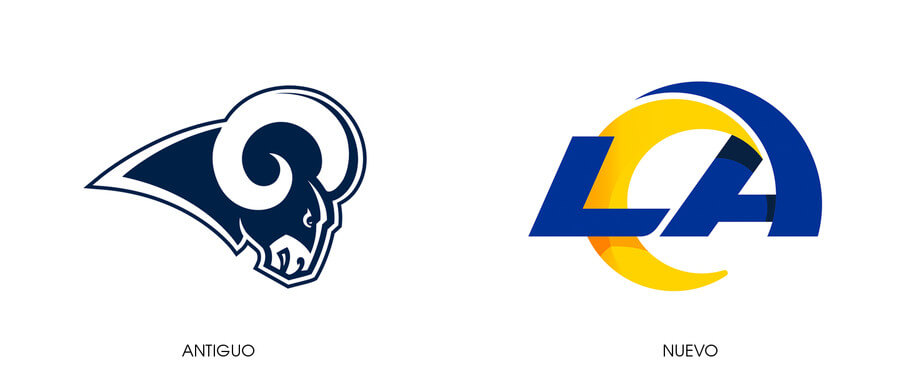
A few weeks ago, we were talking about the change of the logo of the American football team The Angeles Rams. In that case, a greater dynamism had been sought in the design, a feeling of movement and advancement; the classic ram that represented the team was replaced by the letters LA, which refer to the city of Los Angeles.
In the case of the new West Ham United crest, however, the past has been taken as inspiration for the design, nodding to the glory years of this football club. The City of London team was founded on June 29, 1895 And, therefore, the 2020/2021 season will mark the 125th anniversary of the club.
West Ham have just unveiled what will be the team’s kit for home games this coming season, with a new logo design that includes references to the 125th anniversary.
New West Ham crest
Two qualities stand out in this new shield: the retro look and the simplicity. On the one hand, as they have explained from the club, they wanted to recover the design that was used in the 60s, which was his most successful period.
This is a very common movement in the design of the image of football clubs when they want to celebrate any event: the way to recover those better times is to recover the image of those times.
It follows that logic of “if something works, why change it”. Even if virtuality and the digital age are increasingly imposed in all areas of our lives, also in football, often tradition is valued, especially in activities with so much history.
Now we can play through the smartphone, but many are still “lifelong” games like blackjack that have centuries of tradition. Not only in sports or games, but also in the creative arts that past-present-future fusion. It has just been known that the giant Olympus was going to stop making cameras, however, curiously, one of the most used filters on Instagram is the Valencia, which gives a classic and retro air to the image. For many options that new technologies give us, there are many who like to maintain a link with the past and the classic.
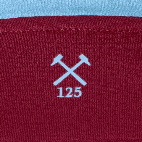
On the other hand, the design of the new West Ham crestAlthough it includes an extra element – the reference to the 125 years between 1895 and 2020 – it is simpler than the one before.
Is the call Flat Design or Flat Design which was also used in the coat of arms of the French National Soccer Team that was created after the Gauls won the 2018 World Cup. This type of design makes it easier to reproduce it in apps or web pages and, in this case, that also easier to embroider on players’ uniforms. Thus, it is a retro design, which refers to the past, but does not forget the present and adapts to it.
It is striking that even at the chromatic level the design has been simplified. This is surely for the same reasons that we indicated before. By having only two colors, its reproduction, both digital and physical, is simpler and faithful to the original.
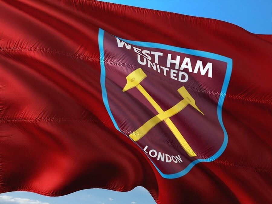
West Ham was originally called Thames Ironworks, because in the area of East London where the club was born there was a large metallurgical factory. That is why the team’s logo has two hammers, and their fans are known as the “Hammers” (hammer) or the “Irons” (steel). In the original shield and many of its designs throughout history, in addition to the hammers, the name of the team and the city to which it belongs, there was also a kind of castle that, in reality, was the facade of the Thames Ironworks factory. The simplified version, such as the anniversary one, does not include the castle, although it is preserved in some images, such as the one that can be seen on the lawn of the club’s stadium.
In the early days, the team main color It was the shade of blue that represents the University of Oxford, since some of its founders came from there. Over time, although blue has been preserved in the uniform for away matches, burgundy has been imposed, which is now the club’s identifying color. Any reference to blue has been removed from the 125th anniversary shield; dominate burgundy, which is already the color that everyone associates with West Ham, combined with the white of the lettering, not only in the logo, but in the entire corporate image for the anniversary celebration.
West Ham celebrate 125 years of life by remembering the times when this humble East London team were crowned European champions. In 1965, the best year for the club, they won the European cup, which was the origin of what is now known as the Champions League.
This season is not looking too good for the team, which may have to celebrate its anniversary in a lower category. His position in the Premier League in the final stretch of the competition is the bottom of the table.
In any case, it would not be the first time that West Ham United played in the second category of English football. If he did it again, he would meet his greatest historical rival: the Millwall. A rivalry that is portrayed in the shocking film Green Street Hooligans, where the plot takes place around a group of West Ham fans.