
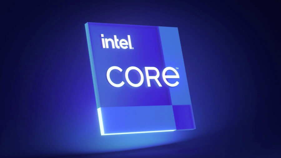
The company Intel presented what will be his new logo, the goal of the makeover is to give a fresh look to the brand.
If you want to download the new vector Intel logo, click on this link to download the file.
The presentation of the new logo took place during the announcement of its new 11th generation processors. It is the third logo that the company has used in its 52 years of life.
The last time Intel changed its logo was in 2006, the new logo retains some graphic elements of the old logo, such as the letter «i»With the square dot.
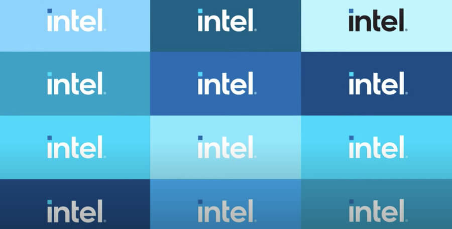
In addition, the classic blue color that Intel has used since its inception remains intact. There are different versions of the logo where the letters are in black but the square point of the letter «i»Will always be blue.
By the way the square point of the letter «i» of intel, represents the potential and power of Intel processors.
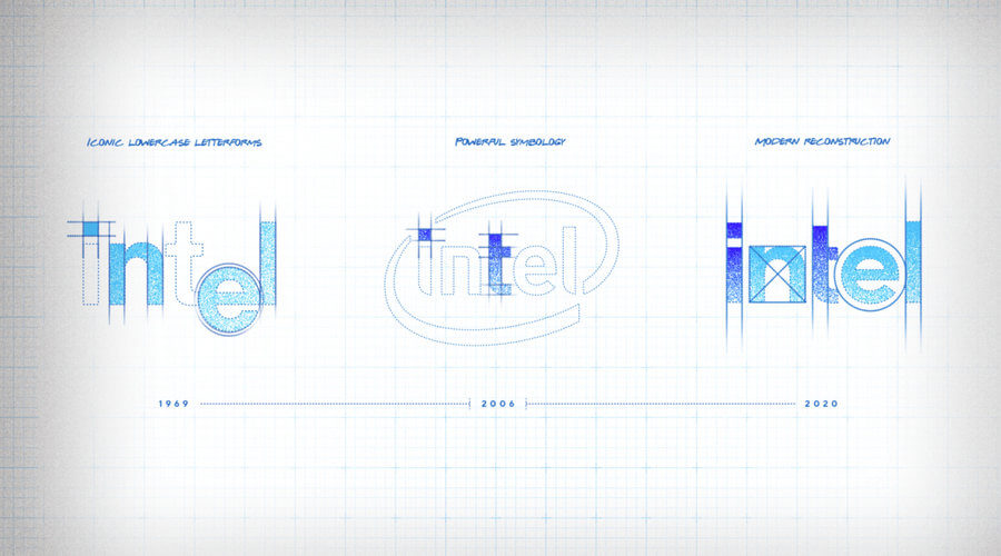

Intel presented what will be its new logo
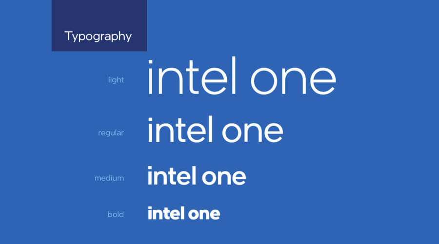
Along with the design of the new logo, Intel introduced its custom typeface called: Intel One. The design of the letters of the typography are with square geometric shapes.
The new intel logo will be seen on all new generation products. On the company’s website it is already beginning to be seen everywhere. The same happens with your social networks, you can already see it on Twitter and Instagram.
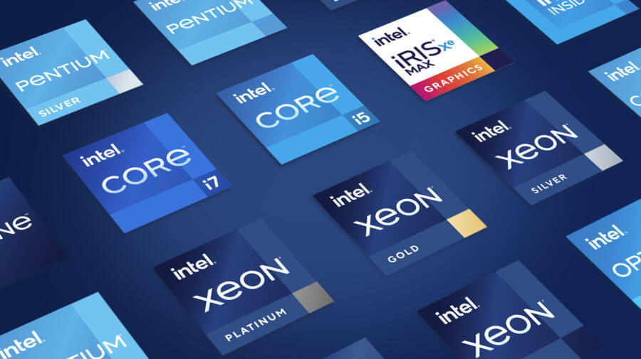

I have read on pages and blog specialized in designs that nobody liked the new Intel logo. The first complaint is that the new logo looks very similar to the one used by other companies and they are right.
Because this style of design is in fashion, many companies use flat design to adapt to the requirements of new platforms.
It’s a design style that I don’t like, but I guess we end up getting used to the change. As in all the logos that companies have presented in recent months.
But what do you think of the new intel logo, do you like the new design better or do you stick with the old one?


